|
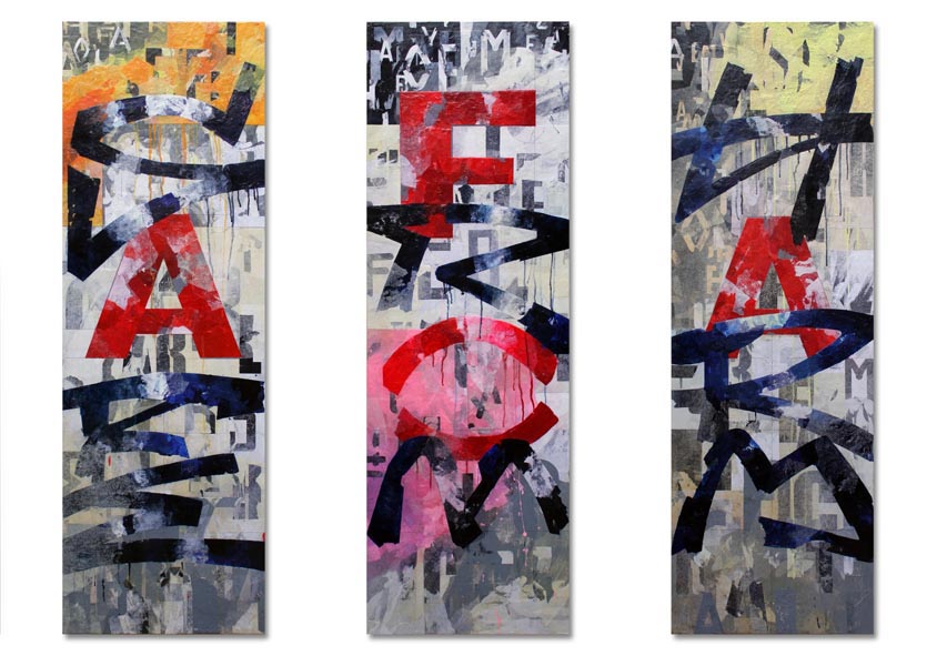
| 'Sick 1', 2012, Acrylics & Paper Collage on 4 Panels, 60 cm X 300 cm (Overall), 60 cm X 60 cm (Each Panel) |
As mentioned already, the origin of my recent ‘Sick 1’ project was 2011’s rioting and the public responses to it. The fourth (‘K’) panel of the set refers to those events most explicitly with obvious references to fire.
 |
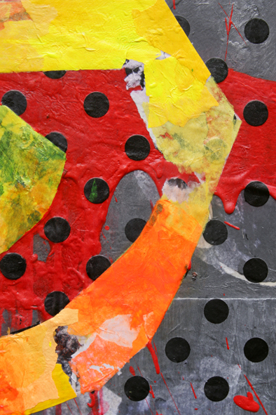
| 'Sick 1 (K)', 2012, Acrylics & Paper Collage on Panel, 60 cm X 60 cm |
As with the riots of the 1980s, the most arresting media images of recent disturbances involved fire. Blazing buildings, hooded arsonists and fire fighters silhouetted against flame become alluring visual clichés in the reporting of the mayhem, and a Google search reveals many such examples. My ‘September’ post mentioned Gerhard Richter’s disquiet over an image’s potential to reduce events of psychological or historical importance to mere spectacle, (related to the events of ‘9:11’ particularly). The mediation of human witness through the filters of T.V., print and the Web is inescapable for us as are desensitisation to events and emotional manipulation through image saturation and recycling of standard image types.

Richter is braver and cleverer than me - he continues to probe the boundaries of representational painting, risking failure in search of a philosophical reconciliation of this problem. My own approach is to offer textual clues and visual traces in a formal arena derived from the impassive surfaces that form backdrops to our upheavals.


The ‘K’ panel is pure invention and lacks any specific visual reference. I wanted to suggest the creep of fire and smoke across the panel whilst forming a visual stop to the quartet’s overall composition. The implication might be equally of ultimate incineration resulting from communal sickness or of cleansing fire. It was achieved by attacking layers of paper and paint with a heat gun, to the point of combusting the panel itself. The remaining portion features a faux crackled paint effect implying the effects of heat, and poster fragments to reinforce the idea of cultural collapse. Inclusion of a ‘Flammable’ symbol suggests torched property and the wildfire of violence but also refers back thirty years to the disturbances in St Pauls. It was adopted repeatedly by Massive Attack, - the most successful exponents of the post-riot ‘Bristol Sound’. The tagged style of the ‘K’ implies a form of ‘vandalism’ that seems now a relatively benign form of dissent after recent events.

By chance, this post coincides with publication of the official report on the 2011 riots. My ears pricked up at the phrase ‘Forgotten Families’ which sounds like a gift of a sound bite already. We’ll see…