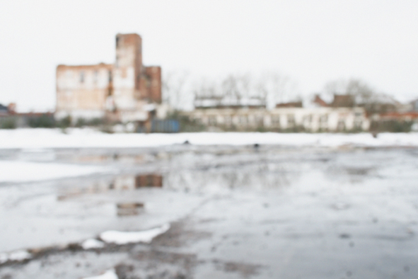
Although our recent snowfall was pretty short-lived, it did create a few appealing photo-opportunities in the local urban landscape. I pass by this burnt-out factory site,, near my Leicester home on a regular basis. This time it seemed to take on a vaguely East European, Cold War kind of vibe.
It's the sort of bleak aesthetic we'd have surely fallen for during my Sixth Form and Foundation Art Course years - when such melancholy, dystopian stuff was very much in vogue.
Anyway, such nostalgic reflections led me to permit myself a little self-indulgence with Photoshop filters for once, - in search of something slightly more expressionistic in quality than normal.
Of course, I may have been especially receptive to all this, through having played Bowie's celebrated Berlin albums several times, since his recent demise. At the risk of spending rather too long following his extended, media-driven, cortege, you could do worse than accompanying the images here with either of these...
'Vestige 1', Acrylics, Paper Collage, Ink, Spray Enamel, French Polish & Misc. Solvents On Panel, 60 cm X 60 cm, 2016
Well, we’re a couple of weeks in, and
I’ve just completed the first painting of the 2016.That's pleasing, given my intention to
ramp up my creativity activity again after a relatively sedate second half of
2015.Truth to tell, this painting was
started just before Christmas, but the majority of the serious work took place
over the last couple of weeks, in a few relatively intensive bursts.
Anyway, ‘Vestige 1’ is intended to be the first in an ongoing series of pieces
all sharing the same basic, rather spare motif, and overall compositional
format.The idea is to repeatedly
explore what might be described as a rectangular ‘zone of absence’, within a square field of varied but
indeterminate visual texture.If that
all sounds both a bit grand and frustratingly abstract, I should perhaps
explain that the original source lies in some of the recent photos I’ve
collected of the ghostly clean patches, revealed undercoats, rectangles of tape residue and the like, which remain when posters or signage have been removed
from public walls.Squiggles of adhesive
mastic and fragments of actual poster material also feature fairly regularly in
some of this source material, and may well creep into subsequent
paintings in the proposed series.
'Vestige 1', (Detail)
I’ve featured a variety of
photographs of this kind of thing here, in recent weeks, as my camera
has been drawn increasingly to subjects that suggest a sense of absence,
removal, or loss of some artifact or channel of communication, in the urban environment.In an attempt to boil down my current
concerns into handy buzz-phrases, two that keep bobbing to the surface are: ‘Traces of that which no longer remains’;
and ‘Lost voices’.
'Untitled', Acrylics, Paper Collage & Spray Enamel On Paper, 30 cm X 30 cm, 2015
An overriding
description of the spirit in which I propose to approach this particular series
of paintings might be: ‘The same, - but
different’ [1.].Of course, there’s
nothing new about the idea of painting a series of relatively uniform
variations on a theme, and it’s really just an even more distilled step on from
at least some of last year’s ‘Map’ paintings.Anyway, as a consciously
adopted M.O., I’m going to regard it as being unashamedly in the tradition of
Monet, Reinhardt, Newman, Ryman, Richter, and a host of others far more
illustrious than I.
In terms of specifics, the
essentials of this particular motif can be seen to derive from a couple of my
recent paper-based studies.Unlike
others in that small body of work, - from the back end of last year, (and
which were more generalised in nature), those two were triggered by a
specific photograph of a section of grubby Birmingham masonry.
Central Birmingham, October 2015
As already mentioned,
my lens has been full of this kind of thing of late, but it feels like this
particular motif is the one that kept returning to my mind as the idea evolved.It always interests me how such intuiting of resonance operates both forwards and backwards in time.I’ve certainly noticed how a current and
specific ‘favourite’ can not only call to mind a store of related imagery, (sometimes
set aside in the archives for years), but also lead to the active seeking out
and collection of even more, during subsequent expeditions, (as is already
occurring).
'Untitled', Acrylics, Paper Collage, Ink, Adhesive Tape & Spray Enamel On Paper, 30 cm X 30 cm, 2015
It’s fair to say that the
processes by which 'Vestige 1' was produced represent far more of an evolution,
rather than the revolution I might have originally hoped for.One stated intention of late has been to
allow more painterly freedom into some of my work.In the event, whilst there is
some greater reliance on the essential properties of fluid media, and a
deliberate combining of often chemically incompatible materials, there remains a significant component of the paper collage approach I’ve been using for quite
a while now.
Visually, I also found myself
falling back on my customary device of a screen of repeated spots, (perhaps
alluding to half-tone reproduction), as a means of getting across a given area
of the picture plane.What is different
though, I think, is that both this, and the visual evidence of other collaged
elements, is now subsumed into a more generalised field of ‘all-over’ visual
texture.We’re talking fairly fine
margins, - I realise, but working on this piece definitely felt a bit different
from previous ones.Perhaps, I can push
myself a little further into new territory, as far as technique is concerned,
as the series develops.
'Vestige 1', (Detail)
One definitely significant
development here is that the element of text, which has remained a feature of
all my work in recent years, is here relegated to little more than mere visual
texture.This is deliberate, not least
as another possible allusion to the 'lost
voices' or obsolete meanings suggested by the rectangular absence.It
remains important to me that those textual allusions should remain, in however
fleeting or fragmentary a form.Indeed,
I’m happy to set this as a definite parameter in which to keep working, - but am
equally happy that this might now include texts that ‘no longer remain’, as well as those that still do.
'Vestige 1', (Detail)
Oh, and this piece definitely reflects my current
preference for a (nearly) monochrome palette.
It’ll be interesting to see how long that holds, and whether the occasional
colour accent opens the gate for more a more heightened chroma to
eventually return.
[1.]: It occurs to me, this isn't so different from John Peel's famous description of The Fall, although in their case, it related more to an overriding aesthetic spirit, rather than a propensity to work in series. Coincidentally, the specific 'ghost patch' photographed in Birmingham lay very close to a daubed graffito reading,"Hit The North",- one of that band's song titles.
You don’t need me
to tell you about the cultural significance of David Bowie now, do you?News of his death landed with a resounding,
global thud, on Monday morning and, doubtless, there will have been numerous
obituaries, tributes and career surveys in all areas of the media, by the time
you read this.
I won’t pretend
to have played too much of his music in recent years, but it occurs to me that
his is a name I’ve referred to more than once on here.I’m sure that’s mostly because his hey-day,
and indeed - his most groundbreaking work, coincided with my own formative
years in the early to mid 70s.At a time
when being ‘a bit weird’ loomed much larger in the popular zeitgeist than
today, Bowie still managed to project an even more alien presence
than most of his contemporaries.
David Bowie, c.1972
There always
appeared to be a self-conscious element of ‘Art’ in Bowie’s practice, and a
willingness to embrace synthesis and artifice that, I suppose, made him a variety
of Post Modernist, before most of us had even heard the term.Like most ‘great’ artists, he also had a keen
eye for the best ideas to steal and the most able supporting talent to co-opt.Being apparently unembarrassed by default,
and possessing a physical presence that suggested he might have actually beamed
down from another planet, didn’t exactly hurt either.Behind all that, lest we forget, also lay an
ability to write relatively simple but eminently memorable tunes.
Anyway, instead
of reiterating a load of standard interpretations that you’ll have heard repeatedly
elsewhere, the most fitting tribute would seem to be to compile a playlist of
Bowie pieces that made the greatest impression on me over the years.I’ve chosen to overlook the various
embarrassing mis-steps and dodgy collaborations with which his career was also
littered, although I do harbor a secret affection for ‘The Laughing Gnome’. It
seems more respectful to simply remember that when he was good, - he was really
very good.
‘Memory Of A Free Festival’:
After several
attempts to forge a Pop career throughout the 60s, (originally, as Davey
Jones), Bowie finally made his breakthrough with the single ‘Space Oddity’ in 1969.The album of the same name is a charming,
slightly naive hotch-potch that feels rather like a wistful farewell to the
already receding 60s love-in.This is
particularly true of the album’s final track, - capturing, as it does, a memory
of the Beckenham Free Music Festival that Bowie had helped to organise earlier
that year.
It’s pretty dated,
idealistic stuff, but I like the wavering harmonium-like keyboards that bathe
the first half of the song with a sense of sun-dappled, psychedelic
melancholia, and the closing, sing-along chant that evokes the attempted communality
of the age.Most memorably, Bowie
signals his ability to combine the knowing and the emotional, in the lines,
“We claimed the very source of joy ran through, - it
didn’t, but it seemed that way.
I kissed a lot of people that day.”
‘Hunky Dory’:
My first thought
was ‘Life On Mars’.My second thought was that just seemed far
too obvious, despite the memorable impression that single made on me at the age
of 10.My third thought was that,
actually, the whole album that includes it is pretty indispensable. Released in 1971, it is, I suppose, Bowie’s first fully mature
album, and one without a single bum track.It may also be Bowie’s most emotionally honest and personally direct offering.
There’s nothing
especially sophisticated about these tunes, and not a little whimsy, but
everything feels properly resolved, and is rendered with disarming
sincerity.Pleasingly, there’s still
room for a couple of strange bits, - just to keep things still moving
forwards.I’ve heard ‘Hunky Dory’ a million times, but have
never worn it out.
‘Drive-In Saturday’:
‘
The Aladdin Sane’ album probably felt like a slightly less significant, second Glam missive
from Bowie’s ‘Ziggy Stardust’
persona, in 1973.It does contain a couple of
genuinely weirder moments than it’s more famous precursor however, and a truly
memorable, iconic cover image that captivated me, long before I actually heard the
record, some years later.
This is my
favourite track on the album, combining as it does, a brand of faux 50s nostalgia,
typical of the age, with an anthemic chorus, (that gets me every time), filtered
through a slightly eerie SF sensibility.
‘Young Americans’:
The ‘Young Americans’ album may not be
Bowie’s most consistent, but it did unleash a couple of stunning singles, (of which
this is one), and ushered in Bowie’s ‘Plastic
Soul’ era.The track exhibits an
insouciant, loose-limbed funk, punctuated by well-judged stop-start junctures, and
an appealingly breathless vocal delivery.
‘Golden Years’:
I can’t really
split this and ‘Young Americans’.If forced to choose therefore, I would actually
have to plump for another of his great Plastic Soul moments, ‘Fame’, - but I’ve already mentioned that in a recent post.I find it frustratingly difficult to dance to
anything much these days, but, in the past, - when I genuinely enjoyed doing so,‘Golden Years’ would always pull me onto
a dance floor.
‘Stay’:
By 1976, Bowie
was reputedly lost in heavy-duty cocaine addiction and a paranoid psychic
prison of his own making.It’s therefore
surprising that he could still put out an album as satisfying and committed as ‘Station To Station’, - the piece most
closely associated with his vampiric, ‘Thin
White Duke’ identity.His situation
may have left him a little short of original material, but he was surrounded by top-notch session musicians and was clever enough to let them stretch out
over some involving, extended cuts.Indeed, in terms
of pure musicianship, the album may actually be Bowie’s most satisfying.I love the title track, but rate this even higher,
not least for the twin guitar threat of Carlos Alomar and Earl Slick, and Bowie’s
simultaneously mannered and soulful vocal.
‘The Man Who Fell To Earth’:
Still From: 'The Man Who Fell To Earth', (Dir. Nicholas Roeg), British Lion Films, 1976
The lead rôle, of
extra-terrestrial, Thomas Newton, in Nicholas Roeg’s properly strange 1976 SF movie,
was ideally suited to Bowie’s stilted, emotionally disengaged acting
‘style’.He may not have been a natural,
- but sometimes a lack of conventional skill is exactly what’s needed.Anyway, we were already used to thinking of
Bowie as an etiolated, otherworldly figure.
Perhaps what
really makes the project so enduringly resonant is the correspondence between Bowie’s
own personal circumstances (as mentioned above), and the plight of his
character, - trapped in an increasingly degrading alien context, as his family
die on their drought-ravaged home planet.Either way, - and despite its flaws, ‘TMWFTE’
is a memorable piece, not least because of Bowie’s presence on screen.Like all the best SF, it is ultimately
about the human condition.
‘Low’:
Bowie Makes The Most Of A Great Profile
Another case
where only the whole album will really do.In fact, ‘Low’ is probably my
favourite piece of Bowie’s, - taken as a complete statement.In reality, it should probably be co-credited
to Brian Eno, who was at least as responsible for its overall aesthetic. Bowie may have been painfully short of original lyrical content, but again, he made a fantastic choice when it came to the supporting cast.
Having relocated
to Berlin, it is famously the first of three albums that Bowie shaped with Eno (and
producer, Tony Visconti), - and is often regarded amongst the pinnacles of his achievements.It exhibits a distinct
Mittel-European flavour, and is suffused with Krautrock-inflected electronics
and metronomic percussion.The first
side of the original LP features a series of strange, emotionally distanced
songs, whilst the second half is an instrumental suite, shot through with Eno’s
trademark ambiences, to brilliant, cinematic effect.
‘"Heroes"’
(Album: Side 2):
(L - R): Guitarist Robert Fripp, Brian Eno, Bowie, Hansa Studio By The Wall, West Berlin, 1977
The second Berlin
album is an even darker, slightly more abrasive, - but almost equally powerful
statement.Unfortunately, its memorable
title track turns out to have been too thinly-veiled a theft of an existing
Neu! song to ever really hear the same way again, and slightly unbalances the rest
of the album as an obvious stand-out single.
The second half
follows a similar, largely instrumental pattern to ‘Low’s’, - evoking, if anything, an even more sombre mood.It’s easy to forget that the Berlin Wall
still stood, (in sight of the recording studio), when these albums were
recorded, and Eno’s instrumental suite here is shot through with Cold War
gloom.As a teenager, I repeatedly drew bleak,
semi-abstracted scenes of post-industrial dereliction to this soundtrack.Nothing really changes.
‘Modern Love’:
Bowie Dips A Toe Into The Mainstream, 1983, (Blondes Have More Funds).
This is pretty
much where I started to lose my real enthusiasm for Bowie’s music, - as he
moved into the 1980s with the mainsteam commercial success of his ‘Let’s Dance’ album.The album’s title said it all really, as the uncannily
prescient Bowie recognised that the future lay in bright, shiny production
values and less nuanced lyrical themes.The weird alien and louche aristocratic personas that had served him so
well, seemed suddenly less appropriate, and it was time to put on a big, pastel-coloured suit and make uncomplicated, good-time music. For all that, I'm always happy to hear this. It may be far less knowing than his mid-70s synthetic Funk and Soul excursions, but it's well put together, (with co-production from Nile Rogers), and positively swings. It's on its toes from moment one, never lets up, and is hard not to love, - just for being what it is.
Postscript: Since I began writing this post, reports have emerged that David Bowie underwent an 18-month struggle with the liver cancer that killed him. It also appears that his final album, 'Black Star', released just days ago, may have even been part of a strategy to manage his own death as a kind of final art statement. Never one to miss a trick, if so, - Mr. Jones.
Being the latest instalment in an ongoing series and the first examples of 2016. I particularly love the set of mostly blanked off slots. I now realise how they seem to fit with my current concern with silenced voices, closed avenues of communication, etc.
Central Leicester, January 2016
Central Leicester, January 2016
I'm loving the crappy, ad-hoc labelling on this one too...
'Cement Cycle: Element 1 (Path)', Digital Print On Foamex On Concrete, 29cm X 29 cm, 2015
Whilst doing a
little turn-of-the-year housekeeping, I came across this post in a partially
written state, and realised that it was a significant loose end in need of
tying.The first post of 2016 seems a
good enough time to fill in the gap, - if only in the interests of
moving on. Better six months late than
never, - even if there is a suggestion of OCD on my part.
'Cement Cycle: Element 2 (Path)', Digital Print On foamed On Concrete, 29 cm X 29 cm, 2015
I alluded to my ‘Cement Cycle’ photographic project several
times last year, both whilst it was in progress, and as it hung in June’s ‘Mental Mapping’ exhibition in Rugby[1.]. However, I never actually dealt with its ten
separate ‘Elements’, as they appearedin their final state, complete with final printed images, text captions, and concrete
supports, (something that seemed to attract a fair bit of attention in the actual exhibition).
'Cement Cycle: Element 3 (Edge)', Digital Print On Foamex On Concrete, 29 cm X 29 cm, 2015
Creating those concrete blocks was, in theory, the biggest technical challenge of ‘Cement Cycle’, (although, if you’d witnessed the pig's ear my ‘professional’
printer made of outputting and cutting the images to the specified dimensions,
you might think otherwise).I toyed with
the idea of purpose-casting them, which might have given me complete control
over the dimensions, but would have also have necessitating building at least
one mold, then dealing with setting times, shrinkage and a lot of stuff I have
relatively little experience with.I
knew weight would be an issue too, as they were always intended to be
wall-mounted, necessitating the casting of a more complicated frame-shaped form,
rather than a simple block.
'Cement Cycle: Element 4 (Edge)', Digital Print On Foamex On Concrete, 29 cm X 29 cm, 2015
Instead, I opted
to buy ten pierced, ornamental garden wall blocks, (of the sort that were so
popular in my 70s childhood), and to chisel out the centres to leave a reasonably
chunky concrete frame.Repeatedly
drilling the backs of these further reduced the weight, and their slightly
rough texture provided an ideal key over which to build a patinated surface
from thin skims of vari-coloured cement and filler.It wasn’t a bad plan, even though it proved
impossible to chisel a single one without also cracking the framing edge,
often in several places.It was easy
enough to rejoin them, particularly as the open backs were blanked off with
thin MDF, but harder to ensure they remained perfectly square, or absolutely uniform
in size.
'Cement Cycle: Element 5 (Island)', Digital Print On Foamex On Concrete, 29 cm X 29 cm, 2015
It was important
that, within an essentially standard format, each block should have an
individual identity through subtle variations in colour, patina and
Implied history,
and that they loosely reflect some of the material qualities of the
photographic subjects themselves.I
enjoyed drilling, chipping and repeatedly skimming them to achieve this,
although power and hand sanding them back to a relatively uniform finish,
wasn’t without its element of hard labour, (and a temporary breakdown in neighbourly relations).The printed photographic images
were laminated onto thin plastic board and, once eventually returned at the
correct dimensions, these were attached to the front edge of the frames with strong
carpet tape.A mastic adhesive fill, and final
sand, flushed them in as seamlessly as possible, and the raw cement was sealed
with matt acrylic varnish.
'Cement Cycle: Element 6 (Island)', Digital Print On Foamex On Concrete, 29 cm X 29 cm, 2015
I won’t pretend
the finished results are 100% slick, (deft use of an engineering square would
reveal a multitude of minor sins), but as low-tech, relatively affordable
methods go, the results are pretty pleasing.I avoided undue deadline stress by sticking to methods I could mostly
control, allowing plenty of lead-time, and just getting stuck in until the job
was complete.They do give the illusion of being possibly solid, I think, and the surfaces are full of pleasing visual nuance.I’m also pleased with the final proportions;
both of each block, and of the overall set of the five pairs as they appeared
on the wall in a grid formation. Even
more importantly, - nothing fell off!I
was determined to get some actual concrete or cement into the exhibition
somehow, and ultimately this felt like a simple, but effective way to have
realised that.
'Cement Cycle: Element 7 (Node)', Digital Print On Foamex On Concrete, 29 cm X 29 cm, 2015
I’ve already
discussed the rationale behind the images, and the different reasons why cement
and concrete also recurred as a significant theme.If they represent a desire to operate in a
medium beyond painting, they also mark an involvement with something a little
more consciously conceptual than usual.It was thus, important to me to maintain a clear link with the source
text of Kevin Lynch’s ‘The Image Of The
City’[2.].I liked the idea of the
project resembling a kind of bogus academic or official report, despite its
underlying subjectivity, and for a while, I considered applying a direct quote
from Lynch’s text to each of the ten ‘Elements’.
'Cement Cycle: Element 8 (Node)', Digital Print On Foamex On Concrete, 29 cm X 29 cm, 2015
In the end
though, I chose to write my own original captions, - utilising some of Lynch’s
terminology to my own less academically rigorous ends.My hope is that anyone familiar with his (admittedly,
somewhat specialist) text would know what I’m getting at, but that each phrase
could just as easily represent a pure fiction.In passing, it’s worth mentioning that this was much the same quality
that my co-exhibitor Andrew Smith captured in his script for our ‘Orfeo’ video collaboration, although to
somewhat more sumptuous poetic effect.Lynch also supplied something of an oblique stimulus there, and it was indeed,
Andrew who had first referred me to ‘The
Image Of The City’, some months previously.
'Cement Cycle: Element 9 (Landmark)', Digital Print On Concrete, 29cm X 29 cm, 2015
One final piece
in the puzzle, possibly worth noting, would be the overlap between several of
the locations in ‘Cement Cycle’ and
in ‘Orfeo’.I managed to avoid direct repetition, with
one notable exception, but in many cases, an image from the former might reveal
a still from the latter if the camera was moved a few metres to right or left,
or simply panned a few degrees.
'Cement Cycle: Element 10 (Landmark)', Digital Print On Foamex On Concrete, 29 cm X 29 cm, 2015
That’s ‘Cement Cycle’ then.I think it achieved much of what I set out to
do, and certainly pushed the envelope a little in terms of my overall
practice.That is perhaps my main reason
for revisiting it here.It represents
the first time I’d considered presenting photography as a definitive,
exhibitable statement within my body of work, and that’s definitely something I
want to pursue further in 2016.
'Cement Cycle','Mental Mapping: New Work By Andrew Smith & Hugh Marwood', Floor One Gallery, Rugby Art Gallery & Museum, June 2015
The recognition
that a mild conceptual strand runs sporadically through my work remains equally
important, and part of that is an implied willingness to work in whatever
medium seems most appropriate to a given idea.In fact, one of my pressing current ambitions is to explore the ways
that pieces in different media might evolve out of, or recycle, each other in a
less compartmentalised manner.If a
self-contained project like ‘Cement
Cycle’ occasionally bobs to the surface, I hope it might also be seen as
evidence of a wider process of hybridisation within my overall practice.
That may all
sound a bit grand or willfully oblique, I realise.On a more superficial level, If the
conceptual subtleties of ‘CC’ were a
little lost on some viewers, - I can at least take some satisfaction in having
turned a few heads with my concrete fettling abilities.
Right, - move on… [1.]: ‘Mental Mapping: New Work By Andrew Smith & Hugh Marwood’. 8 June – 17 June 2015, Floor One Gallery, Rugby Art Gallery & Museum, Little Elborow St, Rugby, Warwickshire, CV21 3BZ. [2.]: Kevin Lynch, ‘The Image Of The City’, Cambridge Massachusetts, The M.I.T. Press, 1960.