Thursday 30 October 2014

'And Now It's Dark, American Night Photography', At Lakeside Arts, Nottingham


Jack Delano, 'Proviso Departure Yard Of The Chicago & North Western Railroad At Twilight', 1942


This post relates to ‘And Now It’s Dark, American Night Photography’, - an exhibition I viewed recently at the Djanogly Gallery in the University Of Nottingham’s Lakeside Arts Centre.  The show’s not on for too much longer, but is definitely worth a visit if you find yourself in the area and have the time.  My own interest derived, in part, from my attempts to take photographs after dark, (with somewhat mixed results).

The title tells you essentially what to expect, but it’s worth outlining that the exhibition is nominally divided into two main sections, the first comprising the work of three contemporary photographers, Jeff Brouws, Will Steacy and Todd Hido, all of whom have made a point of capturing images after dark, and a more general survey of work looking at that particular tradition throughout the twentieth century.  This loose, chronological structure appears to be undercut by an intent to demonstrate how a general sense of optimism or technological/societal celebration in many of the earlier images, is replaced by a sense of disillusionment or loss in those photographers working today.  ‘And Now It’s Dark’ may be a reference to more than just the lighting conditions under which the photos were taken.


Jeff Brouws, 'P.J.'s Lucky Strike, Elko, Nevada', 1995


In my own mind, the show actually divides into three sections, including a pivotal phase where this transition can first be perceived, - but more of that in a minute.  Here’s a basic outline of the exhibition's essential components, reversing the order in which it’s actually hung.


Early Work:


Mostly in Monochrome, (for obvious technological, as much as aesthetic reasons), the tone of much of this pioneering work is generally uncritical.  The main intention seems to be to document the wonders of the, increasingly artificially lit, Modern Age, and the technical wonders of an ever more confidant American society in the twentieth century.

Samuel HermanGottscho’s ‘New York City View: Times Square To The South At Night’, (1933), is a fine example of this.  It’s a beautifully framed, focused and exposed document that attempts little more than to catalogue the brightly illuminated spectacle of that famous site in all its novelty and wonder.  It also demonstrates that, as far as this show is concerned, the tradition of American nocturnal photography is primarily engaged with the effects of artificial lighting, from the earliest days.  Unsurprisingly, given the very nature of the medium, nocturnal photography is as much about light as it is about darkness.  What really distinguishes it is the highly controlled nature of that man-made light.


Theodor Horydczak, 'Waffle Shop On 10th Street: Exterior Of Waffle Shop With Neon Sign', 1950


The other notable themes running through much of this earlier work are that of conspicuous consumption, and of America’s pursuit of happiness in its most material aspects.  Theodor Horydczak does this very stylishly in his ‘Waffle Shop On 10th Street: Exterior Of Waffle Shop With Neon Sign’, (1950).  Again, it is a simple, beautifully composed description of its subject, but one with a distinct appreciation for the high commercial aesthetic of the period.  This delight in its Pop-SF styling and glorious typography, so typical of the era is, of course, only accentuated by our own retro-fascination with such tropes.  This was a period, after WWII, when ‘The Future’ still looked both plentiful and sexy, (Atom Bomb not withstanding).


Jack Delano, 'Activity In The Santa Fe Railroad Yard, Los Angeles', 1943


Jack Delano’s images demonstrate how such visions of American positivity, (or at least, wartime stoicism), derived as much from Government sponsorship as from private enterprise culture.  Produced under the aegis of the Farm Security Administration and the Office of War Information, during the 1930s and 40s, they are somewhat heroic, Romantic visions of America’s will to abide.  They also mark the introduction of colour into the proceedings, and are not without their experimental aspects, despite their documentary intent.  Time-exposed light trails are hardly novel to us now as a photographic technique, but it’s impossible not to be attracted by Delano’s use of them to imply nocturnal railroad activity, back when they probably seemed a daring manipulation of the medium.


Transitional Work:


Though the curators choose not to make a formal separation, my own feeling is that the whole show actually pivots around a group of images, created in middle of the last century, (and amongst my favourite things in the show).  These are the first intimations that, however bright the lights, there is also a darker side to the illuminated American Dream.

William Klein’s ‘Broadway By Light’, (1958), extends the remit of the exhibition to include moving imagery.  Klein’s short film is a high-energy celebration of the electrified entertainment spectacle that is Broadway between dusk and dawn.  Almost abstract in one respect, but full of text, signs and symbols, it’s a whirling cavalcade of chasing, pulsing lights, brand names and invitations to be entertained.  The film is drenched in colour, and movement, and utilises rapid edits and alternating long shots and close-ups, to inject a new level of vitality into those similar subjects from earlier in the exhibition.  Nonetheless, behind its enjoyable Pop aspects, and psychedelic hyper-reality, lie certain more critical implications.  There’s a suggestion of migraine overkill and visual ADHD about it all, and of a leisure society running off the rails and under unstoppable momentum, towards terminal decadence.  When humans appear, it’s as the silhouettes of electricians and sign-hangers, lost within a polychromatic inferno and seemingly enslaved by it.


What happens when that society actually blows a fuse can be seen in René Burri’s suite of photographs, ‘Blackout New York’, shot during the massive East Coast power outage of 1965.  These startling, decidedly existentialist images show New Yorkers huddling claustrophobically, (or for comfort?), in still-illuminated vehicles, or emerging like torch or match-lit partial apparitions from the profound blackness.  A palpable sense of vulnerability,  and paranoia, illustrates how easily security and self confidence evaporate once the lights flicker and we return to the cave.


Images From: Rene Burri, 'Blackout New York', 1965


Contemporary Work:


Here the work of the three chosen contemporary photographers is extensively showcased.  It’s fair to say that, to a greater or lesser degree, the cracks and defects in America’s reverie about itself are made manifest in these images.  That’s not to say that the themes of abandonment or collapse that suffuse many of these images aren’t also often full of sumptuous visual poetry or dark, urban romance.  Indeed, this may be one of the show’s main dilemmas. Despite the story of general decline in the living condition of many sidelined by the pragmatic realities of Late Capitalism, there’s no denying that the juxtaposition of coloured light and atmospheric shadows remains an largely pleasurable experience, visually speaking.

Jeff Brouws:  This is perhaps best exemplified by Brouws’ images, harvested on a series of road trips, and exemplifying marginal situations in a changing economy.  Some of his shots attempt to demonstrate how mainstream, (or Main Street) America must increasingly confront the sleazy or morally questionable, (the brothel or X-rated book store) to scrape a living or find diversion in a world of reduced options.  Elsewhere, his marvelous, desolate shots of sections of road create the sense of being truly lost out on some forgotten highway.


Jeff Brouws, Coffee Shop, Battle Mountain, Nevada,' 1993
Jeff Brouws, 'Exit 24 Off 1-90, Erie, Pennsylvania', 2005


Despite all this, the clichés of Americana haunt many of these pictures.  Brouws’ illuminated gas stations are clear descendants of Edward Hopper’s whilst ‘Coffee Shop, Battle Mountain, Nevada’ (1993), looks like an even more lonesome version of that artist’s famous Diner once even the Nighthawks have left.  Repeatedly, the kitsch beauty of glowing neon, or a sense of delicious melancholy, undermine the real bleakness he may seek to convey. On the plus side, he is, rather good at incorporating signage into his images.  ‘North Wilson Street (MOTEL), Vinita, Oklahoma’ (1991), depicts the lights of a motel reflected a little too beautifully in wet tarmac but, pleasingly, the puddle-mirrored ‘MOTEL’ sign can be misread as ‘WOLFE’.


Jeff Brouws, Details Unknown
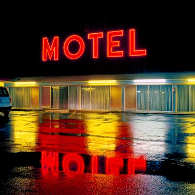
Jeff Brouws, 'North Wilson Street,(M O T E L), Vinita, Oklahoma' 1991


Will Steacy:  Steacy undertakes a conceptually more intriguing form of journey to capture his images.  His project,‘Down These Mean Streets’, involves him walking from Airport to Business District in various cities, documenting the abandoned properties, impoverished neighbourhoods and evidence of distressing events he often encounters along the route.  These are carefully assembled into a conscious narrative, although it does feel like his bloodstained gutters and bullet holes in glass are possibly over-melodramatic, and a sinister, faceless Hoodie just seems too carefully posed.


Will Steacy, (Details Unknown)
Will Steacy, 'Condos, Chicago', 2008


Despite these caveats, ‘Memorial, Philadelphia’ (2009), is a truly moving image, depicting a street shrine to a fallen brother against waste ground, debris and a discarded car wheel.  ‘Condos, Chicago’ (2008), effectively captures a fenced off vacant lot with a developer’s impression of a proposed building, - priced, (one assumes), beyond the reach of many.  ‘Someplace Else, Detroit’ (2009), depicts another tract of weed-strewn ground overlooked by a drab cinder block wall on which that particular legend is spelt out in bold lettering.  I’m drawn to it for all sorts of probably obvious reasons.


Will Steacy, 'Memorial, Philadelphia', 2009
Will Steacy, 'Someplace Else, Detroit', 2009


Todd Hido:  Of all the work in this exhibition, it may be Hido’s which most evocatively tells the story of lives thwarted and prospects denied.  His are also the images with the highest proportion of human content and least dramatic visual chiascuro, (although everything is clearly shot at dusk or under unattractive artificial light after dark.


Todd Hido, (Details Unknown)


The images from ‘Excerpts From Silver Meadows’ show Hido returning to his own childhood home in suburban Kent, Ohio, to document a society in banal decline.  There’s nothing as dark or gritty as Steacy’s imagery, but a distinct air of disappointment or sordid drabness.  His somewhat painterly landscapes often dissolve into mist, scattered wintery light, or just a lack of focus, but feel more like abandoned places in which one might become lost, rather than anything more picturesque.  Hido’s wintery motel, (His images are untitled, emphasising the loss of clear identity), is colourfully lit like Brouys’, but also dissolved by the filter of raindrops on a car window.


Todd Hido, Details Unknown


Once Hido’s lens moves indoors, it documents a world of scruffy, featureless decor, abandoned interiors and distressingly stained carpets.  These may be the soul-sucking motel bedrooms or soon-to-be foreclosed homes occupied once life is reduced to mere existence.  The young women often populating them attempt a listless simulation of allure, but really hint at cheap, uninterested sex entered into as a transaction, or because there’s nothing better to do apart from drink.  For me, the best image amongst them, (and possibly the most distilled in the entire show), is a small, badly lit, close-up of a grimy white phone.  Ghostly and disconnected, it sits on a pale carpet before an obscure expanse of dreary, patterned wall.  It feels an awfully long way back to those early, confident images of nocturnal Manhattan.


Todd Hido, Details Unknown


'And Now It's Dark, American Night Photography', continues until 09 October 2014, at  Djanogly Gallery, Lakeside Arts, University Of Nottingham,  University Park, Nottingham, NG7 2RD.


Friday 24 October 2014

Written City 14: Change Of Use


…What's Next?


West Leicester, September, 2014


You know a site is truly abandoned once the Hand Car Wash guys move on.


Wednesday 22 October 2014

Completed Painting: 'Consumed 3'


'Consumed 3', Acrylics & Paper Collage On Panel, 60 cm X 60 cm, 2014


In a couple of recent posts I discussed ‘Time Passages’, the live art project I undertook at Melbourne Festival 2014.  As I pointed out, one of my slightly selfish motivations for devoting much of the summer to its preparation was to shake up my creative activities a little by working to a slightly different agenda.  It was an opportunity to combat a certain staleness which I’d been feeling for a while generally.  It appears to have worked as, once the remaining loose ends were tied up, I produced this new painting, ‘Consumed 3’, fairly quickly, (by my standards), and with relatively little agonising.


'Consumed 1', Acrylics & Paper Collage On Panel, 100 X 100 cm, 2014


‘Consumed 3’ follows on from the previous two 'Consumed' pieces already produced earlier this year.  Like them, it should technically be termed a collage really, being composed almost totally of torn and layered paper.  Paint is never totally absent however, and the kind of visual and formal thinking they represent, is much the same as I might employ when using fluid media.  To be honest, I’ve given up being too precious about all this, choosing instead to use whatever medium feels most appropriate at a given time, and just enjoying whichever intrinsic physical characteristics may apply.  For all my recent, tentative attempts to branch out into video, etc., a large part of me remains wedded to static imagery and wall-based artefacts.  Exactly how they are realised remains largely up for grabs, however.


'Consumed 2', Acrylics & paper Collage On Panel, 100 X 100 cm, 2014


Just like ‘Consumed 1’ & ‘2’, this one also evolved organically, without any conscious preparatory work and its final appearance was largely dictated by instinct and the accumulation of chance events or happy accidents along the way.  This method seems to have served me pretty well this year and, whilst always a little wary of any comfort zone, for now I’m happy enough to be in a bit of a groove with these pieces.  Whilst the basic working procedures may be pretty similar from one to another, each new attempt appears to be throwing up fresh formal or painterly challenges, so I don’t think I’m working on automatic pilot with them just yet.


'Time Passages' (Details), Acrylics & Paper Collage On Board, Variable Dimensions, 2014


In this case, the obvious development is the reintroduction of a little more colour.  This came in part from my love of the Duck-Egg Blue backing of most of the advertising posters I salvage, and the preponderance of Co-op Green printed fragments I had at my immediate disposal.  That blue always seems like a surprisingly soft, pastoral colour to find in fairly gritty locations, (often in large expanses), as large advertisments decompose.  I think this piece is also a slight hangover from the small elements of ‘Time Passages’ that were inserted into the individual frames.  Some of the backings of those displayed a vaguely similar palette and general mood, but were necessarily lashed together in fairly short order.  Perhaps I just wanted to go back and revisit that in a more considered manner.


Partly, the  text in those elements may have also inspired the little red asterisk that completely transformed this whole piece in the last hour of its production [1.].  It felt pleasing enough, but somehow just too polite, until I dropped that in on a whim.  I love the way that a single smidgeon of primary, complementary colour woke the whole thing up.  Purely by coincidence, I was interested to see that my friend Shaun Morris had done something similar in one of his recent paintings.  Great mind’s eh, Shaun?


Shaun Morris, Title Unknown, Oil On Canvas, 
150 X 90 cm, 2014


In fact, instinct played a large part in my decision to call this piece complete when I did.  I had imagined including more black letter forms, breaking out from the large block at top left in some way to scatter across the whole composition.  Instead something told me to put in the red asterisk and just stop.  Knowing when to walk away without over-doing things is one of the hardest things any painter can learn, I think.  Perhaps making that earlier idea work can become a little challenge for another day instead.


As in all these ‘Consumed’ pieces, the textual elements themselves carry an anagrammatic ‘hidden’ message relating to ideas about consumer Capitalism.  There’s nothing particularly profound about that and it relates to their origins in the appearance and multiple messages of torn advertising posters in a fairly obvious way.  I don’t need to spell it all out any more than that really, - the words and phrases are there for those that want to find them.


That’s ‘Consumed 3’ then.  It is what it is really, - a reasonably pleasing little 'painting' whose birth was relatively un-traumatic.  Mostly, it makes me want to crack on with the next one.


[1.]:  Along with some tiny red printed fragments that just appeared as part of the collage process.  These things are rarely clear cut in reality.


Tuesday 21 October 2014

Written City 13: My. Instinct Is. To Laugh. Furtively.


The sentiment behind this is obviously scurrilous, but there's no denying there's a base humour to be found everywhere in the city's streets.


West Leicester, August 2014


It also appears that those who claim we live in a porn-saturated culture may have a point.  It seems to have seeped into the very fabric of the most mundane corners, (which this is, literally).

While we're at it, - isn't that a beautiful formal arrangement of sign, brickwork detail and a fantastic little window?


Monday 20 October 2014

Janek Schaefer: 'Asleep At The Wheel'


Janek Schaefer, 'Asleep At The Wheel', Windscreen View


It is of course, both a blessing and a curse of the Digital Age, that no single piece of information can any longer remain discrete or hermetically disconnected.  Each new item of interest is linked to a million others, and thus, our attention is quickly overwhelmed and shattered exponentially as we jump from link to link and topic to topic.  Never mind Ebola, information is the virus that will finally consume us all, I suspect.


Janek Schaefer, 'Asleep At The Wheel', IF Milton Keynes International Festival,  2010


Thus it is that, whilst writing a supposedly brief synopsis of Janek Schaefer’s Sound Art piece, ‘Lay-By Lullaby’, (as a tangent to my own current artistic activities) [1.], I found myself also considering his far more ambitious, but clearly related, multi-media installation, ‘Asleep At The Wheel’ [2.].  All of that takes place in the context of several other half-written blog posts, all nested within one another in different ways.  There are just as many others laying around on my hard drive that just never made the cut, (so far).


Exterior View Of Venue For Janek Schaefer, 'Asleep At The Wheel', Milton Keynes, 2010


Yet, I want to consider ‘Asleep At The Wheel’ further  here, for a couple of reasons.  Firstly, because it appears, in itself, to have been a huge, multi-dimensional example of this viral quality of information and knowledge.  It was presented, at first glance, as a kind of immersive Ballardian riff on the thrillingly alienating effects of modern car culture, (as indeed is ‘Lay-By Lullaby’).  The venue, - a disused Sainsbury's supermarket, is a distinctly Ballard-like location and I'm struck by how images of the event capture a similar feel to David Cronenberg's film adaptation of Ballard's novel 'Crash' [4.].  However, further research quickly reveals a far more complex and politically engaged agenda, taking in environmentalism, geo-politics, economics. philosophy, sociology and, pretty much, the prospects for all life on the planet.


Janek Schaefer, 'Asleep At The Wheel', IF Milton Keynes International Festival, 2014


Anyone visiting the installation, (which I didn’t), and spending just a little time absorbing some of the audio information piped into Schaefer’s ten assembled cars or available within the Library and Service Areas, would have left feeling they’d taken on enough mental cargo to last for years.  In fact, considering the existential, ‘big issues’ nature of it all, a lifetime would be nearer the mark.  There's food for thought here on a global scale, and critiques of so much of the way our society and economy are structured.  There are also suggestions about how change might be affected on a personal or local level, including the 10:10 campaign to cut carbon emissions.


Janek Schaefer, 'Asleep At The Wheel', Library Area


Having just downloaded and ploughed through the associated sound files [5.] from Schaeffer’s online archive, I can honestly say I’m feeling pretty overwhelmed myself.  And yet, I would recommend doing the same.  The sound element weaves together numerous sound sources, voices, addresses and radio broadcasts with Schaefer's own musical ambiences into a vast soup of information and ideas.  The general message of the unsustainability of modern industrial/consumer Capitalism, our dependence on rapidly squandered, finite reserves of fossil fuels, and the threat to both the planet’s survival, is hardly new, but becoming ever more urgent as the days go by.  Indeed, it can all seem so intimidating and all encompassing that the individual is left feeling impotent or apathetic.  Nevertheless, Schaefer has to be admired for his ambition and scope, and for presenting so much interrelated stuff in a sensually seductive and thought provoking manner.  It’s also worth noting how well he connects the issues with various insights into human motivations, and that he’s careful to include as many voices of optimism and advocates of constructive change, as he does prophets of doom.


Janek Schaefer, 'Asleep At The Wheel', Glovebox Mixtape.

Janek Schaefer, 'Asleep At The Wheel', Inspirational Rear View Mirror Message


Which leads me to my second point.  There’s no shortage of us, (Schaefer included, it seems), who get off on all the Post Ballard/Dystopian/Failed Modernism/Entropy-fixated stuff.  Let’s face it, there are real thrills to be had from hanging around under road intersections or abandoned factory buildings, cataloguing picturesque decay, trespassing into restricted tracts of infrastructure, or driving nowhere at night.  Such activities provide, to a greater or lesser extent, a frisson of transgression not available through the standard channels of consumption, just as they are themselves gradually accepted as new branches of mainstream culture.  Will all these rehearsals for the Apocalypse seem such fun once the sky actually starts to fall though?  Similarly, a fascination with the ways a life lived increasingly behind the wheel effects our perceptions of the world as an aesthetic exercise, [3.], can stand in for any deeper consideration of the real implications of all this dependence on the internal combustion engine and a petro-chemical economy.


Janek Schaefer, 'Asleep At The Wheel', Library Area.


Not that any of this signals any real change in my own agenda.  Indeed, a significant part of me still holds to the view that an artist’s real role is to respond to the world as they find it, as much as it is to seek to affect change.  Indeed, it’s all too easy to get tied up in an internal debate over whether one’s artistic concerns are a sub-set of bigger, global issues, or vice-versa.  In reality, it may be that for many of us, artistic practice is a manageable way of exerting some rationalising control over life in the face of all the stuff that just seems to big to influence.  I’d like to believe the two things aren’t mutually exclusive, though, and that one might be the thin end of the other.


Janek Schaefer, 'Asleep At The Wheel', Service Area


Mostly, I’m just glad that there are artists around like Janek Schaefer, with motives more noble or generous than my own, who are trying to prove it’s possible to produce thrilling, aesthetically resonant work, whilst still remaining seriously engaged.


Janek Schaefer


[1.]:  Janek Schaefer, ‘Lay-By Lullaby’, 12k, 2014.  Also Presented As A Sound Installation.

[2.]:  Janek Schaefer, ‘Asleep At The Wheel’, Multi-Media Interactive Installation, IF Milton Keynes International Festival, 2010.

[3.]:  David Cronenberg (Dir.), 'Crash', Canada/UK, Alliance Communication Corp./The Movie Network/Recorded Picture Company, 1997.

[4.]:  Or indeed, a kind of Post Modern relish for the Baroque excesses of custom car culture or the spectacular rituals of drag racing.  I'm aware of the irony.

[5.]:  These include the extensive audio elements played within the cars, along with Schaefer's accompanying 'Glovebox Mixtape'.  The latter is also presented as a cassette, designed to be kept in a car.  It is full of gorgeous drones and ambiences, and not unlike 'Lay-By Lullaby' in tone.  It omits the traffic noise of the latter for the most part though, which might, of course, be provided by one's journey in real time.