Showing posts with label Artists and Exhibitions. Show all posts

Monday, 13 April 2020

Out Of The Frying Pan: Remembering William Scott


William Scott, 'Figure And Still Life', Oil on Canvas, 1219 mm x 1530 mm, 1956


We're officially amidst what would normally be the academic Easter break - although that's clearly pretty meaningless, given the current situation.  Many teaching staff have continued to work from home, preparing online teaching materials and attending to the myriad paper/screen/data-based tasks they would normally have to squeeze into the gaps between actual teaching.  Some may be consequently wondering a bit about the exact nature of their vocations/careers.  What exactly, is implied - if so much of the job can be performed without any children in the room?


William Scott, 'Table Still Life', Oil on Canvas, 1433 mm x 1838 mm, 1951


Whatever the ins and outs of all that, I've always been thankful that my own support role as a Technician, mostly involves the everyday practicalities of what happens in actual rooms.  Most of my time is spent engaging with tangible things I can count on shelves, mix up in pots, or clean under a running tap.  Even in Photography lessons, much of my time is spent charging batteries, changing lenses, and setting up lights.  That's all fine and dandy with me - but it does, of course, make it harder to envisage how I might do my job from home.  Given that I am much luckier than many, in still being paid (for now, at least - and something I'm very grateful for), it seemed only reasonable to seek out something significant that might be of use to students and staff, once/if things return to a situation resembling 'normality'.


William Scott, 'The Harbour', Oil on Canvas, 613 mm x 917 mm, 1952


Something that has happened on a fairly regular basis, over the years, is that teachers (and sometimes students) have turned to me, uttering words to the effect of, "Quick! - can you think of an artist/artwork that exemplify (fill in style/approach/theme of choice)?"  An ability to throw up an appropriate name, at least some of the time, has gained me the reputation of being a bit of a walking Art encyclopaedia, although I'm generally at pains to point out that  it's really only because I've been around longer than most other folk in the faculty.  I've been visiting exhibitions and reading books on the subject for most of that time - and for no other reason than I was interested.  If nothing else, I guess I should be grateful my visual memory still works reasonably well - even if I often have to grope a bit harder for the names, these days.


William Scott, 'Yellow And Black Composition', Oil on Canvas,  1524 mm x 1016 mm, 1953


Anyway, I've long thought  I should get this potential archive out of my head, and into a form that others could access a little more readily.  There's no shortage of books and online resources already out there, obviously - but it did seem to me that it might be useful to compile something focussed around some of our more consistent schemes of work, or around examples that might prove refreshing alternatives to the same old - same old.  Let's hope that proves to be the case.  If nothing else, it's keeping me mentally engaged - and has certainly allowed me to delve a little deeper than I might habitually do when challenged at short notice.  I've already had a lot of fun researching partially remembered artists and artworks, and making the kind of connections that transcend my habitual thought patterns.  I've reacquainted myself with a few slightly unexpected names in the process too.  One such is William Scott, and what better excuse could there be to have a look at some of his paintings here?


William Scott, 'Green Pears And Blue Pot', Oil on Canvas, 304 mm x 384 mm, 1955


There doesn't appear to be too much drama in Scott's biography, and I suppose some might also argue there's nothing especially edgy about his work generally.  Mostly, it seems to epitomise an aesthetic often reduced these days (in the shorthand of designers and interior decorators), to 'Mid-Century Modern'.  It's certainly not too difficult to bracket him with other British artists like Nicholson, Hepworth, etc., who sought to extend the modernist tradition of formal abstraction, originated by such pioneers as Cezanne, Braque or Mondrian.  There always remains some connection with observed appearance, and a degree of step-by-step logic in his progressive distillation of subject matter into increasingly stripped-down compositions of  essential shapes.  In Scott's case, there's also a typically British fixation on modestly domestic subject matter (he most readily identifies as a still life painter), and to a largely tonal, slightly chalky, approach to colour.  Both feel typical of the paintings of these islands, and the period in which he rose to prominence.  It's also perhaps worth noting that his work might typify the kind of soft utopianism that prevailed, to some extent, in the post-war period.


William Scott, 'Egyptian Memory', Oil on Canvas, 1118 mm x 1829 mm, 1958


All that Modernist urge to abstract and to purify is, of course, a pretty familiar story by now -  and one which is rapidly diminishing in the rearview mirror of art history.  But, the point of this post isn't about just regurgitating what one lazily thinks one knows about a particular artist's work, but rather - the frisson one gains from viewing afresh something half forgotten, and discovering it still has the power to excite on purely visual grounds.  There may be little that's grand or unduly extrovert in Scott's painting, but, like Braque, Morandi, or even Chardin - he consistently found an impressive degree of poetry in a few domestic items on a table top.  In a typical Scott painting, it seems to be all about the considerable visual tension that might exist between those skillets, cups and bottles, once they are reduced to emblematic essentials, and distributed across a modest arena.


William Scott, 'Painting', Oil on Canvas, 2120 mm x 1350 mm, 1959


As I say, that whole formal thing may hold less currency, nowadays. But when its ideological or philosophical underpinnings are set to one side, there's still something about it that chimes with many of my own aesthetic defaults - however many subsequent layers of implied meaning or theoretical justification I may seek to erect on top.  The disposition of shapes on a picture plane, the acceptance of the inherent flatness of that plane, some attempt to impose a degree of geometric organisation on the visual world, as well as an overall urge to simplify, are all instincts I've long come to acknowledge in myself.  They're also things William Scott exemplified with both verve and elegance - and mostly without moving very far from his own kitchen table.


William Scott, 'White Floating Forms', Oil on Canvas, 1016 mm x 1276 mm, 1960


William Scott, 'Blue And Black Still Life', Oil on Canvas, 864 mm x 1118 mm, 1962


My own acquaintance with Scott came, via a fellow degree student, sometime around 1981.  Scott himself was still active then, although it's probably fair to say his work had settled into a fairly undemanding reiteration of familiar tropes.  As I've mentioned previously, prevailing art trends were definitely moving in a contrary direction, but in Bristol Polytechnic's slightly cosy Fine Art bubble, it was pretty easy to overlook that fact.  The tendency to look further south-west, to that whole mid-century St Ives scene (with which many of our tutors, and indeed, Scott, himself) had been attached, was still pretty powerful, even in the early 1980s.  It became all the more so, once one took the trip down the peninsula (and back in time), to experience all that seductive, self-abstracting landscape at first hand.


William Scott, 'Blue Still Life', Oil on Canvas, 1218 mm x 1831 mm, 1969


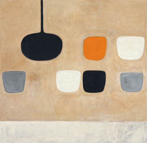
William Scott, 'Still Life With Orange Note', Oil on Canvas, 1680 mm x 1720 mm, 1970


Of course, nowadays, you can't move in Cornwall for tourist-facing galleries of all shapes and sizes, and many are stacked with mass-produced, sub-sub Herons, Lanyons, Nicholsons - and, indeed Scotts.  Such stuff also lines the walls of every other second home and holiday rental throughout the region.  And my own inspirations and enthusiasms long since turned away from both the landscape and the still-life table - towards something far more urban and potentially hard-edged.  But, just as one should avoid the tendency to pigeonhole or write-off an artist for superficial reasons - one should also resist denying one's own back story.  We all get wherever we're going by a variety of circuitous routes, after all.  Above all, I should always remember to keep looking at stuff afresh, and to never deny myself the pleasure of re-engaging, on its own terms, with work I'd half-forgotten.  Mostly, I'm just glad to have remembered that some of those Scott's really are very good.  Who knows? - they might even get some of our students to think a bit more clearly about shape and composition, one day.

      
William Scott, 'Permutation 4 - Ochre', Oil on Canvas, 1676 mm x 1726 mm, 1978


Friday, 25 October 2019

Mark Bradford, 'Cerberus' At Hauser & Wirth, London


Mark Bradford, 'Gatekeeper' Mixed Media on Canvas, 2019


I found myself  in London again, the other day - with my good friend, Susie, for a bit more strategic gallery-going.  This time, the exhibition in question was Mark Bradford's 'Cerberus', currently on display in Hauser & Wirth's impressive Saville Row spaces [1.].  The visit proved well worth the train ticket, and - as with the Oscar Murillo show I viewed a few weeks back, 'Cerberus' both impressed and inspired.  Indeed, it provided a further reminder (were it needed) that abstract painting, albeit in distinctly hybridised forms, is not only still alive - but positively thriving.


Mark Bradford, 'Cerberus', Mixed Media on Canvas, 2018
(And Details Below)


I've been looking at Bradford's work for a while now - having encountered one of his large, heavily distressed canvases at Tate Modern, a few years ago.  On that occasion, I was instantly drawn to his intensive multi-media approach, involving sanded, carved and tattered layers of collaged material, references to a kind of notional urban landscape - implied maps and found text fragments.  The piece I saw that day, and the others I've seen on various screens since, spoke to certain works I had recently produced myself (not least my 'Maps') -  and have continued to influence others I have produced more recently.  I'm happy to acknowledge such correspondences, but can't claim to be operating with anything even faintly resembling the confidence, conviction monumentality (or, indeed - success) evident in Bradford's work,


Mark Bradford, 'Sapphire Blue', Mixed Media on Canvas, 2018
(And Details Below)


And monumentality is definitely the impression one gains on first entering the larger of two galleries at H&W.   The expansive space is dominated by two huge pictures, and another, truly immense, one.  The largest (which also lends the exhibition its title [2.]) encompasses a vast panorama - emphasising that these works might most usefully be regarded as pieces of terrain.  It's a sensation only magnified during the extended seconds it takes to pace its length at close quarters.  One could really 'get one's steps in' with this work.

And, as with much of Bradford's previous work there's often the suggestion of looking down upon an urban sprawl, as if from some 'eye in the sky', whilst being simultaneously being pressed up against the ragged, textures and urban grit of its ghettoised underbelly.  Predictably enough, I'm drawn to that vivid sense of an artist drawing directly from the streets, for visual stimulus, conceptual/emotional inspiration, and actual raw materials.  And the reality is that Bradford is hardly a painter at all, in the purely technical sense.  Some fluid, coloured media may be involved, but his works mostly coalesce from the accumulation of physical 'stuff' (much of it sourced in the field), and the varying degrees of violence he can bring to bear upon it.  


Mark Bradford, 'A Five Thousand Year Laugh',  Mixed Media on Canvas, 2019


And, it transpires, he knows plenty of what he speaks.  Bradford's studio, and the streets to which he most often returns, are located in South Central Los Angeles - a stereotypically forbidding zone of disenfranchised minorities, social deprivation and infamous race riots.  As a gay black man, raised during the Civil Rights era, but now embedded in such a gritty  environment, it can feel superficially counter-intuitive to discover he has maintained a genuinely refined and cultured demeanour - whilst never shying away from the daunting realities of an environment which must have consumed so many others.  In interviews, he has described the varieties of prejudice he encountered, growing up in the Liemert Park district, but is as quick to point out the strongly protective matriarchal context in which he was raised.  In fact, for much of his early life, Mark worked in his mother's beauty salon - seemingly a nexus of female mutual support - before seizing the opportunity of a formalised art education, previously unavailable to other creatively-inclined family members.


Mark Bradford, 'Cerberus', Hauser & Wirth, London, October 2019


Possibly, he resembles the Colombian, Murillo in this respect.  Both hail from the less entitled side of the social or ethnic tracks - yet now function at a high level within the elitist, top-dollar milieu of international 'High Art'.  Instead of feeling excluded from a field as once abstruse and ring-fenced as abstract painting, they cheerfully hybridise its purist pretensions, and revel in its positives.  Certainly, Bradford has turned it all to his own, far less exclusive, ends - re-energising a mode of expression once deemed a bastion of white privilege or entitled machismo, whilst remaining culturally grounded and politically engaged.  He deploys its visual vocabulary with unabashed verve, and yet consistently immerses political or sociological themes within it.  Further still, he has used his market leverage and increasingly elevated profile to instigate consciously inclusive art projects within his community and beyond. In reality, such a practice is all about confounding lazily entrenched stereotypes, both socially and artistically - and it's a pretty inspirational example.  Even without the admirable element of community outreach - It still might just constitute the equally-weighted, 'have cake - eat-cake, equilibrium between the visual and the thematic/theoretical that I've long been yearning for myself. 


Mark Bradford, 'The Path To The River Belongs To Animals',
Mixed Media on Canvas, 2019


Anyway, to return to specifics, it seems that these new 'Cerberus' paintings also represent something of a departure in Bradford's overall oeuvre.  As has often previously happened, The starting point  was a map of both socio-historical, as well as geographical significance.  In this case, it was made by the authorities, to chart the Watts riots, that brought violence and devastation to the L.A streets, in 1965.  An important element of this was a series of colour-coded dots (referred to, by Bradford as 'hotspots'), plotting looted buildings, burnt-out buildings, and those where fatalities had occurred.  But this time, as the work evolved, he allowed his subsequent additions, incursions and excavations to occur more organically than was previously the case.  Many of those hotspots were removed - surviving as phantom memories of the events they once signified.  The blocks and street grids that still remain (generally as relief delineations in some form of extruded mastic), rise only intermittently through far-more clotted and congested landscapes than ever before.  In places, they suggest mere vestigial foundations (the remnants of some conflict or disaster, perhaps); elsewhere - the still just-visible roofs of inundated neighbourhoods.


Mark Bradford, 'Frostbite', Mixed Media on Canvas, 2019


If the pieces in the neighbouring room are generally smaller in scale - they are no less vivid.  If anything, they feel less topographical, and even more visceral (in the biological sense).  To locate oneself in these territories, is to wade, knee deep, through the very guts of a place.  Any fragments of a community, that might remain, are merely glimpsed through an avalanche of overgrown detritus and shattered building materials.  In a piece like 'Frostbite' one can imagine the city becoming submerged beneath the scummy surface of some freezing lake (I actually read this a something altogether more tropical, but I guess the clue's in the title).  In other instances, it might be that its remains are obscured by a dense tangle of forest vegetation [3.]. These may then be the most apocalyptic examples of Bradford's work, to date.  Certainly, they are the most organic - suggesting ruin on a more cataclysmic scale than ever before, it seems.  But we should remember that Mark Bradford came up thinking about 'beauty', from an early age, and that he appears incapable of making anything without a certain degree of elegance about it.  This work may presage apocalypse - but it's also possessed of a profound and terrible beauty.


Mark Bradford, Stills From: 'Dancing In The Street', Video, (2:50), 2019


Which makes it all the more appropriate to conclude by discussing Mark's accompanying video 'Dancing In The Street'.  Interestingly, what initially appears to be the result of tricksy multi-layered video editing, was actually produced by a far more direct expedient.  Archive footage of Martha and The Vandellas, singing their classic song [4.] was simultaneously projected and re-recorded from the open door of a moving van, as it drove around the streets of South Central (I really like the lower-tech simplicity of that).  There's a definite historical resonance here, for many regarded that song's lyric as a call to arms during the racially-charged unrest of the mid 1960s.  In Mark's footage, Martha's face shimmers across the facades of tawdry buildings which might so easily have been torched or looted in '65 - and which now bear the scars from subsequent decades of social deprivation and predatory economics.  But there's a fragile and ghostly beauty at work there, too.  We shouldn't forget that, for many, 'Dancing In The Street' was mostly just a perfect slice of Pop heaven - even in the most pressured of times.  Cerberus may snarl like a hell-hound - but Martha sings like an angel.


Mark Bradford, 'Cerberus' continues until 21 December, at Hauser & Wirth, 23 Saville Row, London, W1S 2ET.  I suspect that, as art experiences go, it may be pretty hard to top, for quite a while.  


[1.]:  It's only natural to be pretty cynical about the international art market, and the interests of power and wealth it so clearly serves.  It is then, only fair to note that, even in a top-end gaff like this - Joe and Josephine Punter can still wander in off the street, and view such high-quality gear, absolutely free of charge.[2.]:  That quasi-mythological title suggests a potentially infernal region - and some clear sentinel presence also.  If we are to detect some socio-political context here (as we must - where Bradford is concerned), we should query the real function of such a border guard.  Is it to seal the perimeter against alien incursion - or really to contain the Hell within?

[3.]:  There's something distinctly Ballardian about this - I'm inevitably reminded of 'The Drowned World', for all its London-centricity.

[4.]:  Martha and The Vandellas, 'Dancing In The Street' (M. Gaye, W. Stevenson, I. J. Hunter), Gordy, 1964


Sunday, 7 July 2019

Oscar Murillo: 'Violent Amnesia' At Kettle's Yard, Cambridge


Disclaimer:  


This post has been far too long in the writing - for which, apologies.  The exhibition it discusses - Oscar Murillo's 'Violent Amnesia' , at Kettle's Yard, Cambridge, actually ended around two weeks ago.  However, with another show currently on in London, and a lot of attention pertaining to his Turner Prize nomination, Murillo still feels very much like a man of the moment, just now.  And to be honest, work like his is, in my opinion, worth discussing at any time.  The Cambridge show certainly whetted my appetite for Murillo's oeuvre, and has inspired me to try to visit his London exhibition in the coming days.  Perhaps this post will do something similar for you...  


Oscar Murillo, '(Untitled) Catalyst', Oil & Graphite On Canvas, 2018-19
(Detail Below)


The painter and multi-disciplinary artist, Oscar Murillo seems to be gaining plenty of recognition, just now - and for pretty good reasons, in my view.  Recently, I found myself at his recent 'Violent Amnesia' exhibition, at Kettle's Yard, in Cambridge's, with my friend, Tim - and came away feeling invigorated by what we saw.   


Oscar Murillo, '(Untitled) Catalyst', Oil & Graphite On Canvas, 2018-19
(Detail Below)

Oscar Murillo, '(Untitled) Catalyst', Oil & Graphite On Canvas, 2018-19
(Detail Below)


Murillo is an ex-patriot Columbian artist - from pretty humble origins, it would seem.  He studied in Britain, following his family's relocation, and has continued to made something of a base for himself here.  However, as would seem to be the case with many artists, these days, he seems to wander the globe relentlessly - seeking creative impetus, making cultural and conceptual connections, and collaborating, wherever it seems most appropriate to do so.  Certainly, ideas about migration, displacement, the complex and fluid, relationships between physical and mental territories - and about the friction between community and globalisation, all appear to form key thematic underpinnings to the work.  Indeed, Murillo has talked quite openly about borders, and the physical domains they delineate, as something he experiences largely through the window of a plane - his ideas and emotions flowing more universally, on the way to somewhere else.  If nothing else, the wide-ranging scope of his practice feels like a inspiring antidote to the growing and depressing trends of  nationalism and intellectual or imaginative restriction - against which any self-respecting artist must surely stand opposed, these days.     


Oscar Murillo, 'Violent Amnesia', Vinyl Cut Letters & White Paint On Wall
(Site Specific), 2019

The Cambridge show alluded to this early on.  The first, eponymous piece encountered, was a text-based memorial to a dead friend, which pleased me greatly with its use of vinyl cut lettering, applied directly to the wall - and partially obscured by a slew of gestural white paint.  However, that almost feels like an adjunct to the main show, which really began with a forbidding curtain of dark, roughly collaged canvas pieces, obscuring one's view of the work beyond in two directions.  This was actually the first instalment of Murillo's long-term project, 'The Institute Of Reconcilliation', which reappeared throughout the exhibition, at recurring intervals.  Here, it seemed to serve as a physical, as well as a visual obstacle to be overcome - suggesting to the seeker of artistic refreshment, "You must struggle to make any progress here."  Is this not also, in essence, the all-too-common experience of that quintessential twenty-first century figure - the migrant?     


Both Images: Oscar Murillo, '(Untitled) Catalyst' Paintings, With 'The Institute Of Reconciliation'
(Installation), Kettle's Yard, Cambridge, June 2019


Behind this, in one room of the impressive new Kettle's Yard exhibition space, hung a thrilling suite of Murillo's ambitious '(Untitled) Catalyst' paintings, alongside another phase of  'The Institute of Reconcilliation' (combining more tattered canvas drapery, damaged church pews, and a concoction of burnt corn and clay).  The latter appears to employ culture-specific references to the Colombian working classes, amongst other things, and is engaging enough.  However, with my painter's hat on - I'd be lying if I didn't admit it was the 'Catalyst' pieces that really blew me away, in that particular gallery.   


Oscar Murillo, 'The Institute Of Reconciliation', Oil On Canvas, Steel Rail, Church Pews,
Burnt Corn & Clay, 2014 - (Ongoing)


It occurs to me that it's increasingly rare to encounter this kind of ambitious, freely expressive, abstract painting in a contemporary exhibition, nowadays.  Nevertheless, it's still one of the most profound thrills in art, to be confronted, all over again, with someone's attempt to discover exactly how paint might get from one edge of a flat surface to another, with energy and verve.  Walking into this room was, for me, an experience not too far removed from that of engaging with Gerhard Richter's timeless 'Cage' suite, at Tate Modern.


Oscar Murillo, '(Untitled) Catalyst', Oil & Graphite On Canvas, 2018-19


Like much of my favourite painting of this kind, the 'Catalyst' pieces manage to combine  overall simplicity (at first sight), with almost infinite, multi-layered complexity - revealed as one stares into their depths.  Composed of tangled overlaid networks of scribbled marks, and broader veils of dragged colour, they achieve an imposing degree of monumentality, whilst also operating on a very human scale by obviously recording of the gestures of the hand and arm.  Indeed, they relate us to our infantile, attempts at clumsy, intuitive picture-making, even as they exist as mature and deeply reflective paintings.  This is, of course, essentially what the Abstract Expressionists were attempting, seventy-five odd years ago.  It's exhilarating to witness it being revived as an approach, with such verve and commitment, so deep into the Twenty-First Century.


Oscar Murillo, '(Untitled) Catalyst', Oil & Graphite On Canvas, 2018-19
(Detail Below)


That these paintings constitute a related series is evident not just from their shared and restricted palette of reds, blues and blacks (somewhat reminiscent of ball-point pens - I now realise), but also from the method of their execution.  It transpires that Murillo's method here involves laying one canvas over another - loaded with paint, before scribbling through from behind.  They are thus a species of turbo-charged mono-printing, as much as they are paintings in the traditional sense, and clearly evolve out of each other.  That the list of media employed includes graphite, emphasises that they are also drawings as much as paintings (if all that tangled calligraphy hadn't already proved the point).  It's no secret that I'm a sucker for a good series - and for such hybridised forms of media-transference.  


Oscar Murillo, '(Untitled) Law', Oil, Oil Stick & Graphite On Canvas & Velvet, 2018-19
(Detail Below)


Murillo's willingness to flit between modes of expression, even within the arena of wall-based picture-making, was underlined in the neighbouring gallery.  The paintings exhibited here combine much of the same expressionistic freedom, and indeed - an overall scruffiness which is thoroughly refreshing in these over-designed, digitally manipulated times.  Here though, Murillo also combines his painterly gestures with stencilled, screen printed and more carefully drawn motifs, as well as elements of scrawled text.  That he is a collagist too, is clear from this piling up of random, and possibly more symbolically freighted statements.  It's also made explicit in the means of physical construction often employed.  It transpires that many of his paintings are literally stitched together from separate sections of canvas - much as is the case with the draped pieces already encountered.


Oscar Murillo, 'Violent Amnesia' 'Oil, Oil Stick, Graphite & Screen Print On Canvas & Linen,
With Steel Rail, 2014-18 (Detail Below)


Oscar Murillo, 'Untitled', Oil On Canvas & Linen With Steel Rail, 2015-16 (Detail Below),
With: 'The Institute Of Reconciliation' (Detail)


The interrelatedness of all this is evident in the painting which again shares a title with the entire show, and which is constructed to hang, curtain-like from a steel pole.  Meanwhile, in a far corner, the (for me) most pleasing of Murillo's ragged canvas drapes ('untitled') obscured a window - content to revel in its pure grubby materiality, without carrying any imagery at all.  In such a fashion, Murillo gets from Rauschenberg to Eva Hesse in a single, effortless bound.  But if this weren't enough, his most dramatic intervention in this particular room - another iteration of 'The Institute of Reconciliation', proves his trans-media credentials, once and for all.  Here, a vast avalanche of seemingly filthy canvas sections, resembling discarded industrial tarpaulins, spilled across the floor.  The wall beyond,was defaced by a field of oily scuff marks - suggesting the canvas was dragged across it in the most rudimentary form of abstract image-transfer imaginable.  The inclusion of more burnt clay, corn, and coins here alludes to the already mentioned thematic underpinnings, but I'd have been more than content with it as a more ambiguously process-driven statement, to be perfectly honest.


Oscar Murillo, 'Surge', Oil, Oil Stick & Screen Print On Canvas & Linen, (2017-18)
With: 'The Institute Of Reconciliation' (Detail), 


Oscar Murillo, 'The Institute Of Reconciliation', Oil On Canvas, Coins, Burnt Corn & Clay,
2014- (Ongoing)


Indeed, if I have any criticism of Murillo's practice (or the small taste of it revealed in Cambridge), it is only that his seeming attempt to cover all bases, formally and conceptually, must inevitably fall a little flat eventually.  For me, this occurred next door, in the tiny St Peter's church.  The ever-expanding 'Institute..' continued here, featuring some pretty rudimentary papier mache figures, punctured by sections of metal ducting, and perched on yet more damaged church pews.  The accompanying notes reveal these to be reminiscent of yet more ritual sacrifice - in this case, the Colombian 'Mateo' effigies, traditionally burnt at New Year.  Murillo's intention with these, as with all his burning of clay, corn, and scattering of coinage, seems to be to comment on the exploitation of labour and destructiveness of consumption.  That's laudable enough, but again - I feel like the impressive formalist aspects of this multi-facetted installation somewhat overwhelm the socio-political content it purports to carry.  Ultimately though - who am I really, to criticise another, far more accomplished artist, for attempting to pack in too many things all at once? 


Oscar Murillo, 'Organisms Of All Countries Unite', Graphite, Oil Stick & Coloured Pencil On
Paper With Carbon Paper, 2016 (Details Below)


And that Oscar Murillo is actually able to cash most of the cheques he writes, was revealed in a couple of smaller spaces, upstairs at Kettle's Yard.  'Organisms From All Countries Unite', comprises four composite suites of meticulous drawings, over which are imposed abstract gestures in a far cruder hand.  The drawings, it transpires - are executed by another artist, commissioned to work from photographs taken by Murillo, to document the economic decline of the once-prosperous (in Soviet times) Azerbaijani village of Sheki.  The gestural defacement was then committed by Murillo - in a piece of disruptive collaboration of which I thoroughly approve.  It feels like a far more eloquent attempt to reconcile visual expressiveness with a socio-political theme somehow - perhaps because of the inclusion of explicit representational imagery, and the conflict between two authorial voices.


Oscar Murillo, 'Organisms Of All Countries Unite', Graphite, Oil Stick & Coloured Pencil On
Paper With Carbon Paper, 2016 (Detail Below)


Also upstairs, hung another collaborative statement, in the form of the mixed media piece, 'Frequencies'.  This represents an on-going project, in which Murillo encourages school students to carry-out free-associative drawings on pieces of canvas, wherever his international travels take him.  These are subsequently stitched together in the form of yet more stitched drapes - potentially giving voice to all the world's children, I suppose.  For such an ambitiously outward-facing, and engaged artist, that seems like a perfectly appropriate ambition.  And after all, if it's not an artist's job to cut creatively through all the barriers of inequality, misunderstanding, and isolationism, currently besetting us all - whose is it?  Oscar Murillo seems admirably up for the task.   


Oscar Murillo & International Students Aged 10-16, 'Frequencies', Mixed Media, 2015
(Part Of Long-Term Collaborative Project)


Oscar Murillo: 'Violent Amnesia', ran  9 April - 23 June 2019, at Kettle's Yard, University Of Cambridge, Castle Street, Cambridge, CB3 0AQ.


Oscar Murillo: 'Manifestation' runs until 26 July 2019, at David Zwirner, 24 Grafton Street, London, W1S 4EZ