Sunday, 10 May 2015

Work In Progress: 'Cement Cycle'


Work In Progress: 'Cement Cycle: Element 1 (Path)', Printed Dims: 29 cm X 29 cm, 2015


One of the reasons for my painting (and indeed, blogging) activities slowing slightly for a few weeks was that I split my focus between that and a photographic project, I’ve opted to call ‘Cement Cycle’.  When Andrew Smith and I agreed to collaborate on our ‘Mental Mapping’ exhibition, I knew I wanted my contribution to be a little wider in scope than solely painting.  I remain highly committed to painting, (or some kind of hybrid form of it), but there’s no doubt I’ve hankered to augment it with work in other media for quite a while.  This was stimulated, in part, by seeing how Andrew’s own practice took a variety of forms beyond painting - and depending on what felt most appropriate), when we both exhibited in a group show in Birmingham, in 2012 [1.].


Work In Progress: 'Cement Cycle: Element 2 (Path)', Printed Dims: 29 cm X 29 cm, 2015


Of course, regular visitors to this blog will know that I spend a lot of time taking photographs, but generally, I’ve only really regarded them as raw material, or a kind of visual diary, - rather than as artifacts in their own right.  I can’t fully explain this; perhaps its because, in an age of almost total photo-image saturation, a painting just feels more like a ‘thing’ with actual presence.   Anyway, the images in this post are the first that I’ve actually considered also putting on a wall as self-justifying pieces.


Work In Progress: 'Cement Cycle: Element 3 (Edge)', Printed Dims: 29 cm X 29 cm, 2015

Work In Progress: 'Cement Cycle: Element 4 (Edge)', Printed Dims: 29 cm X 29 cm, 2015


These ten images represent a selection of concrete or cement-based way-markers that I pass repeatedly on regular cycle commutes to and from my day job.  I often drive to work, but always enjoy those occasions when I can ditch the car and go on two wheels instead.  The alternative route(s) this entails are surprisingly verdant, and largely follow the general direction of the River Soar between the centre of Leicester and its northern periphery.  Just as my recent ‘Map’ paintings relate to relatively mundane local journeys, this alternative route is also very much part of my ‘mental map’ of the city.  As it happens, the source location for ‘Map 1’ and ‘2’, is a nexus of both a ‘Map’ route and my ‘Cement Cycle’ route.
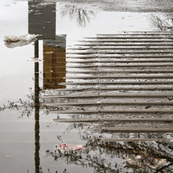

Work In Progress: 'Cement Cycle: Element 5 (District)', Printed Dims: 29 cm X 29 cm, 2015

Work In Progress: 'Cement Cycle: Element 6 (District)', Printed Dims: 29 cm X 29 cm, 2015


The concrete features depicted range from the large scale and visually assertive, such as the cement depot, subway system and river crossing flyover, (which have all featured on this blog before), to the easily overlooked or eminently low-status, such as a section of waterlogged textured paving, or a solitary fence post.  Interestingly, I often notice how the most unassuming or easily overlooked features are those which ultimately impress themselves most on one’s memory of an habitual journey [2.].


Work In Progress: 'Cement Cycle: Element 7 (Node)', Printed Dims: 29cm X 29 cm, 2015

Work In Progress: 'Cement Cycle: Element 8 (Node)', Printed Dims: 29cm X 29cm, 2015


This is something pointed out by Kevin Lynch, an American M.I.T. Academic, whose publication, ‘The Image Of The City’ [3.], constituted a specialised guide for Urban Planning and Architectural Design students of the 1960s and 70s.  Andrew Smith suggested Lynch’s book to me, when we first started laying plans for ‘Mental Mapping’, and I quickly found much in it to chime with my own perceptions of the urban landscape.  Particularly interesting was Lynch’s central acknowledgement of the often highly subjective mental images that city-dwellers compile to aid their navigation of complex environments.  Part of this process involves the investment of familiar, often mundane physical features with emotional or atmospheric resonances far beyond their official status or utility.  Lynch went on to categorise these into five basic archetypes, or ‘Elements’, namely: ‘Paths’, ‘Edges’, ‘Districts’, ‘Nodes’, and ‘Landmarks’.


Work In Progress: 'Cement Cycle: Element 9 (Landmark)', Printed Dims: 29cm X 29cm, 2015


The images from my ‘Cement Cycle’, shown here, are organised in five pairs, according to the same logic.  Each of the versions exhibited will incorporate a text caption inspired by Lynch’s text – but hopefully leaving things ambiguous enough for more open interpretation.  I’m not revealing their content just yet, I’m afraid, - you can’t have all your treats before the actual exhibition.  Each printed image has been laminated onto plastic board; to be fixed flush onto the front of one of the cement blocks alluded to in my previous post.  This should give the illusion of a solid concrete projection when mounted on the wall in Rugby, (Rugby; cement - I’m sure I’ve been though all this already on several occasions).


Work In Progress: 'Cement Cycle: Element 10 (Landmark)' Printed Dims: 29cm X 29cm, 2015


Well, that’s the plan, at least.  I’ve already hinted at the fact that my fettling of the ten concrete supports wasn’t totally without its moments of friction.  Now I just need to satisfy myself that the printing company has actually made them the right size - at the third attempt…


‘Mental Mapping: New Work By Andrew Smith & Hugh Marwood’ will take place between Monday 8 June – Wednesday 17 June 2015, at Floor One Gallery, Rugby Art Gallery & Museum, Little Elborow St, Rugby, Warwickshire, CV21 3BZ.


[1.]:  ‘If A Picture Paints A Thousand Words, Why Can’t I Paint’, Works Gallery, Birmingham, November 2012.

[2.]:  As a Foundation Art student, still resident in my home town of Lincoln, I walked to college every day in the shadow of that city’s huge Gothic cathedral.  And yet, strangely, I retain memories of an age-worn handrail, or a particular dilpidated lamppost - at least as vividly as those of the massed cliffs of ornate architecture looming over me.


[3.]:  Kevin Lynch, ‘The Image Of The City’, Cambridge Massachusetts, The M.I.T. Press, 1960.


Tuesday, 28 April 2015

What's So Funny?...


West Leicester, April, 2015


Well, technically, these are hardly the most accomplished photos I've ever put on here.  I grabbed them with my phone a few hours ago, without even getting off my bike, and they've had only minimal editing or correction on their way to publication.  Perhaps there is something appropriate about the hazy spring sunlight that suffuses them though as, of course, they're really just about that delightful bit of chalked graffiti.

The end of this terrace, close to my home, has served as a kind of public art arena for decades, facing a major road junction, as it does.  Years ago, a community-based mural filled the entire space.  Later, it was painted sky-blue and adorned with a series of large relief butterflies.  It's pretty low-key in  comparison now, although that reddish paint glows nicely under the right illumination, - and it still attracts a steady turnover of graffiti and fly postings.


West Leicester, April 2015


Of course, some might deride this current communication for being unbelievably twee and naive. However, in an age when all we hear about is the murderous intent of power-crazed psychos and religious mentalists, it charms me that someone still thought it worth making the suggestion.

It also gives me an excuse to revisit Elvis Costello's marvellous reading of Nick Lowe's 'What's So Funny 'Bout Peace, Love And Understanding?' [1.].  The Bespectacled One's performance proves that even the most simplistic peace anthem can convince, - if you rip into it with unshakable conviction and the world's greatest Pub-Rock band behind you.  The ham-fisted video hardly does it justice, but it does have a certain period charm, - and you can always close your eyes.


[1.]:  Elvis Costello & The Attractions, 'What's So Funny 'Bout Peace, Love & Understanding?' (N. Lowe), Radar, 1978, (B-Side of Nick Lowe Single, 'American Squirm').


Monday, 13 April 2015

Working Methods 2


There are ten of these, and this was the last.  It's been a protracted, noisy and dusty affair sanding and drilling them in the back yard over recent weeks. 


It's a good job then, that I finished this one just before I got in trouble with the neighbours.  I'm waiting for a snotty letter from the Council any day now.  Surely I'm too old to get told off, by now, - aren't I?


I'll fill in a little more detail about what they're for in the near future.


Completed Painting: 'Map 5'


'Map 5', Acrylics & Paper Collage On Panel, 60 cm X 90 cm, 2015


As I predicted, the demands of producing as much work as I can for June’s ‘Mental Mapping’ Exhibition, is deflecting me from writing too many blog posts just now.  Hence, this is a little delayed, - referring, as it does, to a painting that I completed a three weeks ago now.  On top of that, the piece itself took somewhat longer to finish than I’d originally hoped.  Never mind, everything arrives in its own time and, whilst I can always wish I worked faster, I certainly can’t beat myself up for slacking.  This is all, of course, a largely unpaid vocation, but I’m definitely putting in the hours just now.


‘Map 5’ is, unsurprisingly, the latest of my ‘Map’ paintings and has ended up looking uncannily like the others in several respects.  Each time, I’ve set out with the intention of pushing a new painting in a slightly different direction, only to find I’m actually producing a surprisingly homogeneous little body of related pieces.  Is this because I’m just trying to keep turning them out in a somewhat head-down, unreflective manner?  Am I in danger of just producing the same painting over and over again?  Who knows?


'Map 2', Acrylics & Paper Collage On Panel, 60 cm X 60 cm, 2015


One thing’s for certain, - now isn’t the time for second thoughts.  The time to appraise all this will be when they’re hanging together in Rugby, alongside Andrew Smith’s work, and my own, somewhat different photographic pieces.  Only then will I really be able to take a deep breath; assess what did or didn't work,  and what I might carry forward into future efforts.


'Map 4', Acrylics & Paper Collage On panel, 60 cm X 60 cm, 2015


For now, the main issue is whether I can meet a deadline whilst maintaining the quality of and belief in what I’m doing.  So far, I’m unusually optimistic.  In terms of quantity, there should be around two thirds of what I might once have hoped for in an ideal world, - but that was always (deliberately) unrealistic, and one’s reach should always exceed one’s grasp, after all.  If, as now seems possible, the show is comprised of wholly new work, (produced since the exhibition slot was secured), - then that will actually feel like quite an achievement.  More importantly, I do believe in these paintings.  Whatever their shortcomings, they have been produced with sincerity.


B&Q DIY Warehouse, West Leicester, February 2015


There are actually one or two differences between this painting and the four that precede it.  The most obvious is the move from a square format to a horizontal rectangular one.  This 2:3 format derives from the painting’s main visual source, - namely a set of service gates at the local B&Q DIY warehouse in Leicester [1.].  This is the first of the ‘Maps’ to take its compositional framework from an actual visible subject in that way.


B&Q DIY Warehouse, West Leicester, February 2015


I’ve already mentioned how the majority of the wood, PVA, and hardware that go into my paintings come out of that particular store.  It’s both relatively local and on my way home from work.  It’s also situated opposite the corner, with its row of advertising hoardings, that I’d already identified as a prime location for my ‘Map’ paintings.  Certainly, I’ve passed these gates hundreds of times over the years, and always been drawn to their delightful quality of irregularity-within-formality.  Whilst nominally a regular, utilitarian arrangement of four orange painted panels, - the gates are actually full of nuance and history.  Repairs, irregularly sixed replacement panels, repaints, colour mismatches, graffiti and a haphazard wealth of Health and Safety notices have all combined to create a lovely screen of banal beauty.  I’ve wanted to do something about them for ages, and now realise they actually hark back to the industrial shutters that triggered my ‘Closed’ and ‘Shut’ paintings from a couple of years ago.


'Closed 2', Acrylics & Paper Collage On Paper, 100 cm X 100 cm, 2012
'Shut 1', Acrylics & Paper Collage On Two Joined Panels.
150 cm X 100 cm Overall, 2012


Taking the essential format of the gates for my composition, the painting itself became a screen on which to float a section of street map relating to the location, along with specific references to found signage text and graffiti fragments from the original subject, the stylised triangular arrows from an adjacent sign, and the dominant “If you need help please ask” legend.  The latter is slightly paraphrased from another sign found in the car park beyond.  In my mind, it might become as much of a philosophical injunction, or a pointer towards a succesully-lived life, as a singularly patronising reference to the use of the establishment’s shopping trolleys.  Once again, I realise that these paintings are all about seeking drama and magic (or, more realistically, some form of contemplative resonance), within what are really very mundane routines and journeys.


B&Q DIY Warehouse, West Leicester, February 2015


It will come as no surprise that the orange, white, (and a little grey), palette comes from the B&Q livery.  This co-opting of corporate chromatic identities to provide a painting’s colour scheme is something that has become common throughout the ‘Map’ series to date [2.].  Just as certain tunes might get lodged in one’s head, I often become fixated on certain colour juxtapositions.  I’ve had a thing about orange and grey for a while and this was an obvious opportunity to scratch that particular itch.


Another way in which this painting differs from the previous four is in my having crossed the road and largely left the advertising posters behind.  Layers of torn poster material from the hoardings opposite the warehouse do still form the collaged basis of the piece, but there are relatively few fragments still visible on the final surface, and relatively few passages half-tone dots.  Here though, they have been partially replaced by the labels from packs of the own-brand masking tape used in the painting’s production.  I do enjoy all this knowing self-reflexivity.


Like all the other ‘Map’ pieces to date, I simply worked on this one with relatively little pre-planning, until it appeared to have reached some kind of reasonably balanced conclusion.  There were no preparatory sketches or studies, and just a handful of reference photos.  There was however, a pretty vivid sense of my personal response to a particular site, which was something I was able to keep topping up, even as I replenished my materials supplies to complete it. 


In truth, the painting ended up a lot busier and more congested than I’d originally intended, which seems to have become my default method for resolving these ‘Map’ compositions.  It seems that working without much pre-planning leads me to keep chucking in more and more, accumulating a mulch of guesses and mis-steps, until the thing seems somehow satisfied.  Perhaps this is one reason for repeatedly returning to strategies that have already worked in previous pieces.  Consequently, I do wonder whether I might return to this ‘subject’ in an attempt to achieve something a little more distilled, or which goes in a slightly different direction, when time allows.


[1.]:  Should I be accused of advertising, I should point out that other (although not many), other large DIY outlets are available.  Topically, this week has brought the news that B&Q are themselves struggling and propose to close a significant proportion of their stores.  Should we be so surprised that the DIY market is flagging, given the inability of increasing numbers of Brits to buy, (or even rent), a home nowadays?

[2.]:  I still maintain a considerable affection for much Pop Art, even if much of that movement might be seen as a less-than-critical celebration of mid-twentieth century consumer capitalism.   My own position might be described as a rather more nuanced or disillusioned acknowledgement of the extent to which commercial concerns have now absorbed our lives - shaping our physical, perceptual and mental landscapes in the process.


Monday, 6 April 2015

Natural Selection


These photos don't relate to anything important, in all honesty.  I took them at work ages ago, purely because the first one made me chuckle, - then promptly lost them through some singularly hurried and inefficient filing.


Leicester, Spring 2014


So, mostly, I'm just pleased to have finally turned them up again, (while looking for something else altogether).  Luckily, I'm still chuckling.


Leicester, Spring 2014


'Evolve' was the name of a school performance showcase, by the way.  However, and particularly in the light of recent news reports, I prefer to (mis)read these as a bit of much-needed guidance for Humanity in general.