Tuesday 24 November 2020

Music Re-View 9


All Images: November 2020


This is a frustrating and shallow analysis / so, keep that in mind while reading this review (which I promise is coming).


Well this has suddenly cheered my year / it's like i just swallowed a barrel of mdma / I'll be properly soaking this one in / just gotta wait on my force gauge so I can install this new cartridge then ill finally get to jam / I had already scheduled a week off immediately following release date / I’m a simulated trans dimensional emissary from an ancient hyper intelligent race that existed many aeons ago / I grew up during a time when glitch was entering mainstream music sound, and it simply brings me nostalgia and joy / this the duo at their most approachable for a long time / the heads get it and nod in appreciation while new fans will enjoy / a peaceful landing platform for the wild ship we’ve been riding for some time / for all the fuckery of 2020, there is always meaning hiding around the corners of chaos / oh, and geez, has this year been schmefd am I right? / the effect is like hurrying down an airlocked gangway in the wrong-sized shoes.


The album begins intimidatingly, with a synthetic growl that might be the heptapods in Arrival discovering the ills of gluten / diverse and enthralling, it grows and enraptures over repeat listens, Always on headphones, always at night / something of a mental bear trap, it’s easy to get stuck in its vice-like grasp / the artwork could be better, tt’s not terrible or anything, just meh / it certainly tones down the relentless but admittedly compelling inhumanity of much of their music / what is daunting about their work is less the mystery in how it’s made and more the spectre of supreme disregard that lurks in the margins of / algorithmic machine learning / everything feels distinctly open to possibility, powered by a non-human lifeblood pulsating through the veins of each track / there are rumbles, and soft buzzes like someone tuning a radio, and distant hums and zaps / they have found new ways to make their favourite materials sing / sheet metal, soapstone, and pumice / some humming and whistling / the taste of copper / and even some clapping / every component is perpetually shape-shifting; good luck enumerating all the discrete elements in play / a cloud of powdered pigment ricochets off a cymbal in a soundproof room / a piece breaks off slowly and moves away in a contorted fashion into the air-conditioning / I like the track that sounds like it was made by a fish.


Sometime in 1999, an AIM user with the handle “chemical_redux” sent me a massive block of text around 2am / the composition is an affirmation of the melodic skill cleverly illustrated in their earlier releases, but bent, contorted, lensed and refracted through / non-human / ocular implants / I’ve attempted to digest it all. All with gratitude and nothing but a grin on my face / she was a criminal forensics student / we never met,  it didn’t matter / the only way we can communicate from one aeon to the next is through gravity waves / I probably should have expected that / with a culture as ass obsessed as Latin America there was never a slight possibility the Catholicism would win over horniness / it’s there, but on the periphery of the structure, bending the edges and augmenting the biological input values.


The duo's influence on the greater music scene at large cannot be overstated / to put it simply, they create a lot of work, and are unabashed with their serving sizes / they are indifferent to us by design / sometimes, naturally, this kind of thing can get exhausting / but the hallmarks of their style have never been as prominent as now / either way, it is a new era of their creative efforts / the subtle tweaks to their approach, in addition to the fact that their sound mazes never quite sound the same, lead to / an actual fully automated pseudo-mechanical large appliance techno-orgy like what used to be made / the survivors can only stare in bewilderment until their senses takeover and they take fight or flight / contrary to some beliefs, it’s more than just a matter of punching-in some numbers and letting the machines do all the work / more like how in TV show there a reference is a character’s performance in another film / which way does the sign point? And are we being misdirected? / we know that they can’t be trusted / they have put out some of the most influential / nOisy nON-SeNSe ElecTRoNIk muZiK / designed as a fuck you to the government / in the end, it is enormously pleasurable and a must-listen for / an autonomous being / that’s really all I need from these dudes omg.


If I’m going to start distributing CDs at some point I’m going to start putting a Madagascar bonus track on them that / far surpasses the limits of your preceprehension / there can be no nobler goal.


Wednesday 18 November 2020

Completed Painting: 'Untitled 6 (Constructed City)'


'Untitled 6 (Constructed City)', Acrylics & Screen Print on Panel, 60 cm x 60 cm, 2020

Working on several pieces simultaneously once more, seems to be paying off, just now.  Here's 'Untitled 6 Constructed City', pretty much hot on the heels of '5', whilst my focus has already shifted to '7' and '8'.  Apologies - working like this leaves no time to spend on thinking up more imaginative titles.


Much of what I outlined in relation to '5' carries over into this one, but with one very obvious difference.  There I was getting all preoccupied with the relationship between digitally abstracted imagery, and its translation into some form of 'pure' painting - and with how that implied some shift away from physically collaged elements, when they promptly reappeared as the top layer of this one.  For once, I'm not going to waste too much time agonising over the whys and wherefores of that.  Yes - it's generally useful to set parameters for any piece (or group of related pieces) -  but rules are also made for breaking.  The collaged, screen printed sections seen here, definitely add something that was lacking before they appeared, and that's good enough to be going on with.      


One thing they did achieve, was a better tonal range overall, and I'd be lying if I claimed gluing on sections of printed paper wasn't a quicker way to get there than re-masking and over-painting even some of the underlying silver areas.  There's only so much masking tape in the world, after all.  More important, perhaps - is the greater degree of visual complexity that emerged, along with the implication of another layer of distinct reality.  I even like the slight awkwardness of the resulting augmented composition.   


Perhaps an on-going dialogue between the distilled simplicity I discussed in relation to '5', and the greater complexity exhibited here, will become a feature of this run of paintings - who knows?  But - as touched upon above, perhaps the best thing to do is to stop predicting outcomes, or inventing  regulations for the sake of it - and to simply get on with making the work in whichever manner seems most appropriate at the time.  


Saturday 14 November 2020

Paulo Nespoli & Roland Miller: 'Interior Space: A Visual Exploration of The International Space Station'


All Images: Paulo Nespali & Roland Miller/Nespali/Guardian


My eye was irresistibly drawn to the images in this article in The Guardian newspaper, which cropped up recently.  They are drawn from a newly-published book, 'Interior Space: A Visual Exploration of the International Space Station' [1.], by Astronaut, Paulo Nespoli and Photographer, Roland Miller.  Having at least one astronaut on the team is, I guess, the only way the project could have been realised, when you think about it.


It occurs to me that, whilst our culture is saturated with atmospherically-lit, highly fictional visions of life in space, we rarely see how things really are up there.  The appeal of this project thus seems to lie in its pure documentary intent.  It offers a view of everyday reality here, at what is still the infancy of space exploration (not even beyond Earth's orbit - in fact), rather than the fantastic projections into the far future we are used to.


And what actually is up there, it transpires, is an environment of total functionality, in which every feature is there to perform a task, style or decor are irrelevant, and reason trumps all.  This shouldn't be a surprise really.  The ISS is a scientific facility, and a nexus of pure research.  At present, I imagine the only real reason for its highly specialised denizens to be there is to acertain to whether 'life in space' is even possible at all.  Perhaps only when that has been established - and some of the novelty of being there at all is taken for granted, will we begin to see some form of extra-terrestrial style emerging.  Once people can talk of making 'A life in space', rather than simply constituting 'life', in its baldest sense.


But, of course, no image can exist without containing its own aesthetic - be it intentional or otherwise.  Our eye and brain will construct it from whatever visual information is framed and presented.  The brilliant illumination flooding these scenes, is there to make every piece of equipment (and the information it represents) easily discernable and identifiable - no doubt.  What it also achieves is an almost overwhelming clutter of visual information, outlined in the crispest of detail.  What begins as a purely matter of fact situation, quickly becomes on of dazzling hyper-reality - it would seem.  This assumes that these are largely as-shot photographs, and not heavily Photoshop-manipulated confections, of course.  Whatever the reality, it's really no surprise that my own eye finds considerable sensory delight in all that layered, interlocking geometry, and the way that flashes of synthetic, often vivid, colour accent all those self-coloured neutrals.


Perhaps what delights me more than all of that, are those little glimpses of the mundane and the Everyday creeping into more than one of the depicted environments.  In particular, the presence of a plastic bucket, a hazard warning cone, and half-opened cardboard boxes complete with  bubble wrapped contents, all catch my eye.  Such characteristically Earth-bound details make me feel that my own daily experience is not so far removed from that of the people who work at the frontiers of space exploration, after all.


Monday 9 November 2020

Completed Painting: 'Untitled 5 (Constructed City)'


'Untitled 5 (Constructed City',  Acrylics on Panel, 60 cm x 60 cm, 2020


In my never-ending quest to rediscover increased productivity, I've returned to having several related pieces in progress simultaneously.  Thus, I currently have several 'Constructed City'  paintings in play, with yet more panels also in preparation.  Inevitably though, some still reach whatever passes for completion faster than others - as, I now realise, is the case with this one.

It's always useful to identify the productive modus operandi most appropriate to a particular body of work.  In the case of these painstakingly masked, and methodically applied 'CC' paintings, having several on the go at once seems to make sense.  Put simply - while one coat of paint is drying, another can be masked, or painted upon unimpeded.  A deliberately methodical demeanour, and careful time management, both seem appropriate to the mode of their execution.  It's not unlike how things proceed on a large building project, either.


In certain respects, 'Untitled 5' resembles its immediate predecessor.  However, there are distinct differences too.  My hope is that this next little bunch of paintings will represent a more concerted development of some of the ideas and approaches I've been tentatively groping towards for a while.  The first four 'CC' paintings derived from sketchbook-based photographic collages, and retained a degree of collage in their final execution.  There was also a certain figure-and-ground relationship about them.  However, this new image originated in a far more digital manner, and exhibits more of an all-over, on-the-surface aspect.


Digital Study ('Constructed City'), 2020


In essence, this has a lot to do with the relationship between abstraction and representation, I think.  When this 'Constructed City' project started, over a year ago, it was envisaged as a largely print-based undertaking.  For me, printing and photography (and the relationship between them) are the arenas in which I feel most comfortable dealing with representational issues.  Painting is the field in which things automatically seem to default to the abstract - and often with a some greater accompanying sense of distillation.  As lockdown conditions dictated a move away from shared print studio activities, earlier in the year (and as will presumably continue to be the case again, for a while), shifting the focus to painting seemed the easiest way to keep generating new imagery.  However, I now wonder if some of the frustrations and stuttering workflow, of which I've often complained, might be partly because simply switching media like that often requires fmore reflection than one (I) might have lazily predicted.  I really should know this stuff by now.


Whatever the real intricacies of that may be, this slightly revised approach currently feels like a more natural one for me to pursue in paint.  The imagery still descends from specific photographs.  However, the considerable degrees of editing and distillation wrought upon them in Photoshop, prior to going anywhere near a painting panel, means I'm already far more comfortably in the formal/abstract domain by the time that does occur.

There is certainly a sense in which this painting still resembles some red shapes distributed across a vaguely modulated ground.  However, it should be pointed out that those shapes mostly represent negative spaces (sections of sky or other distant elements, glimpsed between steelwork or scaffolding) in the original photographic reference.  They've been through the digital mincer more than once, to reach their current simplified state, but even in this form, there remains some sense of layering (relating to Photoshop layers - rather than physically collaged photos or prints, in this case).


What does feel vital, is the degree to which spatial ambiguity can be accentuated within future variations.  It feels important that those shapes should retain the potential to appear punched through the surrounding 'ground', at least as much as they appear to float above it.  In fact, an ideal situation would be one in which either/both states might suggest themselves simultaneously, and positive and negative spaces thus toggle back and forth.  The layering, meshing, overlapping, and interlocking of complex screens of visual information is a major function of the way that the construction sites appear, and one which can leave the eye struggling to make coherent sense of it all .  That's as true (if not more so) of after-the-event analysis of photographic reference, as of first impressions, and definitely something I was playing with in earlier sketchbook-bound composites.


As I've already suggested, the real challenge now seems to be one of finding the best way to negotiate the translation from photography to painting.  If the screen prints and collages could comfortably fall back on a higher degree of representation (and indeed, benefit from it in terms of juxtaposed realities), this resort to purer, more formal abstraction feels more appropriate now.  That's certainly true if I'm to avoid descending into unnecessarily pedestrian and ultimately unsatisfying attempts to paint 'realistically'.  Work to your proven strengths - not your weaknesses, and leave that kind of thing to others who do it far better - I say.


In this respect, it's worth highlighting the greater degree of specificity now at work in these scattered red shapes.  It may make them a bugger to mask, but the intricacies of their contours, and vestigial references to certain recognisable details now seem preferable to the more generalised patterns that appeared in 'Untitled 1 - 4 (CC)'.  Clearly, this is because the shapes themselves are doing more heavy lifting regarding the original subject matter, now that photographic or photo-derived printed elements have receded.  The relationship between representation and abstraction is still there, as is the potential to juxtapose layers of meaning and/or visual reference.  For now, however, this feels like a slightly more refined or integrated way to achieve it.

There are more of these coming along fairly close behind, so hopefully it won't be too long  before I can tell if this really is the small breakthrough it currently feels like.       


Saturday 7 November 2020

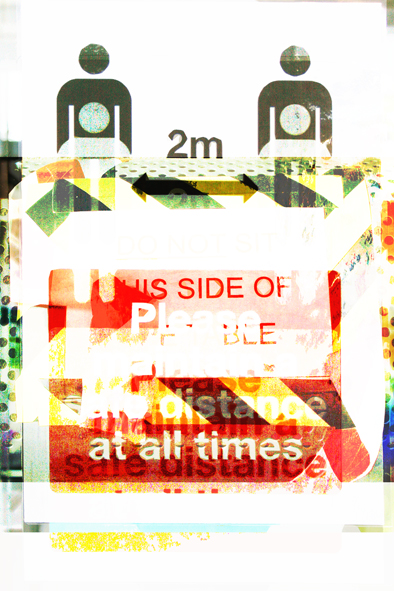
Chairs Missing


All Images: November 2020


"I shake you down to say 'please', as you accept the next dose of disease" [2.].


[1. & 2.]: Wire, 'I am The Fly', From the Album: 'Chairs Missing', Harvest Records, 1978