Showing posts with label 'Colour / Not Colour'. Show all posts

Saturday, 29 April 2023

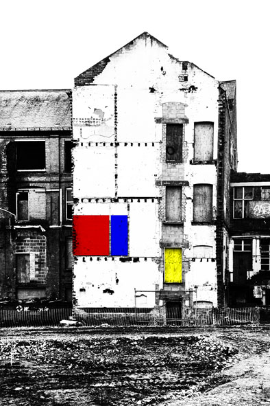
Colour / Not Colour 10 (Found Entropic Mondrian)


Photo-Manipulations: April 2023


“De Stijl sought to establish a new unity in all the arts. They were all to work together to shape the modern world, and were indeed already doing so. In accordance with Mondrian’s ideas, van Doesberg propounded the theory that henceforth in art ‘nature and intellect, or the feminine and masculine principle, the negative and the positive, the static and the dynamic, the horizontal and the vertical’ should be brought into equilibrium.” [1.]


All Original Images: Central Leicester, February 2023


“The search for meaning and form was now transferred in the imagination to society as a whole. The concept underlying Mondrian’s paintings – namely to appear as never completed works – was the same as that of the cathedral.” 
[2.]


"...Mondrian and van Doesberg both agreed that avant-garde painting had to be allied to an equally radical modern architecture. Clear colours in combination with simple white structural elements were to take the place of the sad and stuffy world of the 19th century, which they liked to refer to as 'brown'. Once this new architecture was established, all the problems of justifying avant-garde painting would be solved at a stroke. How would anyone be able to reproach them for painting pictures that no one could understand or need, when examples of the new architecture were springing up everywhere, proclaiming their ideas of colour." [3.]


"In a book completed in manuscript form in 1931 under the title of
'The New Art - The New Life' ('Le Nouvel Art - La Nouvelle Vie: La Culture De Rapports Purs'), Mondrian proclaimed the end of art was imminent. This end would include the end of the Old World, and thereafter the 'new life' and the dawning utopian era could profit from the energies formally used to produce works of art during the dark ages of the human race." [4.]


[1.] - [4.]:  Susan Deicher, 'Mondrian 1872 - 1944: Structures in Space', Cologne, Midpoint/Taschen, 1994/2001


Sunday, 14 February 2021

Significant Yellow Item: #2021.Y004


Significant Yellow Item: #2021.Y004, Southeast Leicester, January 2021


First contact was made on a bleak day, amongst the city's sweated southeastern tracts.  Overlooked by grim, mal-audited fortresses of piecework, the street itself was an entropic backwater of scattered debris - long drained of energy.  We were already deep into the current emergency, but official restrictions remain of little consequence in such zones.  Consequently, the constant  shift patterns remain unbroken, transmitting one unto another in fulfilment of the contract.  The encounter was soundtracked by a subdued machine clatter, syrupy orchestration and that familiar cinematic wailing, typical of the territory.  Dim illumination perspired from diseased tubes, behind greasy windows, on those occupied storeys.  In the street, the cold was a windless, steady-state fact - bitter and irrefutable.       


We can only speculate about the selection of such a setting.  Motivations remain obscure at the best of times, and the correct context is (as is commonly recognised), essential.  What does seem certain is that an insertion of such high visibility could only have been performed in order to manifest some small release of parallel reality.  The precision-moulded grids and structural intricacies employed, speak of a technology far in advance of our own - as could seen by comparison with other primitive stacked structures that littered the scene.  But it is the chromatic physics of the self-coloured enclosure which really place it outside everyday optical constraints as currently understood.  In the prevailing conditions, it was impossible to comprehend how these wavelengths of light could operate amidst such despondency.  Might even an entirely divergent system of physics be in operation?      


That the artefact should act as a receptacle for routine detritus was  a notable incongruity, even on that most quotidian of days.  Despite its shored-up and expedient surroundings, basic  opportunistic practicality seems inappropriate to its crisp geometry and concentrated radiance.  Such a yellow appears to exceed mere function.  Taking this into account, and also reflecting upon the distinctly artificial off-kilter positioning - the overriding impression is, once more, of some manifestation having been deliberately secreted in plain site.


Sunday, 31 January 2021

Significant Yellow Item: #2021.Y003


Item #2021.Y003, West Leicester, January 2021


Amidst the tedium of catastrophe, an unaccustomed inconvenience supplies picturesque relief.

The city's whine of complaint cuts out - its interstices softly padded with granular white noise.


Distance becomes congested and the long-view contracts.  A possibility of compromised respiration hangs in the air.  Meshes fur-up and screens are occluded.  Stark traceries intervene 


Transactional movement runs down, even as activity increases.  A wholesale revision of familiar boundaries has revealed new grounds for refrigerated play; a landscape made interactive.

Consequently, new characters emerge to augment the populace.  In demeanour they occupy three main categories: the sinister, the comic, and the painfully timid.  Many are besmirched.


A vivid emblem is inserted into the monochrome field; an acidic splinter.  The situation has been Risk-assessed.  Your safety is my safety (bam!).  This portent of instability is strangely welcome.


Friday, 29 January 2021

Significant Yellow Items: #2021.Y001 & #2021.Y002


Item: #2021.Y001, Central Leicester, January 2021


  • A pair of closely-related golden portals, separated by a few scant metres, within the same parade of commercial frontages.

  • In each case, a palpable air of intrigue is generated, despite the presence of specific clues to the current (or intended) function of the spaces within.

  • Such clues can also be read as signifiers of frustrated (or deferred) intention, and active change of use, respectively.


  • Both items incorporate textual elements of particular interest - primarily:

  1. An Admirably Literal Descriptor (Item: #2021.Y001):  Note how the almost total objectivity of this legend is undercut only in respect of kerning.
  2. Phantom Graphics - Relating to Previous Function (Item: #2021.Y002): Whilst the city evinces many such palimpsests, it is unusual to witness one of such chromatic intensity.  What might the failure or disinclination to adjust the colouration of the frontage suggest, regarding short-term planning or opportunistic investment?

  • Whilst Items: #2021.Y001 & #2021.Y002 occupy separate physical premises [1.], the correspondence between their shared colour palette is so fortunate as to appear planned [2 & 3.].  In each case, uncompromising fields of saturated, primary yellow (possibly cadmium-derived?) act against cool neutrals and accents of reprographic cyan [4.].  Such juxtaposition might, in other circumstances, evoke vibrant energisation.  However, in current, interlocking contexts, the effect is rather one of despondency or tawdriness (or indicative of misplaced design decisions?) [5.].


Item: #2021.Y002, Central Leicester, January 2021


  • The issue of inversion is particularly relevant - notably, in the following respects:
  1. Chromatic:  In Item: #2021.Y001 a vivid yellow door radiates from within darker, neutrally-coloured surroundings.  This situation is reversed in Item: #2021.Y002.
  2. Geometric:  The overall composition of Item: #2021.Y001 plays out within a landscape format.  The door and associated surround are the only major vertically-orientated elements, within a wider framework of horizontally-inclined rectangular fields (certain small graphic elements being the only exception to this organisational principle).  In the case of Item: #2021.Y002, the overall orientation of the rectangular main components is vertical.  Here, a variety of subsidiary horizontal counterpoints can be found within: upper fan-light glazing and associated, vestigial signage framework (incomplete/damaged), letterbox and associated glazing bar, and respective individual window graphics and doorbell/intercom labels - to left and right of door (see also below).  Notably, each of the latter two categories are themselves organised within vertically-inclined boundaries.
  3. Occupancy:  Item: #2021.Y001 appears to be vacant and inoperative, being essentially in a state of either redundancy, or deferred occupation.  Both sets of premises comprising Item: #2021.Y002 exhibit overt or implied evidence of at least partial occupancy.
  4. Function:  The overall presentation of Item: #2021.Y001, and certain textual clues displayed within it, indicate its intended function within the hospitality/recreation sectors of the economy.  An associated sense of frustration and/or negation is consequently inevitable, within the current context.  Item: #2021.Y002 reveals a dual purpose - split between the domestic and employment related.  The separation between these two modes of activity plays out in the mirrored sequences of temporary-employment vacancy notifications, and resident idents, mentioned above.  Might they also be reunited around the problematic relationship between precarious employment, and the need to meet regular rent payments?


[1.]:  In the case of Item: #2021.Y002, the cyan features are technically applied to the neighbouring premises (see also below).  However, as these documentary images reveal, the overall visual relationship vastly outweighs any such technical considerations.

[2.]:  A coincidental conversation - conducted whilst documenting these items, suggests shared ownership of both enterprises comprised within Item: #2021.Y002.  Whether or not this relationship extends to Item #2021.Y001, remains unconfirmed.

[3.]:  The relationship between chance and intention (within the urban context, and beyond), is a subject whose parameters extend beyond the scope of this post.

[4.]:  Likewise: the relationship between the physically manifested and mechanically-reproduced aspects of the visual city. 

[5.]:  How often are the dual (contradictory) expressive functions of yellow witnessed within the urban environment?


Friday, 22 January 2021

Completed Painting: 'Untitled 10 (Constructed City)'


'Untitled 10 (Constructed City)', Acrylics & French Polish on Panel, 
300 mm x 300 mm, 2020

Here's the second of the small study-paintings, referred to in my previous post.  As I mentioned there, the numbering of these most recent 'Constructed City' paintings is a little out of kilter.  However, it's enough to know that 'Untitled 8, 9 & 10' were all produced pretty much concurrently - with '9' and '10' being initially envisaged as experimental studies - before becoming fully realised little paintings (and ultimately - Christmas presents), in their own right.


There's not much else to relate, really.  You can get the most coherent sense of development of the shared imagery, by back-tracking through my two previous posts, and viewing them in the order: '9', '10', '8'.  That way, you can see how the progressive injection of heightened colour and layered complexity operated upon a simple, largely monochrome prototype.


One last point of possible interest, is that the diagonally inclined geometric motif at the heart of all three of these paintings, was itself recycled, in enlarged form, from the earlier 'Untitled 5' & '6'.  Its translation across multiple platforms (photograph - digital manipulation - painting), and subsequent use, and re-use, are particularly characteristic of my working methods, in recent years.  My fascination with such processes continues unabated, and I suspect they will prevail in my work - for the foreseeable future, at least.


Saturday, 14 November 2020

Paulo Nespoli & Roland Miller: 'Interior Space: A Visual Exploration of The International Space Station'


All Images: Paulo Nespali & Roland Miller/Nespali/Guardian


My eye was irresistibly drawn to the images in this article in The Guardian newspaper, which cropped up recently.  They are drawn from a newly-published book, 'Interior Space: A Visual Exploration of the International Space Station' [1.], by Astronaut, Paulo Nespoli and Photographer, Roland Miller.  Having at least one astronaut on the team is, I guess, the only way the project could have been realised, when you think about it.


It occurs to me that, whilst our culture is saturated with atmospherically-lit, highly fictional visions of life in space, we rarely see how things really are up there.  The appeal of this project thus seems to lie in its pure documentary intent.  It offers a view of everyday reality here, at what is still the infancy of space exploration (not even beyond Earth's orbit - in fact), rather than the fantastic projections into the far future we are used to.


And what actually is up there, it transpires, is an environment of total functionality, in which every feature is there to perform a task, style or decor are irrelevant, and reason trumps all.  This shouldn't be a surprise really.  The ISS is a scientific facility, and a nexus of pure research.  At present, I imagine the only real reason for its highly specialised denizens to be there is to acertain to whether 'life in space' is even possible at all.  Perhaps only when that has been established - and some of the novelty of being there at all is taken for granted, will we begin to see some form of extra-terrestrial style emerging.  Once people can talk of making 'A life in space', rather than simply constituting 'life', in its baldest sense.


But, of course, no image can exist without containing its own aesthetic - be it intentional or otherwise.  Our eye and brain will construct it from whatever visual information is framed and presented.  The brilliant illumination flooding these scenes, is there to make every piece of equipment (and the information it represents) easily discernable and identifiable - no doubt.  What it also achieves is an almost overwhelming clutter of visual information, outlined in the crispest of detail.  What begins as a purely matter of fact situation, quickly becomes on of dazzling hyper-reality - it would seem.  This assumes that these are largely as-shot photographs, and not heavily Photoshop-manipulated confections, of course.  Whatever the reality, it's really no surprise that my own eye finds considerable sensory delight in all that layered, interlocking geometry, and the way that flashes of synthetic, often vivid, colour accent all those self-coloured neutrals.


Perhaps what delights me more than all of that, are those little glimpses of the mundane and the Everyday creeping into more than one of the depicted environments.  In particular, the presence of a plastic bucket, a hazard warning cone, and half-opened cardboard boxes complete with  bubble wrapped contents, all catch my eye.  Such characteristically Earth-bound details make me feel that my own daily experience is not so far removed from that of the people who work at the frontiers of space exploration, after all.




Wednesday, 15 July 2020

'Constructed City' 16: Building With Colour


Main Images: West, North West, and South Leicester, May - June 2020


As I observed last time, my ever-expanding archive of construction-related photographs is inevitably categorising itself into various recurrent themes.  Here's a little bundle focusing on the often startling colours of a modern construction site.


Frank Auerbach, 'Oxford Building Site II', Oil on Canvas, 1960

Frank Auerbach, 'Shell Building Site', Oil on Board, 1959


Once upon a time, construction sites, or 'building sites' - as they were traditionally known, were places of drab, earth colours.  The materials used were almost wholly organic, or of mineral origin, and often (in Britain, at least) appeared to inhabit a world of churned earth - top-dressed with congealing slurries of cement or plaster and littered with debris.  The main concession to gaiety was that drab, pink primer (or possibly, its dull aluminium counterpart) often used on wooden frames, or perhaps, the begrimed, primary yellow of a back-hoe excavator.  Building work seemed almost to be a process of solidifying and shaping the same primary mud from which each new edifice was raised.  In my imagination, it's a world evoked by the early post-war construction site paintings of Frank Auerbach, whose extreme impastos of mangled paint seemed ideally suited to such subject matter
[1.].


The contemporary construction exists in a very different chromatic context.  It's usually one  characterised by far lighter tones, and a wide palette of, often highly saturated, synthetic colours.  The edges (and thus, the point of juncture between contrasting colours) all seem somehow sharper now, too.  In part, this is a reflection of the far wider range of artificial materials now employed, as well as the methods of their assembly.  A degree of traditional brick-laying, timber joinery, cement-pouring or surface-coating may still occur - to be sure.  But they now reside  within an overall process more akin to assembling a kit of pre-exiting parts [2.].  Many components of any new building - be they extruded, laminated, vacuum formed, or otherwise pre-fabricated (possibly even 3D printed nowadays - who knows?), arrive on site resplendent in a surprisingly vivid spectrum of self-coloured hues, metallic or translucent surface wrappings, and manufacturer's liveries.

Thus, a building in progress may now exhibit tangerines, lime greens, cerulean blues, sugar pinks and glittering silver - all juxtaposed within a few square metres.  Pipework, cabling, insulation materials, and plastics of all sorts, can be a particularly rich source of such materials - as typified by the pretty lilac hue prevalent in many of these shots.


Another important participant in all this is the temporary infrastructure of construction.  Safety barriers, barricades and access equipment all come in an ever more strident palette of primaries and saturated secondaries - un-ignorability clearly being one of their key functions.  Heavy plant, and the enormous lifting equipment towering over any large site, exhibit ever more brilliant colours these days, and, of course, the neon yellows and oranges of Hi-Vis workwear long overtook the wardrobes of construction workers, as safe practice and a general concern for well-being, overtook their industry.


In bright sunlight, a busy construction site is a far more garish environment than the urban landscape surrounding it.  For the reality is that many of these brighter hues disappear from the site as a building reaches its conclusion.  Insulation layers vanish behind more tastefully integrated final surface dressings.  The site is progressively denuded of brightly-painted kit, as it is readied for its unveiling.  In some cases, that final reveal may itself involve the removal of another layer of coloured wrapping.  New occupants will eventually arrive to inhabit the completed edifice, by which time the cavalcade of colour has transferred to a new location.


[1.]:  It should be acknowledged that, at the time those pieces were produced, Auerbach was limiting his palette for reasons of economy as well as aesthetics.  That quantity of paint doesn't come cheap across the entire colour chart, after all.

[2.]:  That distinction between 'building' and 'construction' seems particularly apposite, in this context.


Sunday, 16 June 2019

Colour / Not Colour 9


Both Images: Central Nottingham, May 2019


It seems I've been resurrecting a few slightly neglected series on here, lately.  The images in this is post could easily fit into one of several familiar categories, including 'Yellow Things', 'Grey Things', 'Scaffolding', or 'Urban Geometry'.  All of those themes have recurred, in one form or another, at different times, over the last few years.  Ultimately though, it feels like the two images, captured only meters apart, in Nottingham, a few weeks back - best illustrate the idea of 'Colour' and 'Not Colour', played out in similarly abstracted subjects (albeit on two very different scales).  

I often tell myself not to be so predictable in my habitual selection of geometrically formal, picture-plane orientated, minimalist, quasi-abstract imagery - but then I walk past something like this, and off comes the lens cap, as if by involuntary reflex.  I guess the eye loves what the eye loves...


Anyway, he function of neutral 'Not Colours' in contextualising actual colours, is something all painters, in particular,  must come to terms with, sooner or later.  And it seems just as important a feature of the urban landscape - where drab masonry or utilitarian surface coatings often rub cheeks with saturated, synthetic (and often self-coloured) materials.  Certainly, both of these examples seem to typify the kind of artificial, industrial colours that interest me far more than traditional artist's pigments, these days.  And, of course - I'm always a sucker for Cadmium Yellow and Battleship Grey.

I often reflect how, in recent times, I've spent hundreds of hours staring at the bits of cities most people just pass by - and how I've sourced far more of my materials in the aisles of B&Q, than in any art materials supplier.