Sunday, 30 December 2012

Walk Between The Rain


A couple of days after Christmas we finally had a brief interlude of sunshine between the deluges and leaden skies of recent days.  It didn’t last long but allowed me a short photographic excursion round one of my regular local circuits.  Whilst absorbing much-needed Vitamin D, I was keen to discover if my damaged leg muscle showed any sign of healing and also, to gauge the water level of the River Soar.  My house is quite nearby, and hardly any more elevated than the river, so the constant rains and nationwide flood warnings had caused me some concern.  Happily, I found I could walk about a mile with only mild discomfort and the river was well within its banks, although roaring over the weir with spectacular force.


I took a handful of photos that, although of familiar subjects, benefited from a combination of golden illumination and portentously dark skies as the next rain belt moved in behind them.  I’ve always loved the strange juxtaposition of dark skies with foreground elements lit brilliantly from behind the camera.  This time it had an almost eerie end of the world feel, possibly enhanced by the cascading water behind me, which seemed to fit the somewhat calamitous mood of this year as it concludes.


It also made me ruminate on just how vitally a specific quality of light can dictate my emotional response to a particular location.   A normally mundane or overlooked zone can, under certain climatic or temporal conditions, trigger sudden surges of almost visionary romance with whole new trains of conscious thought in their wake.  I suspect more of this quality may enter some of the photographs I take in the near future.  I’ve already noticed an increasing tendency to deliberately point the camera into the sun or bracket shots in search of emotively ‘incorrect’ exposures.  It will be interesting to see if this taste for a rather more subjective quality in images seeps into my painting in the New Year.


I was also delighted to find a couple more motifs to feed my current preoccupation with Health & Safety graphics.  The striped river barrier below the Victorian bridge adds an element of arbitrary, parallel reality to what would be a quaintly picturesque view otherwise.  The green Tarmac sign is something else altogether and illustrates how corporate H&S and mission statement culture can apply a bizarre, almost poetic utopianism to the most workaday situations.


Saturday, 22 December 2012

Proceed With Caution


Christmas approaches; the year starts to dribble away; I’m between painting projects and currently exploring ideas for my next work phase.  As usual in late December, I’m a bit oppressed by weather and light levels, frustrated by an endless stream of calamitous news reports and physically drained from striving to earn a daily crust.  This year, the routine viruses and fatigue are accompanied by a torn calf muscle, - the result, ironically, of an attempt to gain a little more fitness and health of late.  It’s not all negative though.  The school term is over, my time is my own for two weeks, (with anticipation of festive indulgences) and several potential ideas bubble away encouragingly, just below the surface.


At this early stage, before things have coalesced, the most useful thing to do is to get out in the world in search of visual stimuli and the thought processes that they release.  Hence, I found myself out with the camera in Leicester a few days ago, in bitter temperatures but beautiful light, exploring a fascination for hazard warning graphics.  For the first time, I also collected some low-grade phone-video footage.  I think one of the themes of the coming year may be an attempt to augment my painting practice with extra, possibly time-based media elements.  It’s something I’ve never tried before.


For some time, I’ve been visually attracted to the bold interventions of hazard stripes, road markings and related signage that are such a feature of our environment.  The dynamism of their graphic devices and urgent primary colours seem to intrude into the world like an arbitrary, alternative reality, - the complete antithesis of naturalism in any form.  As I photographed a couple of local railway bridges and an adjacent car park, I was increasingly struck by how much this application of synthetic, high-impact black and primary yellow onto the visual environment reflects a disjuncture between the realities of life and the search for a world of total security.  In these cases, it all related to transport systems and traffic management, causing me to reflect, in parallel, on how constant movement and flux are intrinsic to urban life.


I’ll admit that some of this may stem from the influence of Health & Safety guidelines on my work as a school technician.  Having worked with hazardous materials and witnessed the multiple routes to death or injury existing around industrial processes I won’t pretend that much of this stuff isn’t important.  However, I’m not the first to notice the bizarre, potentially infantilising way that H&S culture can replace a realistic understanding of the world, survival instincts and basic ‘good sense’.  So often, the ever-multiplying sea of high-vis clothing, replicated documentation and warning signage appear to be primarily for the benefit of lawyers and insurance underwriters.  Of course avoidable risks should remain exactly that whenever possible but can any species really evolve through total risk aversion?  Should we really resign all responsibility for our lives to the wielders of the yellow paintbrush?


I have a feeling that Safety Yellow and diagonal stripes may play an important role in my next phase of activity, possibly in some attempt to explore the distinction between the formalised process of ‘Risk Management’ and the experience of genuine existential hazards.  It’s all fairly undefined as yet but at least some primary yellow should brighten up a gloomy winter.


Wednesday, 19 December 2012

Playlist 8


Lately, it seems that just turning on the radio news is enough to make me despair at the ridiculous behaviour of our species.  Couple that with short, dreary winter days, frustrations at work and another stinking virus and I really felt like blowing up in exasperation earlier this month.  Some proper shouting Rock music helped a lot and a much more festive vibe is kicking in now.


‘Memory Motel’, The Rolling Stones

Only fools and millionaires could afford to attend The Stones’ 50th anniversary gigs but there have been bargains to be had on their back catalogue.  I picked up the oft derided ‘Black and Blue’ recently which, whilst being a mixed bag betraying signs of their mid-70s fatigue, is much better than critics pretend.  It also includes this wonderful ballad which I’ve had on heavy rotation ever since.  ‘Memory Motel’ has a great melancholy lyric, lovely, almost Baroque guitar work and surprisingly sensitive vocal interventions from Keith.


‘Incense and Black Light’, Rod Modell


Detroit-based Modell has released numerous albums under different names including Deepchord, Echospace, (with Steve Hitchell) and CV313.  They’re all variations on the Ambient Dub/Ambient Techno/Basic Channel type of immersive urban soundscape, and pretty effective too.  At the dubbier or more ambient end of things Modell’s sound often dissolves into a miasma of pure texture. This one’s slightly more varied in its aural palette however, - with a more prominent Techno skeleton.  Apparently inspired by various nocturnal locations in Tokyo, it really does seem to take the listener on a hypnotic journey to the end of the night.


‘BCD-2’, Basic Channel


Basic Channel is both a label and the Berlin-based production team of Moritz Von Oswald and Mark Ernestus.  The nine 12 inch vinyl singles they released between 1993 and 1995 are widely recognized as milestones of Techno.  This compilation, whilst not definitive, is the most coherent collection of their music on a single disc and chronologically charts their evolution from harsh, minimal rigour to something with far more dubby reverb, smeared textures and vaporous atmosphere.  It’s easy to discern the jumping off point for their more explicitly Dub-based work as Rhythm & Sound, and indeed for those, like Rod Modell who mine similar seams.

For some weeks I’ve been grudgingly attending a gym.  On headphones, these endlessly repetitive abstractions are a perfect antidote to the establishment’s generic House and R&B and provide a rhythmic accompaniment for my attempts to reduce my waistline.


‘Bossanova’, Pixies


For a brief period, around the release of their ‘Doolittle’ album in 1989, Pixies seemed like the coolest band on the planet.  They played in Leicester one night and nearly blew the roof off the University Union.  Their neat trick was to combine brutally grungy noise rock, surf-style guitar work and Black Francis’ weirdly intelligent lyrics delivered with entertaining eccentricity.  ‘Bossanova’ appeared the following year after tensions had emerged within the ranks but, without scaling the heights of its precursor, did consolidate their distinctive sound.  What it does have is a skewed Sci-fi sensibility and one of my favourite ever screaming-at-the-wall songs in the coruscating ‘Rock Music’.  When frustrations with the day job start to build, that one provides much-needed catharsis.


‘Monkey Gone To Heaven’, Pixies


A little Pixies always leads to a load more Pixies so it was inevitable ‘Doolittle’ would get played too.  This was the recognisable anthem from that album, being pretty lush and melodic by their usual standards.  Francis still can’t resist a bit of a shout though and demonstrates how to address environmental concerns without sounding remotely worthy.


‘Candy Apple Grey’, Husker Du


This raucous American Indie Rock palaver gets pretty infectious sometimes and is a proven way to squeeze out angry thoughts.  Husker Du were acknowledged precursors of Pixies, and thus, Nirvana later on.  They combined manic, hardcore thrash with hooky Pop know-how, whilst guitarist/joint songwriter and vocalist Bob Mould fairly seethed with palpable disgust at the human condition.  Released in 1986, ‘Candy Apple Grey’ sees them stretching out into slower, more melodic territory but still finds room for the gloriously shouty opener, - ‘Crystal’, (during which Mould simply explodes with erudite rage).  ‘Eiffel Tower High’ is a blast of cornball joy and ‘All This I’ve Done For You’ closes the album on an energetic high point.


‘Birds’, North Sea Radio Orchestra


When I reviewed NSRO’s ‘I A Moon’ around a year ago it was the one of the most refreshing things I’d heard in a while, (it still is really).  ‘Birds’, its predecessor, was unavailable for a while but has been re-released and I snapped up a copy recently.  It has all the qualities of pastoral beauty, and English Romanticism, stiffened by an understanding of Minimalist/Modernist strategies and subtle electronics, that I loved in ‘I A Moon’.

As with their eponymous debut album, the lyrics derive from the canon of English poetry, including Chaucer, Blake and Tennyson and may just evoke the England that, secretly, many natives still wish they inhabited.  Yet, in a way I can't quite define, they always avoid a descent into the merely twee.  Sharron Fortnam is my current favourite female vocalist, (being the equal of Sandy Denny for sheer emotional clarity), and her pure tones are augmented with beautiful choral arrangements on several of these pieces. Amongst the original compositions lies a wonderful instrumental reworking of the Medieval Christmas carol 'Personenet Hodie', putting a modern twist on an ancient tune that could lift the darkest Winter mood.


'On This Day', The Choir of King's College, Cambridge


Each December I embark on the season of compulsory shopping and religious lip service with a fairly heavy heart.  I'm not opposed to Christmas per se, - just the reality of the contemporary routines we can get lumbered with.  Actually. I'm all in favour of mid winter festival to lift the seasonal gloom and welcome those rare moments that are genuinely moving or convivial.  This is Gustave Holst's 19th Century take on the 'Personent Hodie' tune that always helps to make sense of it all.


Despite my secular  outlook, it's only fair to acknowledge the Christians have both great music and architecture so listening to the Festival of Nine Lessons & Carols from King's has become one of my annual rituals.  I sat in King's College Chapel one December day many years ago, as the choir rehearsed.  As the organ reverberated around the Gothic stones I realised the music was its own justification.


'A Christmas Gift For You', Phil Spector


I guess that, as Christmas rituals go, this is the other end of the aesthetic spectrum.  It's cynically commercial, deeply kitsch and performed by the manipulated puppets of a subsequently convicted murderer, - so Merry Christmas everyone!  Those vocal arrangements and patented 'Wall of Sound' production are hard to beat though, and who doesn't love 'Frosty The Snowman'?


'Christmas In The Heart', Bob Dylan


Bob Dylan, Always With The Interesting Hats, - But Why The Wig?

Bob, - what were you thinking?  Dylan proves he's no Grinch by croaking his way through a pile of cheesy festive favourites and a couple of genuinely interesting oddities.  Along with his band he throws himself into the accordion-driven rave-up of 'Must Be Santa', (with a video that must be seen to be believed), and both 'The Christmas Blues' and 'Christmas Island' are hard not to love.

Good job it was for 'charidee' though...


Thursday, 13 December 2012

Written City 6: The Grey Boxes


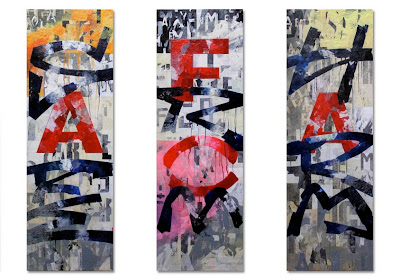
Many of my paintings employ a fairly vivid palette these days.  However, there is a variety of utilitarian battleship grey that also seems to recur in my work, providing a useful foil to the passages of heightened colour.  There’s nothing clever about it, it’s usually just a mixture of Titanium White and Mars Black about halfway along the tonal scale between the two extremes.


'Safe From Harm 1', Acrylics & Paper Collage on Three Panels,
Each Panel: 150cm X 50cm, 2011

For all my love of colour, I always return to that unassuming grey for its ability to give the eye a brief rest within a painting and allow a neutral space where simultaneous contrasts may occur optically.  Perhaps, in the not too distant future, I’ll attempt a primarily grey painting.  Indeed, Gerhard Richter practically made a career of that at one time or another.


Gerhard Richter, 'Stadtbild M8 (Grau)', ('Townscape M8 (Grey)',
Oil on Canvas,  1968
Gerhard Richter, 'Grau' ('Grey'), Oil on Canvas, 1968

Another painter who, I think, uses grey beautifully is Christopher Wool.  I originally came to Wool through his stark, ironic text paintings but also love his more recent wiped abstracts.  The greys in these canvases are the result of the turpsy dilution of black paint rather than of methodical mixing and are full of beautiful nuance and transparent tonality.  I think there are parallels between his looping, self-cancelling calligraphic lines and the graffiti tags which always catch my attention.


Christopher Wool, 'Untitled', Enamel on Linen, 2009
Christopher Wool, 'Untitled', Enamel on Linen, 2007

Out in the field, I particularly associatiate the colour with industrial surface coatings of a mundane, practical nature.  A while back I realised this probably originates in my observation and photographic documentation of the most unassuming forms of street furniture, - the grey boxes.  I’ve been collecting these for a while now as I travel around with my camera and have even been known to return to a specific site that I’ve observed from the car window on a routine trip.  Pointing my camera at them always attracts bemused stares from passers by, making me realise just how eccentric the activities I take for granted as an artist must seem to some folk.


I don’t even really know what purpose they serve, although it’s pretty obvious that they generally contain electrical equipment.  As many sit at junctions or kerbsides, I assume they contain the control systems for traffic signals or street lighting.  Possibly, some are part of telecommunications networks.


At first glance the boxes appear pretty similar but closer acquaintance reveals that they’re all actually individual in different ways.  Of course, what really distinguishes them, and the reason they first came to my attention, is the wealth of graffiti, fly posters, stickers and other examples of unofficial signifiers they attract.  It’s evident that many constitute way-markers in the network of taggers’ territorial squirtings; whilst others become regular bulletin boards for fly posters and accrue beautiful textures of torn paper, tape residue and text fragments in the process.


These photographs were all taken in Leicester and Birmingham and are collected in a round-up of the ‘interesting grey boxes’ I’ve found over recent months, (this bit makes more sense if you imagine it spoken in an adenoidal, anoraky voice).


Tuesday, 11 December 2012

Twelve Months


Whilst casually looking back through this blog earlier today, I noticed it’s a year since I started it.  I’ve just read my slightly tentative and rather mannered introductory post and realised that writing all this stuff has become a far more significant part of my current life than I could possibly have imagined twelve months ago.


'Together 1', 2011
'Broken 1', 2011
'Home 1', 2011

My initial intention back then was to use it primarily as a fairly straightforward means of displaying my artwork.  I’d come to the end of a productive year of concerted painting activity and felt that, for the first time really, I had the beginnings of a body of work I could really believe in.  I’m pleased to say that process has continued through this year too and that the creative momentum of painting, and indeed blog-writing, has become pretty much self-perpetuating.  After years of procrastination, that feels like a major cause for celebration.


'Safe From Harm 1', (Triptych),  2011


'Asylum 1', 2011

'Sick 1', (Set of Four Panels), 2012


Even at the start I knew that the speed at which I work implied I’d end up writing about other things in the gaps between completing each painting.  I’ve always enjoyed writing and, as regular readers must now realise, love words for their own sake.  For years I never really had an outlet for that, (other than boring people in pubs), so this has become a fantastic arena for me to get  the thoughts that regularly clutter up my head into wires and onto screens.


'Welcome', (For Nina May McDermott-Crampton), 2012

'Closed 1', 2012
'Closed 2', 2012


Many of those additional posts feature cultural artefacts of various types, produced by other people.  Some deal with my relationship with the physical environments I’ve passed through, in particular my feelings about inhabiting different cities throughout my life.  A relationship with ‘place’ has always been intrinsic to my perception of life and, along with the whole element of text, plays a major part in my artistic process.  Others venture into the field of philosophy or even politics but, I fear, in a somewhat woolly-headed manner.  The rest are just things it seemed important to say at the time.


Untitled Studies, 2012


It seems I’ve averaged around seven posts per month, which is far more than I ever envisaged.  If Google are to be believed, I’ve had visitors from all continents except Antarctica, including places as divers as Nepal, The Alaand Islands and Reunion, (look up the last two, - I had to!).  To anyone who only stumbled over me in search of information on Gerhard Richter, Stuart Davis or Supersilent, - I hope I could add something to your sum of knowledge.  To anyone who may regularly read this but has never left a comment, - Thanks anyway; I hope all’s well with you.


Studies For 'Shut 1', 2012

'Shut 1', 2012


Perhaps the single most significant effect of the blog to date is how it led directly to my participation in a proper, grown-up exhibition last month and to make some new friends in the process.  Thanks again to those who made that happen and to those who came along to look.


Studies For 'Shut 2', 2012

'Shut 2', 2012


At the risk of over-repetition, this post includes the images of my own work that have featured on the blog over the months.  Sorry if you are sick of looking at these, - there'll be new stuff to show you over the next twelve months.