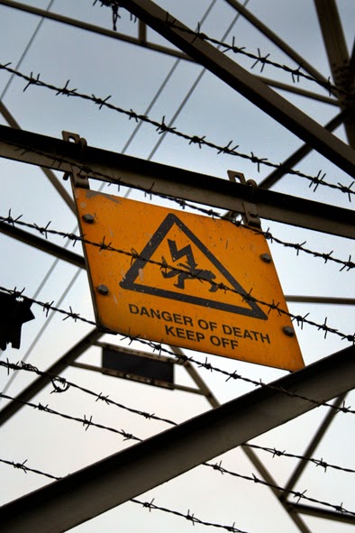
Here are two images culled from my archives of relatively recent photographs. Each was taken as incidental aside to a completely different subject. Each also combines a variety of functional, metallic geometry with an element of hazard graphics. However, they differ markedly in several other respects.
 |
| Keep Off: Rugby, Warwickshire, November 2014 |
The first is somewhat expressionistic, and evokes an almost Punkish element of threat. I'm always drawn to these bald, 'Danger Of Death' statements, whenever I encounter them. I like their lack of H&S bullshit, and the no-nonsense, illustrations that are usually included. Ultimately, all that forbidding spikiness has our own interests at heart.
 |
| Keep Out: Central Leicester, April 2014 |
The second is far more ambiguous, and largely about Minimalism, and abstract formalism generally. There's a synthetic gaiety about the taped hazard stripes, which reminds me of the more abstract end of Pop Art somehow, (Richard Smith - perhaps?). Only later, do I notice the slight hint of implied bondage. In fact, this one implies exclusion for different reasons, and seems more about fortification as a territorial statement, than any attempt to protect the reckless.
No comments:
Post a Comment