|
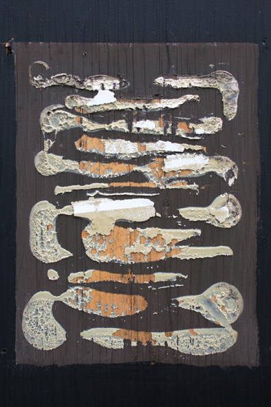
Fiona Banner, 'Scroll Down And Keep Scrolling', Artist's Publication, Vanity Press, 2015.
Cover Image Shows: 'Font', Typeface, 2015, And: 'Font', Carved Limestone, c.1880/2015 |
The Half Term break
came and went in the traditional blur, but I did find time for a trip to
Birmingham’s Ikon Gallery, to take in Fiona Banner’s exhibition, ‘Scroll Down And Keep Scrolling.’ It feels like many of my most meaningful
gallery experiences have happened in Nottingham or Birmingham over recent years
and, just like Nottingham Contemporary, Ikon is an invaluable regional
resource. This is actually the second stimulating
show of a distinctly conceptual stripe I’ve seen there this year, having already
enjoyed Pavel Buchler’s ‘Honest Work’ in
the spring.
 |
| Fiona Banner, 'The Bastard Word', Neon, Paper Templates, Transformers, 2007 |
Whilst my own
practice remains rooted in the tradition of the primarily aesthetic, portable
Art object, both Buchler and Banner prove there’s plenty of interest to be
found in more self-consciously ideas-based stuff for me too, regardless of the
medium in which it is manifested. As noted
before, I really want to have my cake and eat it.
Once upon a time,
during an earlier wave of self-proclaimed Conceptualism, it seemed that an
especially rigid set of ideological constraints might replace any notion of
‘the art object’ with the idea alone, expressed in the least aesthetically
seductive manner possible. Indeed, though
the moment had rather passed, I have vague memories, even from my student days
in the early 80s, of more than one exhibition comprised almost wholly of
typewritten texts, usually requiring a thorough prior knowledge of Marxist
theory.
 |
| Fiona Banner, '1909-2015', 105 Volumes Of 'Jane's All The World's Aircraft', 2015 (Ongoing) |
Both Buchler and Banner
seem representative of a less up-tight subsequent generation of conceptualists,
(epitomised by the YBAs) for whom engagement with serious ideas is no obstacle
to sly humour, sensory stimulation or the resonant artifact. Perhaps the real issue here is the detachment
of ‘ideas-based’ from the purely theoretical, and I’ve sometimes reflect that,
if I want the latter, I might as well reach for a book. As Emin, Hirst and their ilk slide into
establishment respectability, (or fulfill their potential as undressed
Emperors, in Hirst’s case), it’s easy enough to dismiss the YBA moment as a
market-driven storm in a teacup, but the deployment, by various artists of the
period, of a conceptual impulse combined with a greater component of humour,
and the generation of some genuinely enjoyable objects in the process, do feel
like valuable legacies.
 |
| Fiona Banner, 'Arsewoman In Wonderland', (Detail), Screen Print On Paper', 2002 |
Banner herself
has made quite a name for herself, since first coming to the attention of many,
when her ‘Arsewoman In Wonderland’
was included in 2002’s Turner Prize nominations. The perceived shock value of
its pornographic content was of course typical of the period, and guaranteed to
generate easy headlines and an attendant notoriety. Installing whole decommissioned fighter jets inside Tate Britain’s Duveen Galleries didn’t exactly hurt her profile,
either. For all that, this show at the
Ikon is, by all accounts, her most significant British retrospective to date,
and represents a number of her projects over the years. I won’t pretend I responded to everything in
the show with equal relish, but there is plenty in there that delighted,
stimulated or amused me in equal measure.
There’s no doubt
that the word lies at the heart of Banner’s practice, and this extends beyond
content to include an engagement with the formal qualities of text. Indeed, the first thing one meets at the
show’s entrance is a carved stone font, entitled ‘Font’ and incised with examples of Banner’s own conglomerate font,
(also entitled ‘Font’). It’s a neat introduction to the multi-stranded
thinking and willingness to pun that runs through her oeuvre. Beyond the simple impulse toward amusing word
play, I can’t help wondering if ‘Font’
(in either iteration), might also indicate how the actual mechanics of text
might give birth to the thought, as much as the inverse.
 |
| Fiona Banner, 'The Bastard Word', Neon, Paper Templates, Transformers, 2007 |
Related issues of
parentage emanate from another, higher-impact piece waiting within. ‘The
Bastard Word’, encapsulates its own title, with each letter formed from white
neon. We’re invited to question whether ‘Bastard’ is an expletive, a factual
descriptor, or a subject under examination, and there’s a definite sense of the
potential frustrations that may accompany a search for effective verbal communication. That’s something that seems magnified by the
amateurish wonkiness of each character’s formation and the scorched paper
templates that back them on the wall.
Banner’s own attempts to communicate appear complicated by the need to
simultaneously learn the neon-bender’s craft.
A little swearing was involved there, perhaps.
 |
| Fiona Banner, 'The Bastard Word', (Detail). |
The paradoxical
disjuncture between what is felt or meant, and what might be communicated
verbally or textually is, of course been meat and drink to writers,
philosophers and Conceptual artists alike.
Certainly, nothing about Banner’s
work seems to exist on a single level alone and the cycling the neon legend
through varying degrees of light intensity, further stresses the
untrustworthiness of words. Clear
illumination is not always forthcoming.
In fact, the
quality of lighting seems intrinsic to several of the pieces on the
exhibition’s lower level. ‘The Man’ is another impactful example
of this. The title reverses that of Banner’s
book, ‘The Nam’, in which a number of
notable Vietnam War films are transcribed as bald descriptions of everything
that occurs. Alongside the book, a wall
papered with a collage of promotional posters represents the work at Ikon. This allows Banner to détourn her own
material, and one particular critic’s comment that the work was
unreadable. She went on to disprove this
by recording a 20-hour reading, as the multi-cassette piece ‘Trance’.
 |
Fiona Banner, (Foreground): 'Not So Much A Coffee Table Book As A Coffee Table',
Paint On Birch Ply, 2015. (Background): 'The Man', Poster Collage, 1997. |
Nearby, on the
gallery floor, sits a large plywood replica of the thick volume. For those unwilling to read it themselves, ‘The Nam’ functions mainly as a coffee
table book, so, with her usual wit, the artist has supplied her own book-coffee
table. Were all of this not sufficient,
the book’s eye-popping cyan & red livery and publicity material is bathed
in alternate, cyan, magenta and yellow light, referencing full-colour print
technology, magnifying its optical potential, and unifying the disparate
elements into a somewhat more immersive experience, at a stroke.
 |
| Fiona Banner, 'The Man', (Detail), Poster Collage, 1997 |
It’s worth noting
that the publication of books as art pieces in their own right, (under her own
Vanity Press imprint), is something Banner turns to regularly, and extends to
the exhibition’s own ‘catalogue’.
Ironically, the latter eschews text altogether, being entirely
image-based. This idea of a text being
simultaneously presented as an artifact clearly relates to some of this post’s
early observations, and is magnified by the exhibition’s presentation of
individual volumes on purpose-built plinths.
The willingness
to let an idea spin off in a number of directions, in a form of fractal
fee-association, is a recurring feature of Banner’s work. It can be seen in the section of gallery
devoted to ‘Mistah Kurtz - He Not Dead’. This is something of a half-and-half
experience for me, in terms of its appeal.
There are clear references to Conrad’s ‘Heart Of Darkness’, (which itself loops back to her involvement
with ‘Apocalypse Now’, of course, but
he graphics pasted onto the wall here are far too dimly lit to really make any
real sense of, (‘Heart Of Darkness’,
OK, - I get that much). Opposite, a
video plays over a panel patterned with undulating pinstripes, - a motif which
is extended over other adjacent elements, including a pair of bent plywood
chairs.
 |
| Still From: Fiona Banner, 'Mistah Kurtz - He Not Dead', HD Video, 2014-15 |
It’s the video
that appeals to me most here, comprising a rapid-fire procession of still
images dealing with the relationship between the City of London and the arms
industry, and the sexism, conspicuous consumption and ostentatious partying
that also characterise The Square Mile.
Pinstripe motifs reappear thick and fast, be it in the uniforms of city
types or the repeated parallels of stern, corporate architecture [1.], and the whole thing is accompanied by a
distinctly militaristic and percussive soundtrack. It’s worth noting that the
starkly monochrome photos themselves were commissioned from Magnum conflict photographer,
Paolo Pellegrin, and have a distinct flavour of war reportage. For me, the video might stand alone quite
satisfactorily its accompanying elements, but I am intrigued by the strategy of
projecting over another piece of static imagery, as it’s something I’ve been
wondering about myself, recently.
 |
| Still From: Fiona Banner, 'Mistah Kurtz - He Not Dead'. |
I guess we’d all have been
secretly disappointed to miss out on the ‘Oo-er, Missus’ frisson of the piece
for which Banner first gained notoriety.
She doesn’t disappoint, choosing to wallpaper ‘Arsewoman In Wonderland’s’ porno-flick transcription upside-down
this time, in a format recalling a cinema screen. It’s an enjoyable, if puerile gag, meaning
that any attempt to read it at length soon becomes a right pain in the arse
itself, (or in the neck, at least). On a
more high-minded level, I suppose it’s a pretty effective demonstration of how
all this emphasis on bald description can denude words of their emotive or
expressive potential. It seems also to
spotlight the eventual banality at the heart of all functional pornography.
 |
| Fiona Banner, 'Arsewoman In Wonderland', Screen Print On Paper, 2002 |
If the exhibits on Ikon’s upper
level left me slightly less engaged overall, they do include something I find
the single most poetically charged object in the show. ‘Work 3’
is an accurate facsimile of a multi-stage, portable scaffolding tower, cast
entirely (and expertly) in clear Murano glass.
It’s a profoundly self-reflexive item, standing as a ghost of exactly
the sort of work equipment needed to hang an exhibition in Ikon’s
high-ceilinged upper rooms. In fact, one
would require a real Zip-Up tower to assemble this replica one. A palpable frisson derives from the paradox
between our inner-primate’s instinctive urge to scale a literal climbing frame,
and the rational understanding that to do so would result in shattering
catastrophe, (there’s that interface between the physical/emotive, and the
objectively understood, again). For those
that still care, ‘Work 3’ is also just
plain beautiful, as well as potentially lethal.
 |
| Fiona Banner, 'Work 3', Glass, 2014 |
Beyond an intervening gallery
of mixed exhibits that, if I’m honest, made rather less impression on me, stands
another object with a similar air of potential threat. ‘1909-2015’
revisit’s Banner’s prevailing interest in military hardware obliquely, being an
immense stack of every volume of the book ‘Jane’s
All The World's Aircraft’, ever printed, (all the ‘…Aircraft’, - you see). An accompanying video, ‘Jane’s’ shows Banner piling one volume after another onto the
teetering pile, reinforcing our sense that, were this tower of words to fall,
it would make quite an impact.
 |
| Fiona Banner, '1909-2015', Detail |
Like ‘Work 3’, this piece manages to combine elegant simplicity and
considerable presence, with a definite sense of foreboding. The Health & Safety nerd in me wants to
establish that, (surely), a secured steel pole must pass up the centre of the
books, (mustn’t it?), whilst the more primal part of my brain itches to give it
all a good shove, in the hope it doesn’t.
I read in it, a fairly erudite comment on itchy-trigger syndrome and the
self-fulfilling potential of weaponry.
‘Scroll Down…’
includes two remaining video pieces that seem worthy of mention. ‘Chinook’
documents the strangely balletic movements of a Chinook helicopter going
through its paces at an air display. I
always find these huge, twin-rotor machines profoundly sinister and, there again
is that combination of beauty and threat.
The piece also represents a callback to Banner’s interest in the
iconography of the Vietnam War [2.].
 |
| Still From: Fiona Banner, 'Chinook', 16mm Film, Transferred To HD Video, 2013 |
What interests me most, however,
is the revelation, in an accompanying wall-based schedule of aerobatic terms, that the Chinook was filmed at RAF Waddington, in Lincolnshire. That one-time nuclear air base [3.] is only a short distance from my Mother’s
current home and, as a teenager I participated in more than one CND picket
outside its gates on Air Show days [4.]. Huge, moth-like Cold War Vulcan Bombers from
the base were a major feature of my childhood, as they wheeled over my home in
Lincoln. I’m bemused now by how easily
potential annihilation became part of the background to our lives.
 |
| Still From: Fiona Banner, 'Chinook'. |
The reference to air bases
carries over into ‘Tête À Tête’, a video in which two orange aviator’s wind socks
face off in a rural setting, and are alternately and partially inflated, (apparently
by the breeze, but actually artificially, I’m guessing). There’s something half-heartedly priapic
about them, but I suspect the main intention is to suggest a form of
conversation. Could it be that the only
real solution to all this stockpiling of weaponry, and its attendant threat of
obliteration, is dialogue? For Fiona
Banner, it would seem, - it really is all about the deployment of words.
 |
| Still From: Fiona Banner, 'Tete A Tete', HD Video, 2014 |
Fiona Banner: ‘Scroll
Down And Keep Scrolling’ continues until 17 January at Ikon Gallery, 1
Oozells Square, Brindley Place, Birmingham, B1 2HS. I may even try to scroll down a bit further
myself, if time allows.
[1.]: A memorable image of a kneeling (and
spewing?) gentleman, - arse-up, almost cries out “Kick Me!” It appears to be
the original source of all those undulating stripes.
[2.]: In the interests of balance, it’s perhaps
worth conceding that such machines are also employed in humanitarian
operations, such as famine relief, as well as in the movement of military
hardware or personnel.
[3.]: The drones currently deployed in The Middle
East are, I believe, now remotely controlled from the base. Waddington, it appears, remains at the cutting
edge of mechanised destruction.
[4.]: I’ll always remember being called all sorts
of names by an angry mother keen to access a photo-opp. of her toddler astride
a dummy bomb casing. Perhaps I shouldn’t
have tried to politely explain how her offspring would be vapourised, should
such a device ever be deployed.