|
| 'Deleuzian Cartography 7', Paper Collage, Acrylics & Mixed Media on Panel, 600 mm x 600 mm, 2025 |
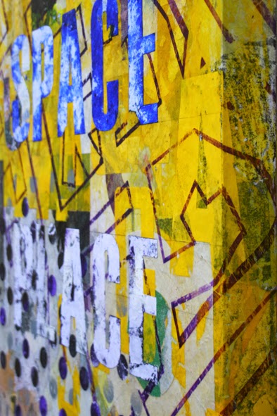
Here's the next in my series of 'Deleuzian Cartography' hybrid paintings, 'Deleuzian Cartography 7'. This is the third produced in this 60 cm square format, and shares the same essential aesthetic as 'DC 5' & '6'. As with those, the piece presents as essentially monochromatic, albeit with numerous nuanced accents of additional colour within the dominant hue. Of course, the saturation levels are ramped-up considerably this time, making this one uncompromisingly, 'The Yellow One'.


Repeat visitors here may be aware of my enthusiasm for 'significant yellow' found objects. It does occur to me that, these days, my approach to colour has shifted dramatically from the atmospheric functions it one fulfilled in my earlier fumblings. Nowadays, the approach seems much more emblematic, often relating to the physical textual or semiotic content of the city, as encountered on my habitual urban derives. In this case, the yellows employed could be related to the high-viz fluoro and safety cadmium that have punctuated the large tracts of west Leicester that have been undergoing redevelopment for many years. This is my regular patch, and I long ago grew accustomed to living adjacent to a vast, ever-evolving construction site, along with its parade of yellow cranes, earth-movers, hazard signage and safety wear. It's no accident that the architectural footprints rising to the surface here relate to buildings that emerged as a result.

The other notable geometric/textual element here is, of course, the parking penalty notice - the collaging of which represents another small departure from previous 'DC' pieces. Car parking is another category of urban subject matter that has cropped up repeatedly here over the years, and notably, another often signified by primary yellow. It also chimes with the themes of territorialisation and deterritorialisation, as juxtaposed throughout the phillosophy of Gilles Deleuze (and Felix Guattari). If the movement and flow of traffic around the city represents one of its key currents, the ever tightening channelling of that movement, and strict control/monetisation of where vehicles come to rest, is an obvious example of (re)territorialisation. To be honest, I can't think of many more territorial issues than the whole fraught area of parking in cities.

As a motorist, the occasional collection of of parking tickets, and indeed, the eternal search for unpenalised/affordable parking, may frame that tension in fairly clear-cut terms. However, simplistic, narratives are pretty useless when applied to the complex realities of modern urban life. To those who walk or cycle, the colonisation of the city by motor vehicles may appear as a restriction as much as it is an aid to 'freedom of movement'. Like many others, I find myself a member of all three demographics, and am aware of how one's perceptions are continually altered by each change of chosen transport. The competing associated narratives and prejudices are as subject to processes of de/reterritorialisation as the arena they play out within.


Written without A.I. [For better or worse]