 |
| 'Closed 1', Acrylics & Paper Collage on Panel, 100 cm X 100 cm, 2012 |
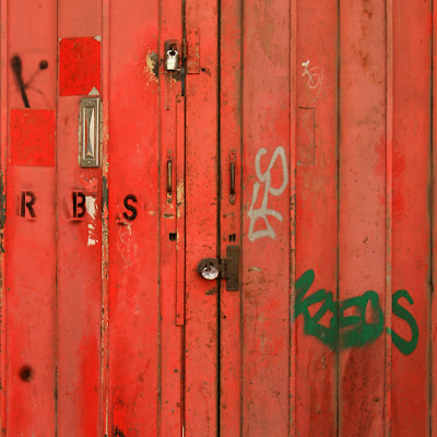
I’ve recently completed the painting ‘Closed 1’ that I showed in progress a few posts ago. It came together pretty quickly, which is pleasing, and has worked out fairly true to my original intentions.
Since taking those in-progress photos I’ve been working on the textual elements. The ‘Closed’ text follows the formal block lettering style of the ‘No Parking’ sign in the original source images. The remaining text employed a combination of collaged characters recalling poster fragments, stencilled letters and graffiti – like calligraphy. Black stencilled letters featured in the source images, as did a green tag that contrasted beautifully with the red shutter in the source images.
The approach to text in this painting differs from some of the paintings from last year where the primary phrases were included as anagrams and were more integrated as formal elements within overall abstracted compositions. This one is closest to simply reproducing the original subject and text styles. I did attempt to scramble the upper text a bit to make it a little less obvious, however.
I agonise a lot over whether potential messages and meanings should be more or less decipherable in my work. Inevitably, when something’s obscure, I wish it were easier to read then, when things go the other way, I worry about it all getting too facile or mono-dimensional. Consequently, when I complete this current phase of work on the theme ‘Closed’ I’ll probably want to reassess my approach to incorporating text into paintings. Certainly, in terms of possible interpretation, this painting feels like it’s at the simpler, more straightforward end of the scale.
One thing that does please me is pulling off a blatantly red and green painting. Maybe this one was always going to be pretty direct.


No comments:
Post a Comment