Sunday 22 April 2012

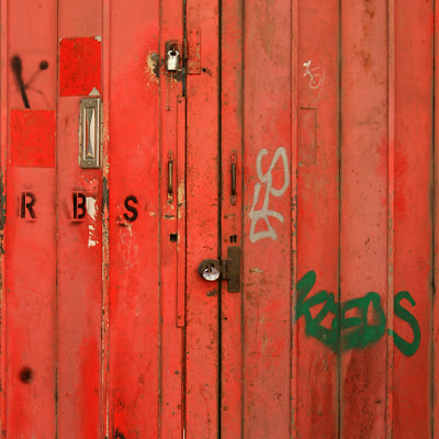
Completed Painting: 'Closed 1'

'Closed 1', Acrylics & Paper Collage on Panel, 100 cm X 100 cm, 2012

I’ve recently completed the painting ‘Closed 1’ that I showed in progress a few posts ago.  It came together pretty quickly, which is pleasing, and has worked out fairly true to my original intentions.


Since taking those in-progress photos I’ve been working on the textual elements.  The ‘Closed’ text follows the formal block lettering style of the ‘No Parking’ sign in the original source images.  The remaining text employed a combination of collaged characters recalling poster fragments, stencilled letters and graffiti – like calligraphy.  Black stencilled letters featured in the source images, as did a green tag that contrasted beautifully with the red shutter in the source images.


The approach to text in this painting differs from some of the paintings from last year where the primary phrases were included as anagrams and were more integrated as formal elements within overall abstracted compositions.  This one is closest to simply reproducing the original subject and text styles.  I did attempt to scramble the upper text a bit to make it a little less obvious, however.


I agonise a lot over whether potential messages and meanings should be more or less decipherable in my work.  Inevitably, when something’s obscure, I wish it were easier to read then, when things go the other way, I worry about it all getting too facile or mono-dimensional.  Consequently, when I complete this current phase of work on the theme ‘Closed’ I’ll probably want to reassess my approach to incorporating text into paintings.  Certainly, in terms of possible interpretation, this painting feels like it’s at the simpler, more straightforward end of the scale.


One thing that does please me is pulling off a blatantly red and green painting.  Maybe this one was always going to be pretty direct.

Friday 20 April 2012

R.I.P. Levon Helm


Life throws up some weird coincidences sometimes.  Yesterday, a colleague at work was playing an album by The Band and we were enthusing about how great they were.  I expressed the opinion that I’ve always enjoyed the eccentricity of bands with drummers who can sing lead vocals from behind the drum kit.  Later in the day I heard the news that Levon Helm, drummer with The Band, had died.


Plenty has been written about them over the years and they clearly influenced loads of musicians.  Their importance extends way beyond their role as Bob Dylan’s backing band but that’s significant too.  Dylan always seemed to compensate for his own lack of instrumental virtuosity by surrounding himself with excellent musicians.  Arguably, of all the Rock acts from the late 60s and early 70s they wove together the various traditions of American vernacular music most convincingly.  The best footage of them is in Martin Scorses’s ‘ The Last Waltz’ film of their farewell gig in 1976 when the list of contributing special guests is a roll call of that era’s most credible talent. 


Levon Helm’s vocals and percussion were vital to The Band’s sound and he could be a pretty funky drummer when he needed to be.  Here’s to the guy…


Wednesday 18 April 2012

Written City 1: Graffiti Bridge


During my recent local photographic excursion I found myself loitering beneath two large road bridges over the River Soar.  It’s a dramatic environment of steeply raked concrete supports and sculpted embankments.  This visual dynamism was amplified by strong contrasts of deep shadow versus brilliant sunlight and brutal concrete versus lush vegetation.


I was drawn, unsurprisingly, to the tangles of tag graffiti that punctuate many of the scarred concrete surfaces.  Nowadays, these scribbles intrigue me more than the grander set piece throw-ups that occur periodically.  At points multiple layers of calligraphy merge to become an overall pattern of polychromatic loops and swirls in opposition to the linear geometry and dull greys of the architecture.  It also finds unexpected kinship in the ripples of reflected sunlight bouncing from the water onto the bridge’s underside. 

Jean Debuffet, 'Wall with Inscriptions', Oil on Canvas, 1945
I thought about graffiti again after reading the following quote from Michael Corris discussing Jean Debuffet’s ‘Wall with Inscriptions’ from ‘Art, Word and Image’. [1.]

“The primitive figure is not yet an autonomous image, but merges with the ground itself; an image, perhaps, of what the rough post-war city had to offer art as a subject of spontaneous, anarchistic self-renewal.  The inscribed wall, then, reveals a complex truth about the city as it inclines towards reconstruction and reconciliation; the sheer materiality of the surface of the wall stands in for the very matter of the city, while its presence is confirmed as a space for inscribing dreams, marking territories or to declare… one’s undying love.  The unsanctioned incursion into social space by an anonymous citizenry marks the very fabric of the city as an actor in the construction of urban life.” [2].

I’m continually fascinated by this conflation of urban materiality and the life unfolding within the city.  I think the bridge graffiti show the relationship flowing in both directions.  Just as city surfaces support inscribed expressions of escapism, constructed identity, or staked claims, their extreme stylisation and agglomeration into unreadable surface pattern reabsorb those individual voices into the physical environment.  It amounts to an ongoing dialogue between individuality and generality - between the personal voice and environmental context.

The whole graffitti/street art thing has become a mainstream industry these days and could be seen as an over-used and devalued signifier for 'the outsider'.  Yet whenever I venture out it's all still there in reality as an inescapable statement all over the city.


Only after half an hour of taking photos did I hear faint music from a phone and notice two pairs of trainers projecting from the shadows.  Two young urbanites were secluded on a hidden ledge, and had almost vanished into the structure of the bridge.


[1.]:  John Dixon Hunt, David Lomas & Michael Corris, ‘Art, Word and Image – Two Thousand Years of Visual/Textual Interraction’, London, Reaktion Books Ltd., 2010

[2.]:  John Dixon Hunt, David Lomas & Michael Corris, ‘Art, Word and Image – Two Thousand Years of Visual/Textual Interraction’, London, Reaktion Books Ltd., 2010


Monday 16 April 2012

Welcome

Welcome to The World - Nina Mae Crampton.  Hope you have fun.


'Welcome 1', Acrylics & Paper Collage on Canvas,
40 cm X 30 cm, 2012

Sunday 15 April 2012

On Yer Bike


I dug my bike out of the shed over Easter.  I’ve always enjoyed cycling but in recent years arthritic joints have limited my activities somewhat.  Anyway, I’m not ready to give up just yet and current petrol prices focus the attention a bit too.  I’m back to work tomorrow so I dodged the showers today and went for a spin while I still had time and energy.  For me the beauty of cycling is the ability to cover some ground whilst remaining more connected to the environment than in a car.  It’s easier to explore forgotten corners or ‘unofficial’ zones of a city on two wheels too.  That makes it ideal for photography so I took the camera, - here are some of the results…


My route took me past two sites that demonstrate the changing economic landscape of Leicester and the nation as a whole.  Wolsey and Donisthorpe were once big names in Leicester’s clothing and textiles industry and occupied premises that were major local landmarks.  Today they remain (for now) as evocative ruins, standing testament to the dominance of globalisation and the loss of a manufacturing tradition.  Much of the Wolsey site has dissapeared now but the beautiful Donisthorpe building is still an important landmark by the river.  In recent years large swathes of Leicester’s industrial architecture have been levelled to make way for new developments.  Generally, these follow the pragmatic £ per square metre aesthetic of much contemporary architecture.  Occasionally, we get something novel like the organic S.F. styling of the National Space Centre.


In fact, it seemed that transformation was everywhere on my ride.  I was amused to see the rusted and graffiti-smothered gates that provided inspiration for part of my ‘Sick 1’ project have been renovated.  I love the whole fluctuation of decay and renewal in urban environments and will be watching keenly for signs of rust and graffiti reappearing on that fresh grey primer.

Hopefully my knees still work tomorrow.  If I can keep cycling this year there’s a chance I’ll reduce my waistline a bit too…

Wednesday 11 April 2012

Art, Word And Image: Stuart Davis & Jacques Villegle

Currently, I'm reading a book called ‘Art, Word and Image – Two Thousand Years of Visual/Textual Interraction’ by John Dixon Hunt, David Lomas and Michael Corris. [1.]  It’s an interesting chronological overview of the subject in three sections, each featuring an historical survey by one of the three named authors and subsidiary essays by various other writers.  The first spans a massive period from the earliest civilisations to 1900, in a selective skim over the centuries.  However, the second section - devoted to early 20th Century Modernism, and the third – covering the post war to present day period, are more satisfying.

 Amongst the artists discussed, are two that I’ve been aware of for ages without studying in any depth – namely Stuart Davis and Jacques Villegle.  Lots of artists hover in the background of my knowledge like that until something intensifies my curiosity.  As both of these have produced work that could be related to aspects of my own I should get my finger out and explore it in more depth.  Meanwhile, here's an opportunity to show examples of their stuff and offer my, (admittedly superficial), first impressions.

Stuart Davis, 'The Mellow Pad', Oil on Canvas, 1941-51
Jacques Villegle, '50, Rue Turbigo, 10 Jan',  Torn Paper Posters, 1977

Initially, one might dismiss Stuart Davis’s work for resembling a rather facile style of funky graphics typical of jazz-funk or ska-pop records from the early 1980s.  However, their dates reveal Davis as a much earlier, forward thinking link between European cubism, (Juan Gris and Fernand Leger for instance) and American Pop Art.  That Davis was active on the political Left suggests these images may be more than just a cheerful hurrah for the pop culture of post-war America.

Fernand Leger, 'The City', Oil on Canvas, 1919
Juan Gris 'Violin and Playing Cards', 
Oil on Canvas, 1913
Stuart Davis, 'Percolator', Oil on Canvas, 1927
Stuart Davis, 'Owh! in San Pao', Oil on Canvas, 1951
Stuart Davis, 'Visa', Oil on Canvas, 1951


Stuart Davis, 'Rapt at Rappaport's', Oil on Canvas, 1952

Stuart Davis, 'Something on the Eight Ball', Oil on Canvas, 1953-54

Jacques Villegle fits into the context of the post-war European Avant-garde and would appear to be an important figure within the tradition of collage.  An interest in commercial posters isn’t so radical today but Villegle’s use of actual torn posters as raw materials dates back to the late 1940s.  These pieces are both from the street and of the street and would seem to point toward the Situationists and beyond to more recent critical responses to modern consumer society.  

Jacques Villegle, 'Blue O Noir',  Torn Paper Posters, 1955
Jacques Villegle, 'Jazzmen',  Torn Paper Posters, 1961
Jacques Villegle, 'Boulevard Bourdon 11 January',Torn Paper Posters, 1965
Jacques Villegle, '122 Rue Du Temple',  Torn Paper Posters, 1968
Jacques Villegle, 'Clermont Ferrand',Torn Paper Posters, 2000


One other thing about these paintings, - they’re all rather beautiful, (for those of us who still care about that kind of thing).


[1.]:  John Dixon Hunt, David Lomas & Michael Corris, ‘Art, Word and Image – Two Thousand Years of Visual/Textual Interraction’, London, Reaktion Books Ltd., 2010

Monday 9 April 2012

Painting In Progress: 'Closed 1'


Previously, this blog has only showcased my own paintings in their finished state, describing their production in the past tense.  This time I’ll capitalise on the ongoing journal nature of a blog to give some insights into work that’s in progress and a glimpse of it in the studio.

'Closed 1' In Progress (Earlier Today)
I expressed frustration over how long it took to complete my ‘Sick 1’ quartet and having seen it off, it seemed important to complete something else more rapidly if possible.  Working speed can be a problem for me and too often I’ve lost direction, sinking into over-analysis and eventual stasis.  I could have won multiple awards for procrastination over the years.  I’m sure most artists would agree that maintaining creative momentum is easier than getting the boulder rolling again after it’s come to rest and last year’s steady output bore that out for me.  Happily, I had a clear idea for my current piece(s) and am making good progress as I write - halfway through the Easter holiday.  Essentially, this post is about keeping a wiggle on.


One afternoon in August 2007 I took my camera into central Leicester and found a set of firmly closed brilliant red industrial shutters.  I was instantly drawn to the wealth of visual incident within a single colour field.  Within vertical structural divisions occur multiple chips, scrapes and scratches, accumulated dirt, faded paint and palimpsests of original colour.  Formal and semi formal lettering, unofficial graffiti and scattered door furniture punctuate the corrugated surface further.  The photos I took stand as images in their own right but I’ve always wondered if they’d work as larger paintings.  The original red images were since augmented with shots of a similar blue subject taken two years ago.


'Closed': Photographic Source Images
Our ongoing economic dilemmas mean the media agonise endlessly over the travails of businesses to survive or prosper within a dysfunctional economic model.  In addition, ever more avenues of opportunity are shut off - for employment, education good health or a safety net for the most vulnerable.  If any sense of a secure future is offered, it is defined in ever-narrower terms.  Those who’ve annexed wealth or privilege guard it jealously to the exclusion of the majority.  ‘Closed’ seems an appropriate descriptor of the current situation.  In that context, the motif of shutters drawn and locked against the world seems ripe for exploitation.


'Closed': Sketchbook Studies
As usual, I’ve done much of the planning through heavily worked sketchbook studies.  The finished appearance of these hides multiple development stages below the surface.  I’ve stayed close to the source images, slightly abstracting them within the basic format of broad and narrow parallel vertical bands. I’ve also remained faithful to the saturated palette of the originals and will probably embark on a blue variant when the current one is complete.  It’s all closely related to my work from last year but also reveals older enthusiasms for formal abstraction and Modernist colour field painting. There are nods to the variation within mono-colour and ‘all-overness’ of Robert Ryman and formal banded geometry of early Stella here amongst other influences.

Robert Ryman, 'Catalyst III', Enamel
On Aluminium with Bolts, 1985

Robert Ryman, 'Untitled', Pencil & Oil
On Paper,  1958
Frank Stella, 'Six Mile Bottom', Aluminium
Paint On Shaped Canvas,  1960

Currently, the biggest unknown with 'Closed 1' is the exact content and treatment of the subsidiary text.  Possible phrases include ‘Capital’, ‘Market Imperatives’, and ‘In The Marketplace’ and I’ll aim to distinguish between formal, semi-formal and outlaw text styles as usual.

I’ll be addressing all that by the time you read this…