Showing posts with label University Of Nottingham. Show all posts

Thursday, 25 October 2018

Mandy Payne: 'Out Of Place' At Lakeside Arts Centre, Nottingham


Mandy Payne, 'Urban Arcadia', Spray Paint & Oil On Concrete, 2018


With the Half Term break, and enjoyably mellow autumn weather, came an opportunity to get out and about, and to take in one or two exhibitions by other artists.  It makes a nice change from fixating on one’s own, as I certainly was for much of the year.  One such is ‘Out Of Place’ by Mandy Payne, at The University of Nottingham’s Lakeside Arts, Angear Visitor Centre.


Mandy Payne, 'Out Of Place', Angear Visitor Centre, Lakeside Arts Centre,
University Of Nottingham, October 2018

Mandy Payne, 'High Rise II'.  Spray Paint & Oil On Veneer Paper Backed
Nut Tree On Panel, 2018


I’ve met Mandy briefly, a couple of times, at Leicester Print Workshop (where she carried out a two-year residency).  It was there that I saw her working on some of the lithographs in this show - and I’d also seen a few of her small, meticulous paintings, at various venues, in recent years.  However, this was my first opportunity to see a large selection of her pieces together, and to gain a greater degree of perspective on her work.


Mandy Payne, (L.): 'Faded Glory'. Lithograph On Paper On Concrete, (R.): 'Changing Spaces',
Lithograph & Multiple Monoprints On Paper On Concrete, 2017

Mandy Payne, (L.): 'Stripped Bare', (R.): 'Pretty Vacant' Lithograph & Monoprint
On Paper On Concrete, 2017


It’s fairly predictable that I’d be drawn to her work, given her fascination with mid-twentieth century Modernist/Brutalist architecture, and her appropriately formal approach to depicting its austere geometries and grids.  My own interest in such subject matter is no secret, as is my similar relish for the (often frontal) compositional formality it inevitably inspires.  I also share an interest in the idea of failed Utopias, implied by the very subject matter itself.  In fact such stuff has become a pretty familiar trope in various quarters, of late.  I’ve written about George Shaw’s paintings ofthe mid-twentieth century Tile Hill Estate on more than one occasion, and also about John Grindrod’s engaging survey of Britain’s architectural forays into ‘utopian’Modernism, 'Concretopia'.  When I occasionally summon the energy to attend to my Twitter feed, I also find regular bulletins from The Modernist magazine, This Brutal House, and The Manchester Modernist Society - all suggesting this is far from an isolated enthusiasm.  I’m often tempted to think it might mostly reflect a nostalgic reframing of the long-abandoned, and seemingly misplaced, idealism of a world some amongst us (of a certain vintage), were born into.  The subsequent questioning of our own place in a changing world inevitably follows.


Mandy Payne, 'Carpenter's Estate II', Spray Paint & Oil On Concrete, 2018

Mandy Payne, 'Gone But Not Forgotten I', Spray Paint & Oil On Concrete, 2018


Whatever the motivation, Sheffield-based Mandy Payne has a prime example of surviving Modernist public housing on her doorstep, in the city’s in/famous Park Hill Flats.  That complex has presided over Sheffield like a forbidding rampart for decades, and is impressed on my own memory from childhood family excursions there in the 1970s.  Park Hill became symbolic of both what might be achieved by a centrally planned public housing policy, but also - what might go awry when progressive idealism, political/financial expediency, and formulaic design ideology conspire to create an inadvertent dystopia.  That’s a well-told tale, of course, and clearly open to interpretation and individual prejudices.  Either way, our current free-market era has generally sought to deride or overwrite the architectural evidence of the Post War Consensus - either by demolishing or ‘gentrifying’ them (for which, read - often tarting-up beyond the reach of their original tenants).


Mandy Payne, 'Broken Brutalism', Spray Paint & Oil On Concrete, 2018

Mandy Payne, 'Love Don't Live Here Any More,' Spray Paint & Oil On Concrete, 2017


That process of post-modernist renovation and up-speccing has certainly been applied to portions of Park Hill in recent years, but it’s notable that Mandy’s artistic gaze remains resolutely fixed upon the begrimed concrete, austere brutalism and generally dilapidated aspect of its untransformed regions.  Her notes accompanying this exhibition claim that gentrification is an issue she’s definitely engaged with, but if I’m honest – I took little in the way of conceptual discourse, or critical analysis from viewing the work itself.  Mandy’s work appears primarily visual in its motivations, and sits resolutely in the familiar traditions of painting and printmaking.  Her meticulous and often intricate paintings (often executed on small, individually cast concrete slabs) suggest it’s all that delicious interlocking geometry - along with a desire to record the ravages of time and neglect in minute detail, which really concern her.  This occasional fracture between an artist’s stated intentions, and whatever slightly differing motives might really be betrayed, is something that interests greatly, as indeed – is the constant tension between the desire to engage with a theme or concept and the often irresistible pull of the purely sensory/visual.  It’s also only fair to admit that I’m as susceptible to the immediacy of the primary visual response as the next artist – despite habitual claims to be exploring ‘layers of meaning’ or the pretense of having reached for some supposed heightened degree of conceptual rigour, in my own work.


Mandy Payne, 'Between Boundaries', Spray Paint & Oil On Concrete, 2018


What the resolutely level gaze, uniform illumination, and seemingly objectivising aspirations of Mandy’s chosen style do suggest rather beautifully, however - is a kind of hyper-real freezing of time.  This is further magnified by the eerie absence of human life, or evidence of any real animation at all within her chosen spartan settings. There are definite stylistic (as well as historical) similarities here with George Shaw’s carefully depicted estate visions of a world now accessible only through memory.  Despite that, her paintings appear to resist the tendency toward photo-realism towards which Shaw’s images have occasionally slid.  For him there also seems to be an elusive element of lyricism - suggesting a degree of personal melancholy.  Mandy’s images feel, if anything, more depersonalised - and therefore, perhaps more like collective memories than meditations on personal history.


Mandy Payne, 'Brave New World', Spray Paint On Concrete, 2018


My response to Mandy’s interesting use of concrete as a substrate for many of her paintings is firstly, that this is both a pleasingly appropriate idea - and indeed, the kind of thing I could easily imagine having attempted myself in the same situation.  However, that is coupled with a slight disappointment that she hasn’t exploited the idea a little less discretely.  Careful examination of the paintings is required to reveal that, what appear as carefully painted concrete surfaces, are actually the raw, locally coloured material itself - modulated with carefully sprayed shadows.  This incorporation of physical materials comes more to the fore in some of her newer paintings of similar subjects outside of Sheffield.  Here, she uses marble slabs as a support - employing its characteristic veining as a more abstract solution to depicting areas of sky. Perhaps she's making more overt reference to the perceived status of rival building materials, and associated issues around low/high-grade accommodation, in the process.


Mandy Payne, 'Precinct 1', Spray Paint & Oil On Marble, 2018

Mandy Payne, 'Precinct II', Spray Paint & Oil On Marble, 2018


That all feels like something I’d personally love to see Mandy push further, and more experimentally, in future work.  It might also be something she could exploit further, or more noticeably, by increasing the scale of some of her images (although admittedly, not without a new set of technical challenges).  Certainly, their current dimensions, and detailed nature, require her to refine her concrete surfaces to such a degree that the material's characteristic surface qualities are somewhat lost.  In addition, my first reaction was that the modest scale of all of this existing work is perhaps also something of a missed opportunity to fully engage with the monumental immensity or engulfing immersion of the environments she depicts.  However, on further reflection, it does feel suggestive of domesticity, rather than of the over-imposing or self-aggrandising - both being standard accusations against Modernist architecture.  It is thus, an important reminder that what Park Hill’s authors were always supposed to be engaged with, was the provision of livable homes for real people.  Ultimately, it may actually be that Mandy is prioritising a more nuanced or balanced consideration of her chosen subject matter, over the more standard sensationalist readings often applied to it.
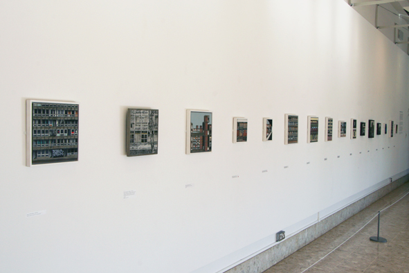

Mandy Payne, 'Out Of Place', Angear Visitor Centre, Lakeside Arts Centre,
University Of Nottingham, October 2018


I’m aware this discussion of ‘Out Of Place’ might appear somewhat hedged about with criticisms, or even like I’m rather crassly trying to tell Mandy Payne how she should be doing her own work.  Hopefully,  I’m really just trying to imagine how I would approach it myself – because it does occupy a stylistic and thematic area I could easily imagine occupying.  My comments actually come from a feeling of real engagement with the work.  As it is, and regardless of anything else written here, I genuinely enjoyed viewing pretty much everything in Mandy’s show, and also the way it all hangs together in its current,  beautifully illuminated venue.  There’s relatively little time remaining to view the exhibition, but I’d definitely recommend it, should you have the opportunity.


Mandy Payne: 'Out Of Place' continues until 28 October at Angear Visitor Centre, Lakeside Arts, University Park, Nottingham, NG7 2RD


Tuesday, 4 November 2014

Sheila Ravnkilde: 'Boxes - 68 Colours' At Lakeside, Nottingham


Sheila Ravnkilde, 'Boxes - 68 Colours' (Detail), Exact Details Unknown, 2014


In my last post I discussed my visit to the exhibition ‘And Now It’s Dark: American Night Photography’ at Nottingham’s Lakeside Arts Centre.  Whilst there,  my eye was also drawn to a site-specific wall piece by Sheila Ravnkilde in the attractive day-lit exhibition space outside the main gallery.


Sheila Ravnkilde, 'Boxes - 68 Colours', Exact Details Unknown, 2014


‘Boxes - 68 Colours’ is a simple enough idea, comprising 68 small cubes mounted in a regular grid, each painted in a different colour and painterly manner.  The variation in paint consistency, application method and surface quality appears endless, (well, 68-fold, at least), as do the colour selections.  Although many of the individual colours are quite saturated, and the contrasts between adjacent boxes quite dramatic, the relationship of each to the white spaces between and the piece’s overall formality, create a mood of refined elegance and calm.


Sheila Ravnkilde, 'Boxes - 68 Colours' (Detail), Exact Details Unknown, 2014


This is accentuated by the gorgeous quality of the illumination that saturates the space.  I’m guessing the site-specificity of the piece was in part a response to that.  I also imagine that Ravnkilde’s agenda is also to explore how the idea of infinite variation within such a standard format, might create a never-the same-twice situation each time it is applied to a different location.  It’s an effective and seductive, if not exactly game-changing, solution, rooted firmly in high Modernism.


Sheila Ravnkilde, 'Boxes - 68 Colours' (Detail), Exact Details Unknown, 2014


What really drew me in to this essentially quite polite artwork though, was the way that the 68 cubes activate the three-dimensional space immediately in front of a two-dimensional wall plane.  Their relief quality means that this space exists in activated, articulated volumes between each element and its neighbours.  It also means that the effects of colour and surface extend over five surfaces each time, multiplying the range of combinations of light, shadow and adjacent contrasts exponentially.  I spent as much time viewing the piece edge-on as I did frontally, and was struck by how its sophistication and complexity increased with each new perspective.  Not least amongst these is the enjoyable way that fluid paint has been allowed to drip down the sides of several boxes after having been applied to the front surface.  This is done in slightly too controlled and predictable a manner to be truly expressive, but it does throw yet another interesting element of randomness into the pot.


Various Of My Paintings, Edge View


This attention to the edges of nominally ‘flat’ wall-based artworks is something that interests me greatly.  My own use of rigid painting panels is partly for practical reasons to do with layering and sanding collage materials.  However, it is also because of the scope it gives me to carry an image around the edges of a painting.  In fact I deliberately build my panels with the 2”X1” battens fixed edge-on to create that little bit of extra depth, for that very reason.  I hope this is more than mere affectation, and an attempt to avoid the various implications of framing without leaving a raw edge.


Various Of My Paintings, Edge View


The slightly paradoxical idea of a painting as a self-conscious object, rather than a purely illusionistic window onto a parallel, imagined reality, has always interested me.  In fact, as I increasingly start to think about the truly intangible shadows & light illusionism of video as a medium, the comparative substance of paintings intrigues me even more.  I love the idea of paintings as functionally ‘useless’, but intellectually/imaginatively/expressively essential objects.  Somehow, the idea that you could mend the roof or create an ad-hoc coffee table with one in an emergency seems to accentuate rather than diminish their true power when simply allowed to become ineffable and self-justifying.  Perhaps that’s just what all Art is really, - a form of imaginative Alchemy, often using the simplest of means.


Thursday, 30 October 2014

'And Now It's Dark, American Night Photography', At Lakeside Arts, Nottingham


Jack Delano, 'Proviso Departure Yard Of The Chicago & North Western Railroad At Twilight', 1942


This post relates to ‘And Now It’s Dark, American Night Photography’, - an exhibition I viewed recently at the Djanogly Gallery in the University Of Nottingham’s Lakeside Arts Centre.  The show’s not on for too much longer, but is definitely worth a visit if you find yourself in the area and have the time.  My own interest derived, in part, from my attempts to take photographs after dark, (with somewhat mixed results).

The title tells you essentially what to expect, but it’s worth outlining that the exhibition is nominally divided into two main sections, the first comprising the work of three contemporary photographers, Jeff Brouws, Will Steacy and Todd Hido, all of whom have made a point of capturing images after dark, and a more general survey of work looking at that particular tradition throughout the twentieth century.  This loose, chronological structure appears to be undercut by an intent to demonstrate how a general sense of optimism or technological/societal celebration in many of the earlier images, is replaced by a sense of disillusionment or loss in those photographers working today.  ‘And Now It’s Dark’ may be a reference to more than just the lighting conditions under which the photos were taken.


Jeff Brouws, 'P.J.'s Lucky Strike, Elko, Nevada', 1995


In my own mind, the show actually divides into three sections, including a pivotal phase where this transition can first be perceived, - but more of that in a minute.  Here’s a basic outline of the exhibition's essential components, reversing the order in which it’s actually hung.


Early Work:


Mostly in Monochrome, (for obvious technological, as much as aesthetic reasons), the tone of much of this pioneering work is generally uncritical.  The main intention seems to be to document the wonders of the, increasingly artificially lit, Modern Age, and the technical wonders of an ever more confidant American society in the twentieth century.

Samuel HermanGottscho’s ‘New York City View: Times Square To The South At Night’, (1933), is a fine example of this.  It’s a beautifully framed, focused and exposed document that attempts little more than to catalogue the brightly illuminated spectacle of that famous site in all its novelty and wonder.  It also demonstrates that, as far as this show is concerned, the tradition of American nocturnal photography is primarily engaged with the effects of artificial lighting, from the earliest days.  Unsurprisingly, given the very nature of the medium, nocturnal photography is as much about light as it is about darkness.  What really distinguishes it is the highly controlled nature of that man-made light.


Theodor Horydczak, 'Waffle Shop On 10th Street: Exterior Of Waffle Shop With Neon Sign', 1950


The other notable themes running through much of this earlier work are that of conspicuous consumption, and of America’s pursuit of happiness in its most material aspects.  Theodor Horydczak does this very stylishly in his ‘Waffle Shop On 10th Street: Exterior Of Waffle Shop With Neon Sign’, (1950).  Again, it is a simple, beautifully composed description of its subject, but one with a distinct appreciation for the high commercial aesthetic of the period.  This delight in its Pop-SF styling and glorious typography, so typical of the era is, of course, only accentuated by our own retro-fascination with such tropes.  This was a period, after WWII, when ‘The Future’ still looked both plentiful and sexy, (Atom Bomb not withstanding).


Jack Delano, 'Activity In The Santa Fe Railroad Yard, Los Angeles', 1943


Jack Delano’s images demonstrate how such visions of American positivity, (or at least, wartime stoicism), derived as much from Government sponsorship as from private enterprise culture.  Produced under the aegis of the Farm Security Administration and the Office of War Information, during the 1930s and 40s, they are somewhat heroic, Romantic visions of America’s will to abide.  They also mark the introduction of colour into the proceedings, and are not without their experimental aspects, despite their documentary intent.  Time-exposed light trails are hardly novel to us now as a photographic technique, but it’s impossible not to be attracted by Delano’s use of them to imply nocturnal railroad activity, back when they probably seemed a daring manipulation of the medium.


Transitional Work:


Though the curators choose not to make a formal separation, my own feeling is that the whole show actually pivots around a group of images, created in middle of the last century, (and amongst my favourite things in the show).  These are the first intimations that, however bright the lights, there is also a darker side to the illuminated American Dream.

William Klein’s ‘Broadway By Light’, (1958), extends the remit of the exhibition to include moving imagery.  Klein’s short film is a high-energy celebration of the electrified entertainment spectacle that is Broadway between dusk and dawn.  Almost abstract in one respect, but full of text, signs and symbols, it’s a whirling cavalcade of chasing, pulsing lights, brand names and invitations to be entertained.  The film is drenched in colour, and movement, and utilises rapid edits and alternating long shots and close-ups, to inject a new level of vitality into those similar subjects from earlier in the exhibition.  Nonetheless, behind its enjoyable Pop aspects, and psychedelic hyper-reality, lie certain more critical implications.  There’s a suggestion of migraine overkill and visual ADHD about it all, and of a leisure society running off the rails and under unstoppable momentum, towards terminal decadence.  When humans appear, it’s as the silhouettes of electricians and sign-hangers, lost within a polychromatic inferno and seemingly enslaved by it.


What happens when that society actually blows a fuse can be seen in René Burri’s suite of photographs, ‘Blackout New York’, shot during the massive East Coast power outage of 1965.  These startling, decidedly existentialist images show New Yorkers huddling claustrophobically, (or for comfort?), in still-illuminated vehicles, or emerging like torch or match-lit partial apparitions from the profound blackness.  A palpable sense of vulnerability,  and paranoia, illustrates how easily security and self confidence evaporate once the lights flicker and we return to the cave.


Images From: Rene Burri, 'Blackout New York', 1965


Contemporary Work:


Here the work of the three chosen contemporary photographers is extensively showcased.  It’s fair to say that, to a greater or lesser degree, the cracks and defects in America’s reverie about itself are made manifest in these images.  That’s not to say that the themes of abandonment or collapse that suffuse many of these images aren’t also often full of sumptuous visual poetry or dark, urban romance.  Indeed, this may be one of the show’s main dilemmas. Despite the story of general decline in the living condition of many sidelined by the pragmatic realities of Late Capitalism, there’s no denying that the juxtaposition of coloured light and atmospheric shadows remains an largely pleasurable experience, visually speaking.

Jeff Brouws:  This is perhaps best exemplified by Brouws’ images, harvested on a series of road trips, and exemplifying marginal situations in a changing economy.  Some of his shots attempt to demonstrate how mainstream, (or Main Street) America must increasingly confront the sleazy or morally questionable, (the brothel or X-rated book store) to scrape a living or find diversion in a world of reduced options.  Elsewhere, his marvelous, desolate shots of sections of road create the sense of being truly lost out on some forgotten highway.


Jeff Brouws, Coffee Shop, Battle Mountain, Nevada,' 1993
Jeff Brouws, 'Exit 24 Off 1-90, Erie, Pennsylvania', 2005


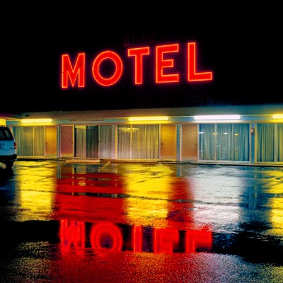
Despite all this, the clichés of Americana haunt many of these pictures.  Brouws’ illuminated gas stations are clear descendants of Edward Hopper’s whilst ‘Coffee Shop, Battle Mountain, Nevada’ (1993), looks like an even more lonesome version of that artist’s famous Diner once even the Nighthawks have left.  Repeatedly, the kitsch beauty of glowing neon, or a sense of delicious melancholy, undermine the real bleakness he may seek to convey. On the plus side, he is, rather good at incorporating signage into his images.  ‘North Wilson Street (MOTEL), Vinita, Oklahoma’ (1991), depicts the lights of a motel reflected a little too beautifully in wet tarmac but, pleasingly, the puddle-mirrored ‘MOTEL’ sign can be misread as ‘WOLFE’.


Jeff Brouws, Details Unknown
Jeff Brouws, 'North Wilson Street,(M O T E L), Vinita, Oklahoma' 1991


Will Steacy:  Steacy undertakes a conceptually more intriguing form of journey to capture his images.  His project,‘Down These Mean Streets’, involves him walking from Airport to Business District in various cities, documenting the abandoned properties, impoverished neighbourhoods and evidence of distressing events he often encounters along the route.  These are carefully assembled into a conscious narrative, although it does feel like his bloodstained gutters and bullet holes in glass are possibly over-melodramatic, and a sinister, faceless Hoodie just seems too carefully posed.


Will Steacy, (Details Unknown)
Will Steacy, 'Condos, Chicago', 2008


Despite these caveats, ‘Memorial, Philadelphia’ (2009), is a truly moving image, depicting a street shrine to a fallen brother against waste ground, debris and a discarded car wheel.  ‘Condos, Chicago’ (2008), effectively captures a fenced off vacant lot with a developer’s impression of a proposed building, - priced, (one assumes), beyond the reach of many.  ‘Someplace Else, Detroit’ (2009), depicts another tract of weed-strewn ground overlooked by a drab cinder block wall on which that particular legend is spelt out in bold lettering.  I’m drawn to it for all sorts of probably obvious reasons.


Will Steacy, 'Memorial, Philadelphia', 2009
Will Steacy, 'Someplace Else, Detroit', 2009


Todd Hido:  Of all the work in this exhibition, it may be Hido’s which most evocatively tells the story of lives thwarted and prospects denied.  His are also the images with the highest proportion of human content and least dramatic visual chiascuro, (although everything is clearly shot at dusk or under unattractive artificial light after dark.


Todd Hido, (Details Unknown)


The images from ‘Excerpts From Silver Meadows’ show Hido returning to his own childhood home in suburban Kent, Ohio, to document a society in banal decline.  There’s nothing as dark or gritty as Steacy’s imagery, but a distinct air of disappointment or sordid drabness.  His somewhat painterly landscapes often dissolve into mist, scattered wintery light, or just a lack of focus, but feel more like abandoned places in which one might become lost, rather than anything more picturesque.  Hido’s wintery motel, (His images are untitled, emphasising the loss of clear identity), is colourfully lit like Brouys’, but also dissolved by the filter of raindrops on a car window.


Todd Hido, Details Unknown


Once Hido’s lens moves indoors, it documents a world of scruffy, featureless decor, abandoned interiors and distressingly stained carpets.  These may be the soul-sucking motel bedrooms or soon-to-be foreclosed homes occupied once life is reduced to mere existence.  The young women often populating them attempt a listless simulation of allure, but really hint at cheap, uninterested sex entered into as a transaction, or because there’s nothing better to do apart from drink.  For me, the best image amongst them, (and possibly the most distilled in the entire show), is a small, badly lit, close-up of a grimy white phone.  Ghostly and disconnected, it sits on a pale carpet before an obscure expanse of dreary, patterned wall.  It feels an awfully long way back to those early, confident images of nocturnal Manhattan.


Todd Hido, Details Unknown


'And Now It's Dark, American Night Photography', continues until 09 October 2014, at  Djanogly Gallery, Lakeside Arts, University Of Nottingham,  University Park, Nottingham, NG7 2RD.