Showing posts with label Frank Auerbach. Show all posts

Wednesday, 15 July 2020

'Constructed City' 16: Building With Colour


Main Images: West, North West, and South Leicester, May - June 2020


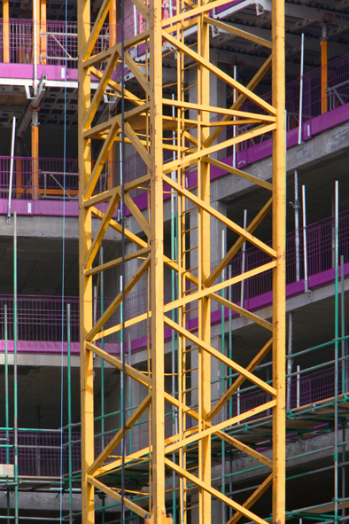
As I observed last time, my ever-expanding archive of construction-related photographs is inevitably categorising itself into various recurrent themes.  Here's a little bundle focusing on the often startling colours of a modern construction site.


Frank Auerbach, 'Oxford Building Site II', Oil on Canvas, 1960

Frank Auerbach, 'Shell Building Site', Oil on Board, 1959


Once upon a time, construction sites, or 'building sites' - as they were traditionally known, were places of drab, earth colours.  The materials used were almost wholly organic, or of mineral origin, and often (in Britain, at least) appeared to inhabit a world of churned earth - top-dressed with congealing slurries of cement or plaster and littered with debris.  The main concession to gaiety was that drab, pink primer (or possibly, its dull aluminium counterpart) often used on wooden frames, or perhaps, the begrimed, primary yellow of a back-hoe excavator.  Building work seemed almost to be a process of solidifying and shaping the same primary mud from which each new edifice was raised.  In my imagination, it's a world evoked by the early post-war construction site paintings of Frank Auerbach, whose extreme impastos of mangled paint seemed ideally suited to such subject matter
[1.].


The contemporary construction exists in a very different chromatic context.  It's usually one  characterised by far lighter tones, and a wide palette of, often highly saturated, synthetic colours.  The edges (and thus, the point of juncture between contrasting colours) all seem somehow sharper now, too.  In part, this is a reflection of the far wider range of artificial materials now employed, as well as the methods of their assembly.  A degree of traditional brick-laying, timber joinery, cement-pouring or surface-coating may still occur - to be sure.  But they now reside  within an overall process more akin to assembling a kit of pre-exiting parts [2.].  Many components of any new building - be they extruded, laminated, vacuum formed, or otherwise pre-fabricated (possibly even 3D printed nowadays - who knows?), arrive on site resplendent in a surprisingly vivid spectrum of self-coloured hues, metallic or translucent surface wrappings, and manufacturer's liveries.

Thus, a building in progress may now exhibit tangerines, lime greens, cerulean blues, sugar pinks and glittering silver - all juxtaposed within a few square metres.  Pipework, cabling, insulation materials, and plastics of all sorts, can be a particularly rich source of such materials - as typified by the pretty lilac hue prevalent in many of these shots.


Another important participant in all this is the temporary infrastructure of construction.  Safety barriers, barricades and access equipment all come in an ever more strident palette of primaries and saturated secondaries - un-ignorability clearly being one of their key functions.  Heavy plant, and the enormous lifting equipment towering over any large site, exhibit ever more brilliant colours these days, and, of course, the neon yellows and oranges of Hi-Vis workwear long overtook the wardrobes of construction workers, as safe practice and a general concern for well-being, overtook their industry.


In bright sunlight, a busy construction site is a far more garish environment than the urban landscape surrounding it.  For the reality is that many of these brighter hues disappear from the site as a building reaches its conclusion.  Insulation layers vanish behind more tastefully integrated final surface dressings.  The site is progressively denuded of brightly-painted kit, as it is readied for its unveiling.  In some cases, that final reveal may itself involve the removal of another layer of coloured wrapping.  New occupants will eventually arrive to inhabit the completed edifice, by which time the cavalcade of colour has transferred to a new location.


[1.]:  It should be acknowledged that, at the time those pieces were produced, Auerbach was limiting his palette for reasons of economy as well as aesthetics.  That quantity of paint doesn't come cheap across the entire colour chart, after all.

[2.]:  That distinction between 'building' and 'construction' seems particularly apposite, in this context.


Wednesday, 23 April 2014

'Somewhat Abstract' At Nottingham Contemporary 1


Nottingham Contemporary, April 2014

I was based in Nottingham for a couple of days over the Easter break, so took the opportunity to drop into Nottingham Contemporary’s latest major exhibition, ‘Somewhat Abstract: Selections From The ArtsCouncil Collection’.  I’ve come to associate The Contemporary with this type of mixed show, in which widely disparate works are assembled around an overriding theme, foregrounding the processes of curation along with those of the artists on display.


In this case, the show focuses on a looser interpretation of Abstraction than merely as a definition of the visually non-representational.  As the title indicates, it draws from the Art’s Council collection of (mostly) post-war British art, and includes plenty of work that is nominally representational or primarily conceptual across a range of media and identifiable traditions.  It’s main agenda would seem to be to question what happens at the edges of abstraction, and those points where the recognisable begins its transformation into something other.  Clearly, this may occur through visual/plastic manipulation, but also, through conceptual processes of abstract thought, formal theory or established ideology.  Impressively, the show gives roughly equal weight to all these modes.


Cynics might object that the real motivation behind such exhibitions is to fill gallery space with whatever is easily (and cheaply?), available and can be assembled around a catch-all theme.  However, I do enjoy the opportunity they often provide to make thought-provoking connections or alternative interpretations, and to make new discoveries.  That is certainly true of this show and it includes several of the latter for me, along with some old friends.  It’s also worth noting that in a genuinely trans-media exhibition, and an era when Conceptualism is often prioritised, painting is rather well represented here.


Enamel, Vegetable & Mineral

‘Somewhat Abstract’ fills all four of The Contemporary’s galleries and I spent several happy hours in there, (punctuated by refreshment breaks on its sunny terrace).  The work is distributed around the separate spaces according to distinct shared concerns, and one could focus on each quite satisfyingly over repeat visits.  I found some of these curated sub-themes slightly more convincing than others and, with time on my hands, was content to immerse myself in the show as a whole.  I made various connections of my own as I went along; returning to spend more time with those works that particularly intrigued me.  As they were numerous, I’ll highlight the paintings here, and deal with work in other media in a subsequent post.


John Hoyland, 'Red Over Yellow 18-9-73', Acrylic On Canvas, 1973

John Hoyland, ‘Red Over Yellow 18-9-73’, Acrylic On Canvas, 1973:  The work of British painter, John Hoyland seems lost in time these days, (Art Historically, at least).  His muscular paintings from the 1970s represent the very end of an American tradition of ‘heroic’, painterly abstraction, and of many of the assumptions about painting that were about to be swept aside by a changing zeitgeist.

Not being a believer in sacrificing babies at bath time, I’m often intrigued by much overlooked work from that period, and being confronted by a painting like this makes me forget the official accounts altogether.  An expansive field of primary red extends across most of the large canvas, revealing fragments of underlying yellow and bordered by a narrow frame of browns, crimson and purple.  To stand before it is a gloriously immersive experience, not unlike that gained from a good Rothko, but Hoyland’s approach is less neurotic and far more extrovert.  The energetically knifed and unctuously dripping paint reveals a delight in its gestural plasticity and delivers a lesson in how to make adjacent, closely related colours vibrate.


Peter Lanyon, 'Soaring Flight', Oil On Canvas, 1960

Peter Lanyon, ‘Soaring Flight’, Oil On Canvas, 1960:  I mentioned Lanyon, (featuring this particular painting), in a post following my short break in Cornwall, earlier this year.  He’s a favourite post-war Cornish painter of mine, (and, unusually, - a native).  This is one of his best, and it was an unexpected pleasure to walk around a corner and find it waiting for me in Nottingham.  Like Hoyland, Lanyon represented a typically mid-20th Century approach to painterly abstraction, but applied it to the elemental qualities of the Cornish landscape.

Lanyon projected his experience of gliding into images that amalgamate the realms of earth, air, water and light, and locate the viewer amongst them in a dynamic manner.  There’s no such thing as a fixed viewpoint here as Lanyon’s energetic brushwork describes his glider’s zig-zag progress through the air.  Meanwhile, the moving cloud, (or shadow), diagonally veiling almost half of the canvas is both exciting and compositionally audacious.


Prunella Clough, 'Waterford Yard', Oil On Canvas, 1970

Prunella Clough:  A definite pleasure of ‘Somewhat Abstract’ is its showcasing of several paintings by Prunella Clough.  I often forget about Clough, only to find myself intrigued by her work when I encounter it in municipal collections.  One of her introverted pieces in isolation can lose out to louder voices, and they benefit from being hung in groups, as here.


Prunella Clough, 'South-West Nocturne', Oil On Canvas, 1970

Clough is a straightforward enough fit for this show, with her consistent exploration of the boundary between the identifiable world and the abstract painterly environment.  There’s something terminally ‘British’ about her tonal palette and general mutedness, but I always respond to her use of urban or industrial sources, flattening of forms and consistent emphasis on surface.


Prunella Clough, 'Perforated Fragment', Oil On Canvas, 1985

‘Waterford Yard’, Oil On Canvas, 1970:  Clearly derived from a distinct location, this painting pushes Clough's subject to the very edge of purely formal abstraction, allowing a few observed features to emerge as flattened shapes from atmospheric darkness.

Prunella Clough, 'Samples', Oil On Canvas, 1997
'Somewhat Abstract' (Prunella Clough Paintings In Situ), Nottingham Contemporary,  April 2014

‘Samples’, 1997; ‘South West-Nocturne’, 1970; ‘Perforated Fragment’, 1985; All Oil On Canvas:  Separated by 27 years but forming a pleasing trio, these push things even further into shape and mark-based abstraction, each exuding a subdued elegance, typical of Clough's oeuvre.  They instantly reminded me of the entropic architectural surfaces I was photographing just a few minutes earlier on my way to the exhibition.  ‘Samples’ and ‘South-West Nocturne’ also demonstrate how beautifully slightly heightened colour fragments can sing from more neutral overall surroundings.


Frank Auerbach, 'Primrose Hill', Oil On Board, 1959

Frank Auerbach, ‘Primrose Hill’, Oil On Board, 1959:  Another interesting strand within the overall exhibition is the inclusion of paintings by Walter Sickert, David Bomberg and Frank Auerbach.  Famously, each taught the next, passing a baton of traditional representational painting that became increasingly abstracted through the physicality of paint application, without ever sacrificing the primacy of subject.

There are three Auerbach’s in the show, (including a terrific portrait etching of Lucian Freud), but this one is my favourite.  It’s an early, largely brown example, from the days when, apparently, he couldn’t afford a wide range of colours in the quantities needed to build his massively impasted paintings.  It reinforces my feeling that Auerbach’s obsessive attempts to carve space and form through sculptural paint and sheer force of will, are far better suited to landscape subjects than the figure.  It’s all deeply obscure, but I still feel I could walk down the hill, through all that unctuous gravy, towards the distant building emerging from the  nocturnal gloom.


Francis Bacon, 'Head VI', Oil On Canvas, 1949

Francis Bacon, ‘Head VI’, Oil On Canvas, 1949:  If I’m honest, I sometimes find Bacon a bit overrated.  There’s no doubt he produced many powerful images, but there are some fairly lame, poorly constructed ones out there too.  Whether or not he eventually became self-parodic, this famous early picture is a concentrated example of his work in its power to affect, and undiluted shock value.  In translating Velasquez’s 1650 portrait of Innocent X into the image of an eyeless screaming Pontiff, Bacon created a perfect symbol of human tragedy or lost faith, and an icon of post-war Existentialism.

Bacon was pretty dismissive of abstract painting, although his work often employs passages of suspended description to interesting psychological effect.  Here, the figure is confined within a trademark artificial space frame and subsumed within an ambiguous abstracted void.  I guess Existentialism could be described as a philosophical abstraction, although it sometimes feels pretty real to me.


Tomma Abts, 'Heit', Acrylic & OIl On Canvas, 2011

Tomma Abts, ‘Heit’, Acrylic & Oil On Canvas, 2011:  When German-born Tomma Abts won the 2006 Turner Prize, some trumpeted ‘a return to painting’.  That seems typically superficial, but the award did at least validate painting as a live issue, alongside the wide range of other media available to 21st century artists.  More interesting than the promotion of one medium over any other, is the way that Abts repurposes certain tropes of abstract painting tradition to illustrate that, nowadays, everything is up for grabs.

Painted across two adjacent canvases, ‘Heit’, shares the same modest dimensions and the general appearance of geometric Constructivism or Op Art, seen in all her art.  Paradoxically, Abts constructs such works organically, without prior planning, accumulating the textural marks of corrections and alterations beneath their final surfaces.  She also introduces illusionistic shadows, (as here), creating considerable internal tension as the final painting pulls in three different  directions at once.


Keith Coventry, 'Crack City', Oil On Canvas, 1993 (2 Of 4)

Keith Coventry, ‘Crack City’, Oil On Canvas, 1993:  Like Abts, Coventry pastiches the style of high Modernism here, in a set of four, repeated reworkings of Malevich’s white-on-white Supremacist square.  His agenda is highly conceptual however, and reimagines/retitles the squares as the footprints of housing blocks in London’s notorious Woodpecker Estate.  It’s an arch comment on the legacy of Utopian Modernism’s damaged legacy that, admittedly, relies on knowledge of the estate’s dysfunctional reputation.  Like the small bronze crack pipe sculpture displayed alongside, it also alludes to the hard drug addict’s abstract disengagement from everyday experience.

Zebedee Jones, 'Blue/Green', Oil & Wax On Canvas, 1993

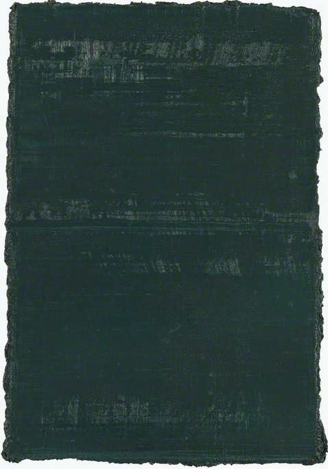
Zebedee Jones, ‘Blue/Green’, Oil & Wax On Canvas, 1993:  I know nothing about Jones’ work, (beyond what a quick online search reveals), so this piece called to me, purely on its own terms.  It’s clearly in the tradition of the painted monochrome, and of conceptual painting about process and the medium’s specific properties.  I’m still a sucker for this kind of self-reflexivity and, whilst it lacks the sumptuous spectacle of Jason Martin’s work in a similar field, I enjoyed its nuanced surface and somewhat sullen demeanour.  I also love the way its internal content transcends the edges of the canvas creating an energised, ragged interaction with surrounding space.


Varda Caivano, 'Untitled', Oil On Canvas, 2011

Varda Caivano, ‘Untitled’, Oil On Canvas, 2011:  This is another, rather modest, blue-green painting by an artist I don’t really know.  It could have become lost amongst the surrounding work, but something about it called me back for repeated views.  Filled with an accumulation of insubstantial shapes, it seems to share the sense of an ambiguous but navigable environment, (albeit with difficulty), that I enjoyed in the Auerbach already mentioned.  Accumulations of scrubby, translucent paint, and chinks of revealed, contrasting colour between larger shapes, introduce breathing space into what might otherwise be a claustrophobic experience.


It pleases me that ‘Somewhat Abstract’ introduced me to two interesting painters of whom I had no previous knowledge, amongst some acknowledged big names and relatively familiar images.  It’s also intriguing (and illuminating of the current cultural situation) that work which might have emerged at any point over the last hundred years, (for example, in the case of Abts and Caivano), was actually produced within the last decade.


Nottingham Contemporary, April, 2014


‘Somewhat Abstract: Selections From The Arts Council Collection’, Continues until 29 June 2014 at: Nottingham Contemporary, Weekday Cross, Nottingham NG1 2GB.


Tuesday, 4 February 2014

'Pop Art To Brit Art' At Djanogly Gallery, Nottingham


Joe Tilson, 'Gagarin, Star, Triangle', Screen Print, Oil, & Polyurethane On
Wooden Reliefs,  1968


Early 2014’s busy round of gallery-going continued for me with a visit to the exhibition, ‘Pop Art To Brit Art: Modern Masters From The David Ross Collection’ at The University Of Nottingham’s Djanogly Gallery.  Whilst there, I also caught David Manley’s ‘Epidemic’ And ‘Black North’ paintings and went on to view ‘Since 1843 In The Making’, a selection of work by Nottingham Trent University Alumimni) at that institution’s Bonnington Gallery.  For now, I’ll deal with the first of those exhibitions.


‘Pop Art To Brit Art’ showcases the private collection of David Ross, University Of Nottingham graduate and co-founder of Carphone Warehouse.  The phone racket obviously pays well, (no surprise there), as in little more than twelve years, he has amassed a representative survey of British art from the last half century, (i.e. his own lifetime), the artists included being the usual, high profile suspects.  The clue is in that ‘Modern Masters’ tag line.


Jonathan Yeo, 'Portrait Of David Ross', Oil On Canvas, 2005


It’s impossible to avoid the thought that this is all just a rich man’s hobby and, if the news media are to be believed, there’s plenty about Ross to feel queasy over, (Tory party donations, playboy lifestyle, country gent affectations, alleged financial irregularities, - all the usual stuff).  However, no one ever claimed that art collectors (or artists for that matter) must all be admirable people.  The quality of much of the actual work here is impressive, which could suggest a degree of genuine engagement on Ross’ part, rather than just an exercise in ticking a list of prestigious and expensive names.  If nothing else, he may deserve credit for making it available to the public like this, unlike an increasing number of ‘investors’ nowadays.  I actually made two visits to the show over successive weekends, in the company of different friends, and it’s testament to its scope that I found plenty to engage me on both occasions.


David Hockney, 'Wilshire Boulevard, L.A.',  Oil On Canvas, 1964


The exhibition itself divides fairly neatly into three distinct groups, namely: Pop and Op Art from the 1960s and 70s, (Blake, Hockney, Hamilton, Caulfield, Riley, etc.); The more traditionally painterly, but roughly concurrent ‘School Of London’ work, (Auerbach, Kossoff Hodgkin, etc.); and the more recent YBA stuff, in much of which the Pop legacy clearly prevails through a rather more conceptual filter, (Hirst, Quinn, etc.).  The significance of, and connections between, all this have been thoroughly documented elsewhere, so, (as is my wont), I’ll just highlight a few individual pieces that caught my attention for different reasons.


Peter Blake, 'Babe Rainbow', Screen Print On Tin, 1968

  • Peter Blake, ‘Babe Rainbow’, Screen Print On Tin, 1968:  I guess Blake is the jolly, favourite uncle of British Pop and the fact that this is one of his best-known images seems to establish the serious credentials of Ross’ collection.  Despite its familiarity, there’s something charming about Blake’s very British take on Pop.  It’s full of parochial nostalgia but also backed up by his undoubted skill as a figurative artist and formidable illustrative draughtsman.


Gerald Laing, 'Number Sixty Seven', Oil On Canvas, 1971

  • Gerald Laing, ‘Number Sixty Seven’, Oil On Canvas, 1967:  I’ll admit Laing is an artist who has slipped under my radar until now.  His emulation of Ben-Day dots and flat colour to depict his bikini-clad model seems a straightforward enough comment on the nature of both popular imagery and mechanical reproduction now, but I can see why Ross was drawn to it.  I’m still a bit of a sucker for such references to print technology, be it in the work of Sigmar Polke or the actual fragments of fallen posters I regularly collage into my own work.


David Hockney, 'Rubber Ring Floating In A Swimming Pool', Acrylic On Canvas, 1971

  • David Hockney, ‘Rubber Ring Floating In A Swimming Pool’, Acrylic On Canvas, 1971:  Like Blake, Hockney can seem a bit too accessible and over-familiar until one is confronted by his actual work and reminded just how accomplished a painter he actually was all along.  This is an unusual Hockney in its elegant near abstraction, depicting a precisely delineated, hot pink floating ring, seen from above in deep turquoise water, with a narrow, golden brown strip of mottled poolside along the lower edge.  Hockney was amongst the early painters who exploited the specific qualities of acrylic paint and his use of staining, modulation, subtle watery detail and general flatness is highly seductive here.  The painting feels like a distillation of the light-saturated, hedonistic Dolche Vita Hockney found in California at the time.


Patrick Caulfield, 'Cafe Interior: Afternoon', Acrylic On Canvas, 1973

  • Patrick Caulfield, ‘Café Interior: Afternoon’, Acrylic On Canvas, 1973:  I overheard a fellow gallery goer dismissing this as tragically dated but I disagree.  Granted, Caulfield’s flat colour, crisp black outlines and sense of period design anchor his work to a particular time, but I generally find them to be full of more timeless formal concerns too.  His colour is artificial but actually deeply atmospheric and well judged here, whilst his chosen style seems as much a methodical exploration of a specific pictorial convention as a mere search for facile graphic impact, (much like the American Lichtenstein).  As is often the case, Caulfield also includes certain perceptual conundrums such as the perplexingly solid diagonal shadow extending right across this image, and lower black band cutting through the chair legs.  Both serve to disrupt the image while conforming to its overall system.


Frank Auerbach, 'To The Studios II', Oil On Board, 1977-78

  • Frank Auerbach, ‘To The Studios II’, Oil On Board, 1977-78:  I no longer embrace all that existential struggle and hewing-at-the-coal-face approach to painting as much as I once did.  However, I still find something compelling in Auerbach’s work and this is a good one.  It’s interesting to see The School of London painters included here, persevering in wresting an image from the materiality of paint alongside all those concurrent references to mechanical reproduction, facile glamour and glossy modernity.  Nowadays, generally, I find Auerbach’s encrusted surfaces and space-carving brush marks far more suited to landscape subjects than the figure.  I also find in his painting all the things I fail to see in the work of Leon Kossoff, (also represented).  These closely allied painters appear similar in some ways and yet so very different in others.


R.B. Kitaj, 'Yona In Paris', Charcoal On Paper, 1982

  • R.B. Kitaj, ‘Yona In Paris’, Charcoal On Paper, 1982:  Whether or not Kitaj lost the plot big-style towards the end, as some critics contend, I’m still engaged by his construction of composite images and the narrative threads that run through them.  It’s all very Jewish, but I’m mostly interested in the way he seemed to provide a bridge between the Bacon/Auerbach/Freud axis and the Pop sensibility, without ever losing his own identity.  Actually, there’s little of all that to see in this piece, - it’s just a terrific  piece of fairly traditional portrait drawing.  I was massively impressed by his drawings during my Foundation studies and still don’t know of many better draughtsmen/women, (draughtspersons?).


Richard Hamilton, 'I'm Dreaming Of A Black Christmas', Screen Print On Collotype,
Printed In Colour With Collage, 1971

  • Richard Hamilton, ‘I’m Dreaming Of A Black Christmas’, Screen Print On Collotype, Printed In Colour With Collage, 1971:  Hamilton was often regarded as the presiding genius of British Pop and his work does contain a conceptual underpinning not always so evident in that of his compatriots.  The exhibition includes four of his prints, including ‘Cristea 81’, - the famous image of Mick Jagger and Robert Fraser in handcuffs after a drugs bust, and an icon to the massive attitudinal changes overtaking 1960s Britain.  This one interests me more though, being the most sophisticated comment on mass media and the technology of reproduction in the show.  Having reversed an original negative movie still, Hamilton made a photorealist painting which was then further recycled into the final print.  Although immediately accessible both in subject and as an image, there’s an essential weirdness about the appearance of Bing Cosby and his environment, which speaks volumes about the translation between media.


Marc Quinn, 'Wintergarden Series', Pigment Transfer Print, 2000

  • Marc Quinn, ‘Winter Garden Series’ (6 of 8), Pigment Transfer Prints, 2000:  Quinn made his name as part of the YBA set with the genuinely arresting ‘Self’, a self portrait bust cast from several pints of his own frozen blood.  These lurid and highly synthetic-looking flower photos can’t claim the same gruesome shock value but do continue his interest in suspended animation through cryogenics.  Each literally frozen arrangement comprises a selection of blooms from diverse global sources, thus commenting upon the artificiality both of their means of indefinite preservation, and the floristry trade in general.  The effort and resources required to import and then freeze the flowers is clearly an environmental nightmare, coupled with the bizarre synthesis of the whole enterprise.  What may initially appear merely kitsch and decorative actually becomes a pointed comment on our distance from ‘nature’ and preference for immortality, however misplaced, over transient beauty.

Marc Quinn, 'Wintergarden Series', Pigment Transfer Print,  2000


If one or two of the final pieces in this exhibition look like they were purchased for reasons of fashion or celebrity, this doesn’t spoil the overall exhibition, and it’s a show that should appeal to practicing artists and the casually curious alike.


‘Pop Art To Brit Art: Modern Masters From The David Ross Collection’ continues until 9 February at: Djanogly Gallery, Lakeside Arts Centre, University Park, Nottingham, NG7 2RD.