|
'Painting After Technology' Gallery, Tate Modern, London, May 2015. (L-R): Work By:
Laura Owens, Wade Guyton, Tomma Abts, Albert Oehlen |
A few posts back,
I wrote belatedly about a gallery trip to London I made earlier this year. My goal was to visit retrospective
exhibitions of work by Richard Diebenkorn and Marlene Dumas, both of which were
well worth the trip. However, with a
spare hour to kill at Tate Modern, I also dipped into the latest hang of the
permanent collection. I want to consider
a little of what I found there in this post.
Although it’s after-the-event, it all has some bearing on current thoughts
about my own work, both recent, and to come. Interestingly, while the main reason for my
visit was to enjoy two favourite artists not directly related to my own stuff,
these serendipitous discoveries actually feel surprisingly applicable to it.
 |
| Gerhard Richter, 'Cage' Paintings (L-R: '1,2,3'), Tate Modern, London, May 2015 |
I love such
inexplicable ‘gifts’ and, whatever else the Tate may or may not be, I find it a
regular source of revealing discoveries or refreshing new juxtapositions. This is in part due to the curatorial habit
of regularly shuffling and recontextualising the collection thematically rather
than chronologically, seemingly to avoid standard, tired accounts of Art
History. It may also be due to fact that
I visit London less regularly these days.
Several visits a year have now dwindled to one or two, and things I’ve
become familiar with over the years can seem a little fresher once more. Absence makes the heart grow stronger,
perhaps. However, the things that really
caught my attention this time were mostly new to me.
 |
| Gerhard Richter, 'Cage 1', Oil On Canvas, 2006 |
 |
| Gerhard Richter, 'Cage 2', Oil On Canvas, 2006 |
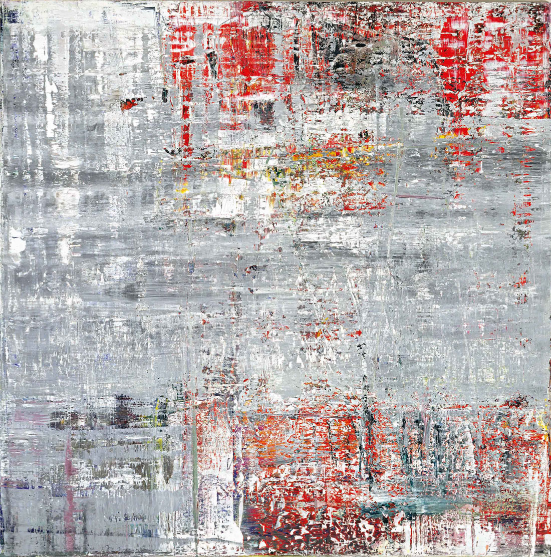
I had started by
heading straight for Gerhard Richter’s room of ‘Cage’ paintings. I’ve loved
this suite of six, immense, squeegee-dragged abstracts since they were
installed in the wake of Richter’s large Tate retrospective in 2012. As a visitor attraction, it may now serve a
similar function to the famous ‘Rothko Room’,
in the Tate’s mind, but I find rather more of interest and philosophical
complexity in the Richters, these days.
Richter’s technique of repeatedly dragging his accretions of paint over
and through each other is simple in essence, but highly complex in terms of
outcome. The ‘Cage’ works actually encapsulate a wealth of insight into the
nature of time, process, self-reflexivity, and (of prevailing interest), the
materiality of paint. Notwithstanding
his status as an established giant of international painting, he still does it
for me as regards balancing Philosophy with a tireless medium.
 |
| Gerhard Richter, 'Cage 4', Oil On Canvas, 2006 |
 |
| Gerhard Richter, 'Cage 6', Oil On Canvas, 2006 |
In an adjacent
gallery, entitled ‘Torn Papers And Walls Paper’, I discovered a newly hung trio of pieces of direct relevance to my own
recent concerns. Gordon Matta-Clark’s ‘Walls Paper’ commemorates a more
extensive installation of 1972, comprising an entire wall, papered with
printed, manipulated photos of part-demolished New York project buildings. Whilst its near-abstract qualities are
engaging in their own right, the piece also appears to engage with issues of
architectural transformation and the inadequacy of affordable housing provision. Covering the walls with repeated images like this
suggests both the compartmentalisation of low-rent accommodation, and the pasting
of fly-posters within an urban environment.
 |
Gordon Matta-Clark, 'Walls Paper', Printed Paper, Original Installation At David Zwimer Gallery,
New York, 1972 |
Of even more
immediate impact was Jacques Villeglé’s ‘Jazzmen’. I already knew this piece, as one of his
classic found-poster ‘Affiches Lacérées’, but it works particularly well
conceptually, in its present company.
Simply re-exhibiting a battered section of advertising material may seem
a fairly facile strategy these days, (albeit one that appeals greatly in its
directness), but back in 1961 it had considerable radical currency and is
clearly in the Duchampian tradition of the ‘Readymade’. The activities of Villeglé and his fellow ‘Nouveaux Realistes’ appear to antecede and coincide with certain Situationist ideas, not
least in their conception of the streets as an arena of self-generating images,
texts and potential detournements. No
prizes for guessing why I’m always happy to see this work.
 |
| Jacques Mahe De La Villegle, 'Jazzmen', Printed Paper On Canvas, 1961 |
 |
| Mark Bradford, 'Riding The Cut Vein', Paper, Varnish, Silicone, Caulk & Charcoal On Canvas, 2013 |
The third piece
in that gallery, and one of particular relevance to my own recent output, is
Mark Bradford’s ‘Riding The Cut Vein’ from
2013. It’s another mural-sized piece, of
incredible intricacy, also constructed from layered posters, (heavily manipulated
and abraded, this time). Appearing initially
abstract, the loose, mesh-like geometry extending across its upper portion soon
reveals itself as a form of notional, street map. That is carved into an indescribably nuanced
surface, created by employing power tools to sand and grind back through the
accumulated paper strata. The process reveals
a dazzling array of colours, patterns and text fragments, like a field of
granular micro-clues. Naturally, all this
speaks loudly to my own recent concerns with urban cartography, found texts and
hybrid poster-collage. Spookily
coincidental though it may seem, I’d never even heard of Bradford prior to this
encounter, (honest, Guv.). A little Googling
suggests I’ll be investigating his oeuvre a lot more in the future.
 |
| Mark Bradford, 'Riding The Cut Vein', 2013, (Detail) |
 |
| Mark Bradford, 'Untitled', Manipulated & Collaged Posters On Canvas, 2009 |
If that little
room detained me for several enjoyable minutes, I gained even greater
stimulation from the larger gallery immediately beyond. Gathered under the banner of ‘Painting After Technology’, this new
hang showcases a selection of big (and big-ish) names in the field of
contemporary or near-contemporary Art.
Amongst these, were interesting pieces by Tomma Abts, Charline Von Heyl,
Laura Owens, Jacqueline Humphries, Wade Guyton, Sigmar Polke, and, especially
pleasingly, Christopher Wool and Albert Oehlen.
Fairly obviously, all can be said to make some specific reference to the
relationship between traditional and ‘new’ (be that digital or mechanically
reproduced) media [1.]. Polke is, I suppose, the granddaddy here, consciously
looking back to the layered halftone, found imagery of Pop Art, as he does. Along with several others here, he also
emphasises the importance of German painting in recent decades. In that context, (and thinking of daft, old George Baselitz), is it also worth noting how many of these notable artists are
women?).
 |
| Sigmar Polke, 'Untitled (Square 2)', Oil, Acrylic & Gold Paint On Canvas, 2003 |
I’ve been thinking about those
media relationships a lot recently, whilst the work of both Wool and Oehlen in
particular, are recent enthusiasms of mine, without my having actually seen any
for real previously. I initially came to
Wool through his ironic, monochrome text paintings, but the large ‘Untitled’ canvas of 2007, represents a
looser, more recent mode of wiped, abstraction.
It’s impossible not to find some memory of graffiti in the calligraphic
elements, but these paintings are as much about the accumulation of fluid marks
through repeated erasures and cancellations.
Wool’s gestural turps-wipes into thinly painted statements, leave a history
of swipes, drips, ghost marks, veils and general nuance. The results are confident in scale, but
remain pleasingly nebulous and transitory in overall effect. They speak of the movement of a human hand,
the fluid plasticity of paint, the implied accretion of grime and incoherent
texts in city streets, and the ceaseless cycles of statement, partial
cancellation and restatement, (ad infinitum), that characterise Wool’s urban
context.
 |
| Christopher Wool, 'Untitled', Enamel On Canvas, 2007 |
Were this all that Wool offered,
it would be plenty, - but essentially just another iteration of traditional
painterly abstraction. However, as the augmented screen print, ('Untitled', 2009), hanging alongside reveals, Wool’s overall process is one in in
which a wide variety of visual statements (and application methods) are endlessly
recycled, repurposed and reproduced through photography and print media as well
as paint. Ultimately, nothing feels like
a definitive statement, but rather just the latest image in an endless reverie of grimy city streets. It feels like
everything informs everything else, and even the overriding tendency towards
abstraction is modified by the significant role of Wool’s bleakly atmospheric
documentary photographs in the overall scheme.
 |
| Christopher Wool, 'Untitled', Enamel On Screen Print On Paper, 2009 |
 |
| Christopher Wool, 'Absent Without Leave', Photocopied Photograph (Part Of Artist's Book), 1993 |
Oehlen is another well-established
artist who nevertheless sees to occupy a position of continuing relevance (or
something to do with what is often called ‘Zeitgeist’). Earlier work seems to belong to a mode of
deliberately awkward German daubing that does relatively little for, but although
it’s difficult not to admire the sheer bloody-minded will to stir things up
that it implies. 2007’s ‘Loa’, however,
represents a more multi-layered mode of combining elements of collaged
promotional material with almost arbitrary instances of smeared or sprayed
paint and textual references to contemporary music.
 |
| Albert Oehlen, 'Loa', Acrylic, Oil, Ink, Spray Paint, Photograph & Paper Collage On Canvas |
There’s often a slightly
slap-dash, even unfocussed quality about much of this, almost as if Oehlen was
drawing upon a grab bag of contemporary stimuli whilst partially distracted. It’s the kind of thing one might even imagine
being made whilst simultaneously watching TV or checking their phone. And yet, is this not actually highly
representative of our current, attention-deficient cultural consciousness? In fact, there is some variety of awkward
formal coherence about much of Oehlen’s work, but one that appears to emerge,
as if by accident, through the eventual condensation of suspiciously aimless
statements.
 |
| Albert Oehlen, 'Untitled', Oil & Ink On Canvas, 2007 |
That’s also there in his
linear 'Computer Paintings', to some extent.
They could be dismissed as resembling those potentially endless free
doodles we all practiced the first time we encountered a PC mouse, but further
examination reveals they are actually rather more knowingly constructed. The combination of free, directly drawn
statements, with more deliberately filtered effects of pixilation, or
pattern-generation, clearly exploit certain effects intrinsic to the
medium. Intriguingly, they also indicate
that it has long-since acquired a kind of recognisable ‘tradition’.
If encountering Wool and
Oehlen provided my biggest single excitements, there was much else in the
gallery to engage me and provoke thought.
Wade Guyton’s large-scale ink jet print, ‘Untitled’ (2011), exhibits an abstract minimalism that feels
distinctly Modernist. However the apparent attempt to print a solid block of
ink are full of banding, glitches, accidental marks and empty areas,
undermining any sense of seamless mechanical perfection or even, adequate manufacture. It’s probably no accident that the two halves
appear actually seamed together.
 |
| Wade Guyton, 'Untitled', Inkjet Print On Linen, 2011 |
Of all the pieces in the
room, Tomma Abt’s thoughtful, little quasi-Op painting, ‘Zebe’, from 2010, stood out for its characteristic modest
scale. It might be possible to make some
case for this piece representing the importance of craft, in contrast to the deliberate
superficiality, or even vacuity, of certain pieces surrounding it [2.]. Paradoxically though, this tendency towards
insubstantiality, or a kind of ungroundedness, feels like one of the qualities
that most links much of that work with its particular moment. It feels less like a problem, once it becomes
something perfectly worthy of exploration. [3.].
 |
| Tomma Abts, 'Zebe', Acrylic & Oil On Canvas, 2010 |
It may be that, as usual, I’m
a decade behind everyone else, but it definitely feels like there are
implications, in much of this work, that could usefully inform my own. Whatever the future holds, there’s little to
suggest that our collective perceptions won’t continue to be transformed by advancing
digital technology. This is probably
equally true, regardless of whether one actually employs it as a means of
production, or simply lets it inform a kind of surface-slide,
aesthetically. One question is, I
suppose, to what extent we choose to be shaped by it; to embrace it
imaginatively; or to actively push back against any sense of deterministic impotence.
My own feeling is that, as
ever, it’s all up for grabs really. I
suspect, someone is already writing an algorithm to simulate the kind of
intuitive thought characteristic of painting, but that it may still look (interestingly)
more like itself than ‘actual’ painting.
I also trust that artists will still find ways to corrupt any code, on
an arbitrary whim, for a little longer yet.
Perhaps, in the long run, some recourse to authenticity, and/or an
attitude of subversive adoption, will co-exist as superficially opposed, but
equally useful, ways to chart the course ahead.
[1.]: Dan Perfect would be another artist, with
whose work I have become acquainted in the last year or two, and who seems to engage
with various, related issues. Certainly,
a process of digital translation appears to unmistakably alter the final
appearance of his painting.
[2.]: There is, indeed, an actual vacancy of
ill-resolved paint at the very heart of Oehlen’s ‘Loa’.
[3.]: I
have heard it claimed that many newer artists now crave a greater sense of
authenticity, and even, laughably, that ‘Authenticity’ is now ‘in’, (think about
it).