Sunday, 22 June 2014

Rae's A Smile: Even More Thoughts About Fiona Rae


Fiona Rae, 'Shifting Sands Dusts Its Cheek In Powdered Beauty',  Oil &
Acrylic On Canvas, 2010


This post contains some more reflections on the work of Fiona Rae, following my recent visit to the ‘Painter, Painter: Dan Perfect, Fiona Rae’ exhibition at Nottingham Castle Museum & Art Gallery.  I’ve written about her on here before, after seeing her paintings in Walsall in 2012 [1.], and still stand by what I wrote then.  The current Nottingham show focuses on her most recent output, so I’ll concentrate on that now, hopefully without too much repetition.  As before, these are miscellaneous reactions to the work on show, rather than a coherent thesis about Rae’s project.


  • The text characters that first drew me to Fiona Rae's paintings have largely disappeared in recent years.  I'll admit I miss them, but there's still no shortage of Pop content, and certainly plenty to captivate and intrigue in her current paintings.  They aren't without their crisper-edged graphic motifs, but the visual vocabulary Rae adopts now constitutes a rather more traditionally painterly language, seen overall.

  • This manifests itself most obviously in her use of thin, sloshed-on and freely dripping paint.  Currently, this seems her favourite way of covering distance, and of establishing some form of nebulous ‘ground’ early in a painting’s development.  However such drips and veils also creep over earlier statements at times, lending much of the work an aquatic or partially submerged quality.  The lush, distinctly tropical ‘Shifting Sands Dusts Its Cheek In Powdered Beauty’, would be an obvious example of this.


Fiona Rea, 'I Need Gentle Conversations', Oil & Acrylic On Canvas, 2012

  • Accompanying the inherent liquidity of Rae’s current work, there’s a general trend towards increased openness within it too.  ‘I Need Gentle Conversations’, in particular, is very economical, consisting of some pale sloshes of fluid paint, a little brushed calligraphy, and tiny, sparsely-scattered decorative motifs, over a plain field of sky blue.  ‘I Always Wish You Every Happiness With My Whole Heart In The Distance’ feels like its nocturnal companion piece and isn’t much busier, with plenty of solid black ground visible between it’s painterly gestures and drawn elements.


Fiona Rae, 'I Always Wish You Every Happiness With My Whole Heart
In The Distance', 
Oil & Acrylic On Canvas, 2012

  • It might be tempting to dismiss some of this as superficial or tossed away, but I prefer to see it as Rae engaging with the concept of ‘less is more’.  After years of relative sensory and information overload, it feels like she’s keen to allow her paintings to breath and to find out how little is actually necessary to resolve them.  Some would argue that this is something most mature painters try eventually.


Fiona Rae, 'Does Now Exist?', Oil & Acrylic On Canvas, 2013

  • It’s impossible to ignore the palpable Orientalism of Rae’s current vision.  Her own origins lie in Hong Kong, and so often now her imagery seems to look back to The Far East.  The paintings mentioned above all approach the feel of Chinese or Japanese watercolours and the suggestion of pendant branches drenched in blossom.  There’s more than a hint of Chinese textile design about ‘Does Now Exist’ and ‘Dusk Brings Your Eyes’, with their peacock palette and bunches of brushstrokes that loop into implied blooms or butterflies.  In ‘Mixing Feelings And Time’, gravity coaxes the unusually sombre, washed ground into a precipitous mountain landscape, above which flies a bold graphic device constructed from left-over Chinese dragon components.


Fiona Rae, 'Mixing Feelings & Time', Oil & Acrylic On Canvas,  2012

  • This being the twenty-first century, there’s little resembling ‘authenticity’ in all this.  The cartoonish panda-bear motifs that crop up repeatedly in these paintings derive from cute mascots bought, not in Hong Kong or Shanghai, but New York.  Everything is mediated through global cultural filters of one sort or another.  Rae’s ‘foreground’ elements are often depicted with crisp, black linearity, suggesting the conventions of animation or comic book illustration.  Her predilection for strings of dots might resemble beads or bulbs, but also remind me of the tourism-driven market in Australian Aboriginal painting too.

  • The Artist maintains that those devices are there to act as a foil to her more earnest or ‘meaningful’ passages of expressive paint.  There’s no doubt we are frequently arrested (and delighted), by the kitsch stars and cheeky faces peeping from between her more painterly statements.  However, I suspect it’s all pretty knowing really, and that even her more Expressionist strategies are exactly that, - recognisable signifiers.  She may throw plenty of ‘pure’ paint into the pot these days, but this is still more like the restless Post-Modern recombination of readable motifs, than the obscurity, portentousness or quasi-spiritual affectations of the New York School.  Indeed, is not the very idea of ‘meaningful’ paint not itself just another such sign these days?


Fiona Rae, 'Everything Will Be Beyond Your Thinking', Oil & Acrylic
On Canvas, 2012

  • I’m always cheered by how Fiona Rae strips all the potential machismo out of abstract painting whilst leaving us in no doubt over her seriousness as a painter.  It would be easy to dismiss all those cuddly pandas, stars, decorative flourishes (and, in the past, - glitter), if they weren’t all adding to our sum of knowledge about how grown-up paintings might be constructed today.  Her small-scale collages cheerfully recall a teenage girls’ scrapbook, but are full of formal considerations and the intrinsic abstract qualities of their supposedly frivolous raw materials.  It’s like she’s constantly challenging the blokes to get on their critical high horses.


Fiona Rae, 'Untitled (Small Collage No 26)', Mixed Media On Archive Paper On Board, 2011

  • There’s a feast of colour to be enjoyed in these paintings.  The near psychedelia of ‘Do Not Scream’ or ‘Shifting Sands Dusts It’s Cheek In Powdered Beauty’ emphasise her skill with a candy-coated synthetic palette, but elsewhere, she uses such hues as galvanising accents within far more sophisticated, even naturalistic schemes.  The earthiness of ‘Mixed Feelings And Time’ is a genuine surprise in this show, and it’s also important to recognise there are just as many darker paintings in Rae’s oeuvre as brilliant ones.


Fiona Rae, ' Do Not Scream!!', Oil, Acrylic & Gouache On Canvas, 2010

  • In the past, Rae often seemed to arrive at compositional solutions through an embrace of scattergun randomness.  Nowadays she seems to marshal certain pictorial elements into almost arbitrary compositional armatures, - imposing order on looser passages.  This is particularly obvious where she has drawn straight lines between stars, to create an implied diagram of constellations.  In that last painting, it’s the cheeky pandas that are interconnected as they apparently float in cartoon space


Fiona Rae, 'Does Now Exist?' (Detail), Oil & Acrylic On Canvas, 2013

  • Rae’s paintings have always gathered numerous parallel realities in simultaneous but seemingly indifferent relationships.  Disparate elements orbit, or even impinge upon each other but with no focal point or suggestion that they even inhabiting a common physical space.  There’s no coherent scalar logic there either, and the smallest of details can command our attention at any given moment.  What there is, instead, is a series of notional internal spaces, (or space/times), and even a suggestion of quantum or particle Physics as a result.

  • For me though, the real analogy is of cyberspace.  These paintings seem to epitomise that sense of island hopping between parcels of information whose spontaneous connections occur, then evaporate, in a click or a swipe.  Where a more convincing inhabitable environment begins to coalesce, as in ‘Do Not Scream !!’, it still feels like a temporary situation constructed from unexpected, fleeting conjunctions.  I’m consistently impressed by Rae’s ability to inject our current cultural ADHD into a static (and traditionally contemplative), medium, whilst retaining all the stuff that makes painting great in the first place.


‘Painter, Painter: Dan Perfect, Fiona Rae’, continues until 6 July at Nottingham Castle Museum & Art Gallery, Lenton Road, Nottingham NG1 6EL.


Perfect and Rae will be talking about their work and conducting a tour of the exhibition between 2.30 – 3.30 pm on 28 June 2014.


Saturday, 14 June 2014

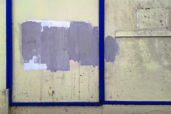
Colour / Not Colour 2: Revisions & Cancellations


Tints...


Peepul Centre (sic), Belgrave, Leicester, June 2014


...And Tones


Nottingham, Leicester, May 2014


Picture Perfect: More Thoughts About Dan Perfect


Dan Perfect, 'Generator', Oil & Acrylic On Linen, 2012

Dan Perfect

Following myprevious post about the exhibition, ‘Painter, Painter: Dan Perfect, Fiona Rae’, at Nottingham Castle Museum & Art Gallery, here are some thoughts specifically about the work of Dan Perfect.  I left the show wondering if I’d actually enjoyed Perfect’s work even more than Rae’s (which is still fascinating), but this may just be because he was completely new to me.  Inevitably, one brings fewer preconceptions in such cases.  Anyway, in no particular order…


  • Dan Perfect’s paintings are essentially environmental.  Each contains a variety of internal space within its dense thicket of gestural marks, implied calligraphy and half-resolved hieroglyphs.  Were these illusions of traversable, physical terrain, it would doubtless be a tough scramble. In fact, they are primarily landscapes of the mind, - accumulations of thoughts, impressions, memories and associations.

Dan Perfect, 'Arcologies', Oil & Acrylic On Linen, 2012

  • Often here we are lost without a map and unable to see the wood for the trees, but occasionally, Perfect leads us to the edge of the forest. 

  • This allusion to physical environment is reinforced by the obvious kinship with aspects of the twentieth century British abstract landscape tradition.  It’s impossible to avoid memories of Peter Lanyon, whose multi-viewpoint plotting of a painterly topography seems an antecedent to some of Perfect’s own mark making.

Peter Lanyon, 'High Moor', Oil On Canvas, 1962

  • That tradition also reveals itself whenever the painter recalibrates his palette away from the Pop end of the spectrum to incorporate neutrals and less saturated earth colours, (‘Arcologies’, ‘Generator’) or where greens prevail, (‘Full Fathom Five’, ‘Howl’).

Dan Perfect, 'Full Fathom Five', Oil & Acrylic On Linen, 2012

  • Indeed, the whole issue of colour in these paintings suggests that, for all their juxtapositions and apparent randomness, the Artist’s underlying instinct is actually towards some form of harmonious equilibrium.  He’s no stranger to vibrant contrasts, saturated hues and vivid pigments, but there is a tendency to organise them into analogous overall schemes.  Thus, it’s possible to speak of a green canvas, a lilac or red/orange canvas, or, most elegant of all, an exercise in cool and warm (almost) monochrome tones, (‘Cerberus’).

Dan Perfect, 'Cerberus', Oil & Acrylic On Linen, 2013

  • However, we’d be mistaken to see this work as wholly pastoral in mood.  Indeed, it is equally redolent of the multiple voices and pestering stimuli of urban life, or, of the overload of images, memories and cultural references in which we all swim.

  • Perhaps this ability to suggest rural and urban contexts simultaneously is a main strength of these paintings.  It speaks of our contemporary situation, in which communications technology, knowledge-based industry and development sprawl all blur any real distinction between the two.

Dan Perfect, 'Laocoon', Oil & Acrylic On Linen, 2013

  • Over and over, Perfect’s seem on the verge of resolving themselves into identifiable pictograms or motifs.  Not so long ago, this often happened, - with a vocabulary of archetypes including cartoon faces, and body parts emerging with regularity.  Nowadays, his tangled brush strokes and scribbles stop just short of transformation, - which is even more intriguing in Gestalt terms.

  • Perfect has spoken of the memory of lost toys and the graphic style of Marvel comics as contributing to his melting pot of influences.  Both reinforce the importance of archetypes and memory in his work, - of recognisable fragments surfacing from a soup of apparently random mental or sensory activity, (even if he now leaves us to dot the eyes and cross the teeth).  The comic book connection feels like a stretch, but there is certainly an element of the carefully constructed but highly dynamic compositions and whiplash lines of such a tradition.

Dan Perfect, 'Transporter', Oil & Acrylic On Linen, 2014

  • Another obvious reference point for all the wandering calligraphy in these paintings is the tagged graffiti to which my own eye is perennial drawn.  One may try to avoid the potential triteness of such reference points, but it’s an inescapable contributor to the visual texture of so many spaces we all pass through.  What never ceases to captivate me is the effect of form overcoming function, - of communication overwhelming physical space even as its own meanings dissolve into style.  It’s the obverse of the way that Perfect’s own marks stop just short of resolution into anything actually readable.

Dan Perfect, 'Clumping', Watercolour, Ink, Gouache & Pastel On Paper, Date Unknown

  • I’m particularly fascinated by the clear distinction between phases of activity in Perfect’s work.  Ideas-generation takes place through free associated, almost automatic drawing.  Compositions for final paintings are meticulously developed from those statements digitally, before being translated at full scale on the canvas.  These stages are performed as discrete activities, suggesting extended periods of time within which he is in either a largely intuitive frame of mind or a more conscious planning mode.

  • The artist highlights the ambiguities of scale that occur within that digital arena, and the deliberate intention with which supposedly random (small) gestures are reconstructed on the canvas is an important feature of the final paintings.  It can be seen in the careful, oversized description of broken brushstrokes, accidental gestures, stroke pressures, and in the vestigial colour fringing familiar to anyone who has ever made Magic Wand pixel selections in Photoshop.  This is something I’ve puzzled over in my own work and his openness about modern methods and artificial constructs feels refreshing and giving of permission.

Dan Perfect, 'Generator' (Detail), Oil & Acrylic On Linen,  2012

  • Another knowing clue to the role of the computer in this work is the illusion of glowing light emanating from some of Perfect’s marks, and the recurrence of small translucent discs reminiscent of a Photoshop filter.  The multi-layered ambiguity (in paint) between the possible glow of a screen, photographic phenomena and overlapping conventions of depiction is both sophisticated and fun, (and very much of the moment).

Dan Perfect, 'Laocoon' (Detail), Oil & Acrylic On Linen, 2013

  • The title of ‘Howl’ may allude to the post-war Beatnik vibe (being the title of Allen Ginsberg’s famous poem of the era), as do the obvious echoes of Jackson Pollock and Abstract Expressionism in general, ('Full Fathom Five' is a title nicked straight from Pollock).  The more I look at these paintings, the more they seem to exist simultaneously in the present, and 60 years back.

Jackson Pollock, 'Full Fathom Five', Oil & Misc. Detritus On Canvas, 1947

  • Music from that period may also be important to this painter.  In the video made to accompany the exhibition he knowingly alludes to Free Jazz, and I can easily imagine the content of his images swirling to the strains of Ornette Coleman or Albert Ayler.  Indeed, viewers find themselves inhabiting them, immersively, in much the same way as we do such sounds.


'Painter, Painter: Dan Perfect, Fiona Rae', continues until 6 July 2014 at Nottingham Castle Museum & Art Gallery, Lenton Road, Nottingham NG1 6EL.


Sunday, 8 June 2014

'Painter, Painter: Dan Perfect, Fiona Rae' At Nottingham Castle


The Half Term school break came and is long gone, but I can’t claim I made very good use of it.  I’ve complained about my recurrent knee problems in the past and, after some months of relative improvement, I’ve been in a lot more pain again just lately.  I suspect it may be due to my having been a bit lazy about my physio, just as the spring weather picked up and I jumped on my bike with careless abandon.  I hope things may improve once more if I carefully address those issues, (particularly as I'd put a deposit on a new bike just before the problem reared its head again.


Nottingham Castle, May 2014

Anyway, I must admit I went into a bit of a sulk about it over the holiday and, instead of just getting on with all the stuff I could do sitting down, I spent most of it reading (and writing) in a horizontal position, under the pretense of ‘resting’.  That situation felt increasingly untenable as the week progressed so, in the end, I just ignored the pain and limped off to Nottingham Castle Museum & Art Gallery to view their current exhibition, ‘Painter, Painter: Dan Perfect, Fiona Rae’.  In the event, it provided an excellent distraction and well worth the effort.


Nottingham Castle, May 2014

I’d not been to Nottingham Castle for quite a while despite my frequent visits to the city.  The building actually resembles a Renaissance palace more than any traditional idea of a fortified castle, being completed as a residence for the Duke of Newcastle in 1679, and filled with his lavish collection of status symbol art.  The interior was destroyed in the 1831 Reform Bill Riots, but reinstated as an Art Gallery in 1878.  As municipal museums go, the five-&-a-half quid admission fee is hardly cheap, but it does occupy pleasingly landscaped grounds and commands attractive views over the city from its cliff top terrace.  It’s not a bad place to hang out for a few hours, as indeed I did.  I note the recent announcement of substantial Heritage Lottery Funding for the Castle and ambitious plans for its advancement.  The creation of such visitor 'hotspots' can certainly be a two edged sword, but I guess it's to be welcomed, in principal at least.

View From Nottingham Castle Terrace, May 2014

‘Painter, Painter’ is a show of recent paintings by two interesting nominally abstract painters who also happen to be husband and wife.   I’ve written enthusiastically about Fiona Rae’s work on here before, but Dan Perfect’s was new to me, (could that be his real name? - it’s just too good).  She’s certainly the one with the bigger reputation, but both bodies of work impress me equally, as does the commitment and intent both invest in their chosen medium.


'Painter, Painter: Dan Perfect, Fiona Rae', Nottingham Castle Museum & Art Gallery,
May 2014.  (Photographer Unknown)


It’s unusual for two painters to be so closely linked personally and artistically, (working in the same East London studio complex, and certainly with some shared painterly concerns), and consequently, impressive that each maintains a distinct identity and equally high quality within their output.  With the show divided equally between them, and works by each artist hung in groups, it definitely feels like witnessing a thoughtful dialogue between the two of them.  The glossy catalogue [1.] further reinforces this with its novel back-to-back design, and does represent very good value, (during the exhibition).


Paintings By Fiona Rae, 'Painter, Painter: Dan Perfect, Fiona Rae',  Nottingham Castle
Museum & Art Gallery, May 2014

Perfect and Rae both fit comfortably enough within the tradition of abstract painting but also re-imagine it for the twenty-first century.  I plan to outline some thoughts about each artist’s work later on, but there are definitely some themes that unite the show as a whole.


Dan Perfect, 'Full Fathom Five', Oil & Acrylic On Linen, 2012

Notable amongst these would be a willingness to allow an overall composition to evolve by compiling numerous disparate motifs or painterly gestures.  Indeed, the relationship between expressive mark-making and more consciously constructed motif is key in both oeuvres.  What particularly interests me is the way that one mode can so easily morph into the other and the dialogue this creates between accident and intention and, indeed, the very nature of abstraction itself.  An obvious antecedent for all this would be the the kind of mid-twentieth century Abstract painting typified by Jackson Pollock, (particularly in Perfect’s painting), but, looking further back, I also see echoes of Kandinsky, Klee or Miro and a general tendency for pictographic motifs to evolve either from serendipity, (both artists), or deliberation, (more overtly in Rae).


Paintings By Dan Perfect, 'Painter, Painter: Dan Perfect, Fiona Rae', Nottingham Castle
Museum & Art Gallery, May 2014

Another common denominator between both painters is a distinct Pop sensibility.  This has always been there in Rae’s work, and it was the use of text characters, borrowed motifs and contemporary hieroglyphs that first drew me to her.  Although many of these have recently disappeared, they are often replaced by scattered cartoon-like figures and a prevailing engagement with the appropriated and the kitsch, - often played out via a distinctly synthetic or sugary palette.  If Perfect’s work can sometimes be seen to have one foot in the camp of (British) landscape-derived abstraction, it also suggests a processing and recycling of Pop references in there too.  However entangled, there is a tendency for his painted calligraphy to resolve itself into suggestions of graffiti or cartooning.  He has also spoken openly of being influenced by Marvell comics and of the importance of music to his painting. 


Paintings By Dan Perfect, Nottingham Castle Museum & Art Gallery, May 2014

Nowhere is this more obvious than in the clear engagement with digital technology that both evince.  Perfect makes a clear distinction between his generation of imagery through intuitive drawings and studies, and its careful resampling and the methodical planning of final paintings in the digital realm.  Whilst Rae claims to use Photoshop primarily to make colour decisions, I’m sure digital tools have facilitated much of her collaging and plotting of precise graphic motifs in earlier work.  More intriguing is the sense of a somewhat indefinable form of internal space (and its organisation), within so many of her paintings.  To my mind, there is something ineffably cybernetic about the feel of much of her output.


Fiona Rae, 'Everything Will Be Beyond Your Thinking', Oil & Acrylic
On Canvas, 2012

Ultimately, it is the drawing together of painterly concerns, and more vernacular or decorative traditions, into something fit for a twenty-first century sensibility, that impresses most across the show as a whole.  Indeed, that total disregard for distinctions between ‘High’ and ‘Low’ Art; between the meaningful or ‘felt’ and the decorative may just be the greatest strength of both artists.  If ever proof were needed that painting still has a relevant future, (or that marital bliss is not inimical to creative endeavor), Perfect and Rae provide it.

'Painter, Painter: Dan Perfect, Fiona Rae' continues until 6 July 2014 at Nottingham Castle Museum & Art Gallery, Lenton Road, Nottingham NG1 6EL.


Disclaimer:

Apologies for the slightly patchy quality of my photos here.  I foolishly flattened my camera battery and was forced to rely on my phone.  The fact It was a new and unfamiliar phone, and that I hardly ever use them to take pictures anyway, didn't help either.  In the event, the exposures, whilst not perfect, were better than expected, - but how on earth does anyone ever hold those things steady?


[1.]:  'Painter Painter: Dan Perfect, Fiona Rae' (Exhibition Catalogue), Nottingham, Nottingham City Museums & Galleries, 2014.


Saturday, 7 June 2014

Colour / Not Colour 1


In The Land..


Of Grey...


...And Pink [1.]


All Images: Nottingham, May 2024


(Being part of what I suspect may become a series of visual meditations, loosely inspired by David Batchelor's book , 'The Luminous And The Grey' [1.].


[1.]:  David Batchelor, 'The Luminous And The Grey', London, Reaktion Books, 2014.

[2.]:  Caravan, 'In The Land Of Grey And Pink', Deram, 1971.