Thursday, 2 November 2017

Completed Mixed-Media Piece: 'Fridge 1'


All Images:  'Fridge 1', Acrylics, Paper Collage, Mixed Media, Screen Print, Spray Enamel
& Magnetic Letters On Refrigerator Door, 66 cm X 49 cm, 2017


Following the tease of my previous post, here are some proper images of my just-completed ‘painting’, ‘Fridge 1’.  More than ever, it feels a bit misleading to call such a piece a painting.  Acrylic paints (not to mention more utilitarian surface coatings) certainly play a part in its production, but are more than outweighed by its elements of collage, assemblage and combined media.  And, of course, the choice of a repurposed refrigerator door as a support is at least as significant as the imagery placed upon it.  Without wishing to be too self-aggrandising, I’d like to think this owes more to the tradition of something like Robert Rauschenberg’s ‘Combines’, than to Western easel painting generally.  If it is a painting, there’s definitely more than a bit of that old twentieth century idea of ‘painting as object’ about it, I think.  Ultimately, what real use are any such labels?  It is what it is, then.


As previously outlined, the fridges (more specifically – the abandoned variety which litter my immediate urban surroundings) are a key motif of my ongoing ‘This S(c)eptic Isle’ project.  In that respect, they join such things as the Union flags and tradesmen’s and courier’s vans, (which also feature here).  These feel like more or less clichéd signifiers - not only of the way many of us live, but of our moment in history too.  They clutter the mental as well as the physical landscape ‘round our way’ and give certain clues to the lifestyle aspirations, survival techniques and cognitive dissonance of so many of my countrymen and women.
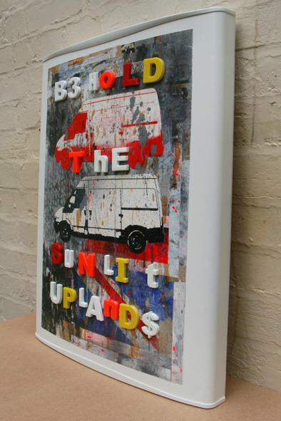


I currently have a small collection of these ‘Fridge’ pieces in production, with the wherewithal stacked in my back yard for it to become a larger collection.  But, as with any series, the first one to reach completion always feels like something of a breakthrough.  It answers various questions, both aesthetic and technical, and definitely points the way forward for those to follow.

I’ve lived with them over the summer, and spent much of time wondering how to work over what I always knew were essentially backgrounds (albeit fairly well resolved ones).  Part of my solution – that of incorporating printed representational imagery (derived from my original photography), clearly owes another massive debt to Rauschenberg.  The addition of screen-printed elements to work commenced in other media is something I toyed with a little last year, and certainly intend to pursue further in future work.
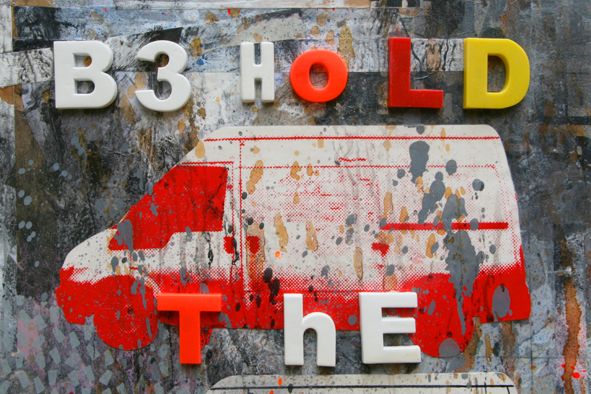


And, while we’re at it - I guess my continuing habit of inserting written texts into visual pieces also owes as least as much to the influence of Jasper Johns as to any other of the numerous artists who have deployed a similar strategy.  It’s pretty obvious that the recent/current major London retrospectives of those two closely allied Modern masters, cast a pretty long shadow over my current thinking.  The specific chosen phrase is an extract from my own extended piece, ‘Below the Line/Beneath Contempt’ – itself an absurdist compendium of contributions to the fevered debate immediately post the EU membership referendum, ‘found’ on various newspaper comment sections.  Indeed, that was the starting-point for this whole undertaking, and it still seems to preside over it, somewhat ludicrously.


The use of plastic fridge magnets to spell out the message is (I hope) a fairly neat little gag, as well as a novel new way of dealing with texts in my work.  I certainly like the added layer of 3D relief they supply, if nothing else.  They are, of course the kind of thing one might use to encourage literacy in young children.  Perhaps they might also allude to the key thematic A, B, C of my project – namely, Austerity, Brexit, and Consumption.  In the case of the latter, that might encapsulate consumption of: disposable lifestyles; of consumer (un)durables; the food they once contained (and which may now be delivered instead); or a population – preyed upon in accordance with the logic of late-stage Capitalism).  The betrayal of one generation’s future by another, and  the lack of political insight or historical awareness resulting from a society’s inability to adequately educate its population, might also be seen as subsidiary themes running through ‘This S(c)eptic Isle’.


Anyway, that’s enough potential 'meaning' for one relatively modest piece – isn’t it?  It’s certainly more than enough superfluous (and possibly self-defeating) over-explanation…


Tuesday, 31 October 2017

Work In Progress: 'This S(c)eptic Isle', Fridge Door & Prints


Work In Progress:  'Fridge 1', Acrylics, Mixed Media, Paper Collage, Screen Prints,
Spray Enamel & Magnetic Letters On Refrigerator Door, October 2017


In a year of steady activity - but distinctly short on finished work, it's pleasing to be  completing the first of my fridge door pieces.  I couldn't resist taking a couple of oblique shots as the last application of white enamel was still drying.


Four of these fridge doors have sat around in a partially complete state for several months now, as I tried to envisage my next moves on them.  It turns out the answer lay in the addition of screen-printed elements (resulting from several recent trips to Leicester Print Workshop), and a text spelled out in fridge magnets.


Work In Progress:  Screen-Prints On Paper, October 2017


'Bout time too...


Wednesday, 25 October 2017

Piper's Hidden Reverse


All Images: Rushey Mead Academy, September 2017


Sometime in the last century, Leicestershire County Council began a really rather impressive art collection - as a lendable resource for the county’s educational establishments.  It’s a memory of  an era when there was money in the system for such things as Chagall prints (one of which I once discovered at the back of a High School stockroom), or work by big name artists of the period, of the ilk of Robyn Denny, Patrick Heron or Prunella Clough.


We clearly live in far less enlightened, more parsimonious times, but what remains of the collection still exists, and continues to circulate around local schools.  In the Art Dept. where I earn my corn, work from the Leicestershire collection serves both as engaging décor, and  (more importantly) as a valuable teaching resource.

Thus it was I found myself packing up a John Piper piece, the other day for return to base.  If I’m honest, Piper isn’t really my thing these days, although I can see some quality in much of his work.  Perversely though, I did find myself drawn to the reverse of the frame, and the various clues (both textual and textural) that it offers to the artwork’s history in public service.


John Piper, 'La Chapelle St Robert, Dordogne', (Medium/Date Unknown).


With apologies to the artist’s memory, a layer of bubble wrap over the image itself also helped me to see it afresh…


Tuesday, 24 October 2017

'Jasper Johns: Something Resembling Truth' At Royal Academy Of Arts, London


Jasper Johns, 'Target', Encaustic & Collage On Canvas, 1961


Over the recent Half Term holidays, I went to view The Royal Academy’s current 'Jasper Johns: Something Resembling Truth' retrospective exhibition, along with my friends, Tim and Andrew.  It’s a show I’ve been anticipating all year.  Here are some of the things I learned:


  • The early pieces with which Johns made such an impact, still feel strangely – almost hermetically, unassailable.  We’ve lived with copious reproductions of those targets, Stars & Stripes flags, US maps and numerals for over half a century, and yet the effect of the originals remains urgent and immediate.  And, despite such familiarity, the chances to see the real things, here in Europe - have been few and far between.  My initial reaction, on approaching these pieces for the first time, was a surprisingly emotional one of real joy.


Jasper Johns, 'Flag', Encaustic & Collage On Canvas, 1967


  • There’s a crisp freshness about many of these pieces.  The target and flags that greet the visitor at the start of the exhibition show little of the aging or loss of vibrancy one might expect from paintings of their vintage.  Does the wax involved in Johns’ encaustic technique help to somehow fix the pigments – or were they just always particularly well cared-for as a result of their almost instant market value?


Jasper Johns, 'Map', Encaustic & Collage On Canvas, 1962 - 63

Jasper Johns, '0 Through 9', Charcoal & Pastel On Paper, 1961


  • That initial celebratory rush gave way to a more reflective appreciation of just how much of an influence Johns’ characteristic aesthetic, and general demeanour have been on me over the years.  It emphasised the extent to which I have quoted him, both wittingly and unwittingly, on numerous occasions.  My ‘Vestige’ paintings from last year may - I now realise, be as much a subconcious paraphrasing of his ‘Canvas’, as they are a response to the actual street-based subject that triggered them.  My enthusiasm for a certain variety of battleship grey (Johns is a master of the greys), and deployment of text elements within my work - are as attributable to the influence of Johns as to that of any other artist possibly associated with them. 


Jasper Johns, 'Canvas', Encaustic & Collage On Canvas, 1956


  • The established art historical significance of Johns’ breakthrough pieces is well rehearsed, and the passage of time has inevitably cemented them into the general canon of Modern Art.  It’s hard for us to fully appreciate now, the real disruptive effect their recourse to external ‘subject’ must have presented to the Abstract Expressionist certainties of mid-century New York painting.  Johns’ destruction of his very earliest work indicates his emergence wasn’t quite as fully formed and instantaneous as official history suggests, but does emphasise the degree to which it represented a significant step-change in everyone’s artistic priorities (including his own).  If Duchamp once pointed the way out of established European tropes, perhaps Johns (and Rauschenberg) did the same for American art.


  • In fact, it actually feels like Johns’ agenda was often one of repurposing Duchamp’s pioneering promotion of the idea over the sensory appeal of the artifact - back in favour of the resonant art object.  There is a certain stripe of conservatism running through Johns, who remains, at his core - a maker of beautiful things.  He seems to epitomise my own trite personal mantra that Art is certainly a branch of Philosophy – but one in which you still get the joy of making stuff.


Jasper Johns, 'Fool's House', Oil, Sculpt-Metal & Charcoal On Canvas
With Objects, 1961-62


  • Johns has naturally beautiful visual handwriting.  He is one of Art’s consistently elegant scribblers and possesses an enviable deftness with the nominally expressionistic brush stroke.


Jasper Johns, 'Periscope (Hart Crane)', Oil On Canvas, 1963


  • For all that, his deployment of the gestural mark actually appears to serve a different purpose.  There’s a distancing effect in the early works, in which Johns appears to quote expressionism as a formal option, rather than an unconscious outpouring - and as a means to create nuance and a friction of new implications within his utilitarian, given subjects.  Put simply - to modulate and encrust formal elements that we expect to be functional signs, is to invest them with new layers of potential meaning.


  • …And, I’ve always loved the pictorial tension between a loose, painterly fields and a crisp, precise edge – of which Johns is a consummate master.


Jasper Johns, 'The Critic Sees', Sculpt-Metal On Plaster With Glass, 1961


  • Sculptures like ‘The Critic Sees’, or the ‘Painted Bronze’s, are among the most elegant jokes in Modern Art, and feel distinctly part of Duchamp’s legacy.


Jasper Johns, 'Painted Bronze', Oil On Bronze, 1961

Jasper Johns, 'Painted Bronze', Oil On Bronze, 1960


  • If Jasper Johns and Robert Rauschenberg were once roped together, (even more intimately than Braque and Picasso, at another pivotal moment in western art), how fortunate are we to have been presented with major retrospectives of both artists in recent months?  The chance to compare and re-evaluate works so emblematic of their particular moment - and so freighted with significance, (and to mostly find them still vital and enduring in resonance) feels like a luxury.  This show hasn’t been without its detractors, but I wouldn’t have missed it for the world.


  • In the light of this, is it too obvious to observe the inconvenient (but oft-repeated) sense of a diminution of power in the later work of both artists?  Of course, these things never travel in an undeviatingly straight line, or as explicably as art critics and historians would wish.  Nevertheless, both retrospectives seem to suggest a certain dilution in the intensity of each artist’s powers or effect, as time went on.  Is this the price to be paid for such early acclaim? - or a debilitating function of the foaming art market? - or simply an assertion that almost no one can keep scaling the same lofty heights of eloquence they once did, whilst simultaneously avoiding the spiral into repetition and self-parody?


Jasper Johns, 'Spring', Encaustic On Canvas, 1986


  • And this is, of course, the real dilemma with John’s career.  The prevailing theory that his work beyond the 1970s represents a notable fall-off in quality and purpose is commonly heard, but I was determined to seize the opportunity to make up my own mind.  The sad fact is, all three of us found more foundation in that view than we might have hoped for.  Regrettable though that may be, 'Something Resembling Truth' must surely trump any desire to airbrush an artist’s reputation.  Perhaps we should instead be grateful that an artist who seems almost too good to be true, early on, proved himself merely human after all.  And ultimately, I’d defend the right of any artist to struggle on for as long as they feel the need to – regardless of the outcomes.  The truth is, it’s probably less of a problem for Johns than it is for his audience and critics.


Jasper Johns, 'Racing Thoughts', Encaustic & Collage On Canvas, 1983


  • For what it’s worth, my own ‘problem’ seems connected to John’s desire to replace his earlier, peerless demeanour of cool detachment, with one in which he admitted personal emotions and insights into the work.  But that’s hardly a crime per se.  Indeed, it still forms the main agenda of a huge proportion of artists.  And the impulse to collage more personal allusions, obscure signifiers and tangential references into an oeuvre where once elegant distillation or a tendency toward minimalist concentration once held sway, is a forgivable ambition.  It might even represent a degree of personal growth on Johns’ part.  The real issue is a seeming difficulty in realising his new agenda.  There’s a sense of an artist forcing the ideas more, at the same time as the ability (or energy) to resolve them is somehow diminished.


Jasper Johns, 'Montez Singing', Oil On Canvas, 1989-90


  • What feels most disappointing is the transition in Johns’ work from sublime plasticity (be it painterly, sculptural, or in print), to a dispiritingly thin variety of illustration.  It seems ironic that his shift to more personal subjects, and emotional insights, should seem them merely described (often poorly), rather than evoked.  It’s a seeming reversal of his earlier state of sensual philosophy.  The use of supposed trompe-l’oeil effects, feels particularly shoddy (all those corny peeling corners and badly-rendered nails).  It could have been an interesting strategy, but actually ends up feeling lazy and lame.  The quotation of child-art eyes and lips is especially embarrassing (when it might have been a effective paraphrase).  A painting like ‘Montez Singing’ looks like a waste of a lunch break.  It’s all somewhat dispiriting, and I was surprised by how much anger it seemed to unleash within us.  Is that just an inevitable pit-fall of hero worship, I wonder?


  • Of course, it could just be that John’s mark-making is better suited to the abstract that to the representational.  Could my adverse reaction be because that is how I feel about my own?


Jasper Johns, 'Between The Clock And The Bed', Oil On Canvas, 1981

Jasper Johns, 'Corpse And Mirror', Oil On Sand On Canvas, 1974 - 75


  • Although it represents a transitional phase between ‘classic’ early Johns, and the more questionable later work, I still find much to like in his works from the 1970s and early 80s – in which all over patterns of hatching and flagstones take precedence over the more overtly emblematic motifs of previous years.  These new devices might appear to hark back to the painterly concerns of the Abstract Expressionists, but there’s still a sense of conscious deliberation about Johns’ new methods of getting across a canvas.  They feel like signifiers for certain Ab Ex. tropes, rather than an unmediated outpouring of emotion or spirituality, and despite their more obscure, personal origins are essentially just new elements of vocabulary within Johns’ own invented pictorial language.  There is a sense of layered meanings filtered through these broken fields; but they are mainly still references to external sources or quotations from other artists (such as Edvard Munch) – rather than any non-specific expressionism.


Jasper Johns, 'Dancers On A Plane, 'Oil On Canvas With Painted Bronze Frame', 1980


  • Thankfully, not all the news from the latter portion of the exhibition is as bad.  The ‘Regrets’ series feels to me like a moderate return to at least some of Johns’ intrinsic strengths.  He selects a single, found motif in a photo of Lucian Freud, commissioned by Francis Bacon.  Instead of overburdening it with additional imagery, he allows its resonances to emerge through the layering and mirroring of this single source; for the negative shape created by the photo’s damaged portion to become a formal pictorial element of some significance; and for the ghostly skull which haunts the series to be found through pictorial chance operation - rather than tritely imposed.  Lest we forget, Johns moved in the same circles as John Cage, back in the day.

 
Jasper Johns, 'Regrets', Oil On Canvas, 2013


  • Whilst the exhibition closes with a perfectly acceptable painting derived from the Freud image, the full implications of the ‘Regrets’ series really play out in a suite of printed variations on the theme.  Johns continues to quote himself (and others) in all this, but it feels like he’s digging a bit deeper again, and releasing things rather than merely forcing them.


Jasper Johns, 'Regrets (State 13)' Aquatint On Paper, 2013


  • The underlying theme of ‘Regrets’ is a fairly standard one of ageing and impending demise -  underpinned by a distinct sense of existential despair.  But, surely that’s forgivable from an octogenarian artist – isn’t it?  Would that we might all be working as productively as Johns, at a similarly advanced age.


'Jasper Johns: Something Resembling Truth' runs until 10.12.17 at: Royal Academy Of Arts, Burlington House, Piccadilly, London, W1S 3ET.


Sunday, 1 October 2017

Yellow Patches


West Leicester, September 2017

It's a while since there's been much yellow on here - so here's some.  I've been waiting ages to photograph this wall.  Finally, the other day, the carpark cleared sufficiently to afford a clear view - just as it became illuminated by limpid Autumn light.


The best things are worth waiting for...


Monday, 25 September 2017

Elided Views 5: Business & Law


All Images: Central Leicester, September 2017


The ability to sustain scientific advancement and theoretical pluralism in social sciences was always deeply attributable to the extent by which the underlying empirical research is free from any form of methodological failing.  A massive centre post with three braces supports the ceiling of the ground floor room.  When you feel powerless, it can be difficult to see the light at the end of the tunnel.  All theories and scientifically proven hypotheses are limited by the extent to which all data used to provide the underlying empirical support are free from any form of bias.  It becomes difficult to find the strength to get up and keep pursuing your dreams or even to imagine life any other way.


The slots in the centre beam mark the position of a timber and plaster screen which used to divide the room.  In line with other areas of social sciences, empirical research in accounting and finance is also highly sensitive to the nature of information used.  It’s not uncommon to forget that you decide whichever direction you want your life to take.  Possible existence of bias in accounting and financial data can lead to erroneous and invalid inferences. The truth is that the fact that you may have weaknesses doesn’t mean that you have to be weak.


You broke up.  You got the sack.  You received bad news.  You’ve Ballooned.  The lack of consistency on accounting year closing dates for British companies raises significant questions regarding potential look-ahead bias in previous UK research.  You feel like you have failed.  You’re stuck in a rut or have lost control.  Up to the present day, the main methodology adopted to control for this problem is the use of a six-month lag between the balance sheet date and the use of this information in a study.  It has a drainage shaft which is joined by another from the floor above which leaves the building at ground level.  Can things get any harder?


There are a lot of adjustments that people can make when they are not satisfied with their appearance, from changing their hairstyle to wearing different outfits.  For example, portfolios are formed on June-end using only accounting information with reporting dates earlier than the previous December-end.  An attractive feature of the room is a stone aumbry, or wall cupboard.  But replacing a way of behaving or a lifestyle is not as simple.  Much of the roof timbering had to be replaced but an original truss and kingpost remains in one room.  This ensures in almost all cases that the information used is indeed publicly available at the time of portfolio formation.