Wednesday, 31 July 2019

'Constructed City' 1


All Images, Leicester And Nottingham, June - July 2019

As I intimated in my last post, I've spent a lot of recent hours photographing major building work.  There's plenty of that going on in my own Leicester back yard - and in Nottingham, where I'm a regular visitor, also. 


It definitely feels like it will probably trigger a new body of work, in coming months.  However, for now - it just feels like I'm in a gathering phase.  It's usually only after a period of immersion in the field that certain themes and associations really start to coalesce around a category of subject matter, and I'd never want to be without this process of just 'getting in among it' with the camera.  There's already the odd glimmer of something emerging, thematically - but mostly, I'm just happy to indulge myself with the sensory overload of all this stuff, at present.


Of course, there's a difference between the various meanings to be found in a subject, and the purely visual/formal correlations (closely connected though they may become).  One thing that's pretty obvious is that large construction sites are an absolute gift to my love of complex visual structures and formal geometry - as is amply demonstrated in this first little batch of images.  


I remember, as a student, being advised to let imagery evolve organically, by grouping visual material, be it primary sources or secondary influences, into connected categories - however simplistic.  Often, the easily made, immediate connections start to give way to other, less obvious, associations, in time.

In this case, everything here fits neatly into a pigeonhole labelled 'meshes and grids', and it's all pretty frontal and parallel to the picture plane.  So far - so much something I've always always loved.  But already, I'm also starting to think about relative degrees of complexity, and the introduction of disruptors into modular systems, as well as the whole idea of layering, and the compartmentalising of space, in three as well as two dimensions.  There also seems to be something worth exploring about just how many different ways there might be to fill-in space, both pictorially, and in terms of the urban landscape, in all of these.    


That'll do for now, then.  There'll almost definitely be a load more to follow, as the year progresses...


Tuesday, 23 July 2019

The City Clears Its Lungs


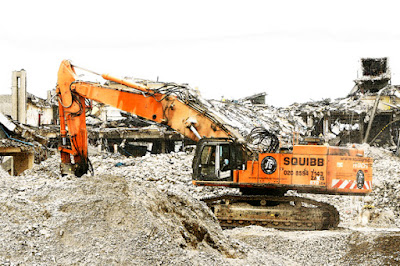
All Images: Imperial Tobacco Horizon Site, West Nottingham, May 2019

As I discussed in my recent printmaking-related post, one of the biggest current influences on my local environment is the impact of significant redevelopment and construction work, here in West Leicester.  As I write, the clang of girders, and clatter of pneumatic wrenches drifts through my open window, as another section of the local skyline is filled in with a complex cage of steelwork.


But, before such transformative physical statements can be imposed on a city, it's normally necessary to clear space for them to occupy.  Indeed, this continual process of upheaval - of drawing, erasure and redrawing - of rising, falling, and rising again, is a big part of what lends any major conurbation its characteristic dynamism.  That churning dynamism, and the drive to invent, and reinvent themselves on a grand scale, is of course, what all cities have been about - ever since they first appeared as a mode of habitation, in the ancient Middle East.


Thus, before this blog, as seems likely, becomes an arena for my already expanding library of construction-related images - it seems only fitting to include a few relating to what goes on (or comes down) before.  In this case, the site under scrutiny is actually on the outskirts of Nottingham, rather in my own back yard - being the rapidly vanishing Imperial Tobacco 'Horizon' plant.  This edifice has long constituted an imposing behemoth on the western fringes of the city - an effect that was only magnified by its stark, Brutalist design.  It's perhaps only fitting then, that its removal from the landscape should play out with such post-apocalyptic grandeur.  My camera was certainly never going to resist a spectacle of such thrilling devastation.  


To read a little further into the events depicted, one could naturally find significance in the erasure of yet another large-scale concrete monument to the modernism of my childhood, or even draw some conclusions about the rapidity of our culture's turn away from recreational smoke inhalation.  And, depending on what replaces the plant - they may also represent  more evidence of our turn from manufacturing, towards a service and knowledge-based economy.


That's all perfectly valid.  But, to be honest, when I stood on a pile of rubble to take these shots, I was mostly just captivated by the raw, visual excitement of those pulverised ramparts and mountains of shattered concrete - and with the muscular steel monsters rumbling around amongst them.  As ever, experience first - theorising later.


Tuesday, 16 July 2019

'Show Me The Way To Go Home...'


First Three Images:  West Leicester, July 2019


These images seem pretty typical of the kind of thing one might take on a nocturnal stagger home - after taking a little drink, and therefore convincing oneself that the subjects illuminated by the phone's flash have some sudden and profound significance.  Which is exactly what they are.


They differ from the photographs I normally take, being both nocturnal, and spontaneously 'snatched' (although I'll confess to a little post-camera editing here - which somewhat redresses the latter quality).  They were also taken on my phone - which is a tool I have often tended to under-utilise for image capture.  That does seem to be changing slightly though, now that I've admitted a little more social media into my life - and become an occasional exponent of Instagram.  I don't plan to start photographing my dinner anytime soon, and still remain a bit reluctant to put my own image online, unless strictly necessary.  However, aside from their standard publicity functions, there is a certain appeal to the idea of using such platforms as a kind of spontaneous visual diary - I guess.  Stuff like this seems to characterise the kind of immediacy that might suggest.

Should you feel so inclined - you can find me on there by simply searching for: hughmarwood.  


Christopher Wool, 'East Broadway Breakdown', C-Print, 1995-95


It also occurs to me that there's a certain correspondence between my shots here, and some of those in Christopher Wool's 'East Broadway Breakdown' suite, from the mid 1990s.  Maybe that's no real coincidence - as I was researching Wool's work while writing my last post.  Either way, I am always drawn to the deliberately slip-shod and profoundly quotidian nature of his photography.  Now, if I could just break myself of my Photoshop habit...


Christopher Wool, 'East Broadway Breakdown', C-Print, 1994-95


Monday, 15 July 2019

CMYK Screen Printing Weekend At Leicester Print Workshop


Untitled 4-Colour CMYK Screen Print (Test Piece) On Paper,
200 mm X 146 mm (Actual Image), 2019 


With a lot of time spent laboriously fettling cardboard boxes, fridge doors and abandoned trundle toys, over the last eighteen months - my printmaking excursions have been fairly few and far between.  I made an attempt to rectify that recently, and to reboot my enthusiasm for screen printing in particular - by attending Leicester Print Workshop's two day CMYK-specific training course.  It proved to be a thoroughly enjoyable experience, and has certainly inspired me me to get back into the workshop, now that the blessed school holidays have finally kicked in.


Untitled 2-Colour CMYK Screen Print On Paper (Test Piece),
200 mm X 146 mm (Actual Image), 2019


Untitled 3-Colour CMYK Screen Print On Paper (Test Piece),
200 mm X 146 mm (Actual Image), 2019


Although I'd done a fair bit of screen printing in recent times (prior to 2018's sculpture-orientated, spare time-devouring, energy-sapping endurance test), it had all been either single-colour photographic stuff, or featured the fairly unsophisticated layering of single, flat colours.  There's still plenty that can be achieved that way, of course (and certainly, I'd only scratched the surface of what's possible), but getting to grips with proper, CMYK separations, in order to play with the real potential of full colour, photo-derived imagery, felt like a missing piece of the jigsaw.


Untitled 3-Colour CMYK Screen Print On Paper (Test Piece),
200 mm X 146 mm (Actual Image), 209


Screen printing has always felt like a logical extension of the fact that nearly everything I produce, nowadays has  photographic origins.  Strangely - for someone who can often be pretty dim, or a bit 'analogue', where technology is concerned, the translation of imagery between different media, and the whole embrace of once wholly-commercial processes of image reproduction, feel pretty intrinsic to my process, nowadays.  It probably  has a lot to do with the resolutely urban nature of everything I do, and the way that such imagery contributes to the urban landscape.  Certainly, the insertion of oversized (usually highly idealised) commercial photo-imagery, into an otherwise physical (and possibly less than 'ideal') context, can provide some pretty thrilling shocks to the perceptual system, I find.


Untitled 4-Colour CMYK Screen Print On Paper (Test Piece),
200 mm X 146 (Actual Image), 2019


Untitled 3-Colour CMYK Screen Print On Paper Test Piece),
200 mm X 146 mm (Actual Image), 2019


I'm far from the first to notice all that, of course.  It's been a staple of the Post-Pop sensibility for 60-odd years.  Nevertheless, the interaction between the 'real' and the imagistic remains a key feature of the actual environments in which I spend most of my waking hours.  The appropriated, printed imagery of Warhol or Rauschenberg, the 'stolen' photography of Richard Prince, or Christopher Wool's boundary-hopping slide between paint, photography and print (and back again) all seem like pretty appropriate accompaniments to my daily experience.  Of course, younger artists might scoff at this - pointing out that these are all quite elderly exemplars, and that the physical or printed artefact is itself now 'well-obsolete'.  The integration of secondary imagery (or text) into our routine experience has, after all, become an all-pervasive, virtual process, at this stage of the cultural game.  The effortless negotiation of simultaneous parallel 'realities' is something many folks now take for granted, and hardly worthy of comment.  In which case, sue me! - I'm old enough for some kind of techno-historical perspective to actually make sense.  Also, staring at electronic screens, all day gives me eye strain.  Besides, aren't a bit of 'craft' and a degree of retro-appeal what all the really cool kids crave, these days?


Untitled 4-Colour Screen Print On Paper (Test Piece),
225 mm X 150 mm (Actual Image), 2019


Untitled 4-Colour Screen Print On Paper (Test Piece),
220 mm X 145 mm (Actual Image), 2019


Anyhow, I digress.  LPW's two-day course gave me all the new learning and techno-tricks I needed to make colour separations in Photoshop, and a useful refresher in the fundamentals of screen printing technique, to boot.  I was pleased to find that my muscle memory for things like photo-emulsion application, squeegy angles, and pulling pressure, hadn't deserted me in my recent absence.  I could just concentrate on the things that are crucial to full-colour halftone printing, like precise registration and relative colour density - without having to go all the way back to Square One.  As a result, the prints I produced (whilst they can only be regarded as experimental practice pieces) turned out to be encouragingly successful.  In fact, I've even sold one, without actually trying  (who'd've thunk it?). 

Oh, and if any eagle eyed visitors here should notice that not all my registration was exactly spot-on - I blame an initially loose pair of hinge clamps.  The only sensible course of action was embrace the error, and designate the wonkiest of my early prints as  'experimental', as the cyan and black went on.  That's my excuse, and I'm sticking to it.


All Remaining Images:  Sneinton, Nottingham & West Leicester, January - July 2019


It is worth noting that the image I chose to reproduce was selected from an ever-expanding tranche of recent photographs, concentrating on major construction and redevelopment activity.  There's a lot of that going on in my neck of the Leicester woods, just now - with several major new buildings already nearing completion, and a lot more scheduled to follow over the next few years.  This is all part of the grand plan to redevelop a significant tract of West Leicester, between the inner ring road and my own neighbourhood.  It will transform the riverside area formally known as Blackfriars/St Augustines, and extend into the equally neglected post-industrial Frog Island area beyond - to exactly what effect, only time will tell.  Those particular environs have featured on here, several times, and I'll confess, I'm already slightly mourning the loss of one or two of my old favourite derelict hot-spots. 


But to live in a city is to embrace change and celebrate often-dramatic physical transformation.  If the region is to be transformed from a marginal playground of creeping stasis and desolate reverie, into a sleekly designed and heavily marketed zone of new-found density and intention - so be it.  The changes now unfolding are undeniably exciting - as new structures emerge, and empty sections of the map, and equally vacant intervals in the city's skyline, are suddenly filled in.  My lens already loves the intricate networks of scaffolding, complex geometries of newly-erected steel, jointing patterns in incomplete cladding, and glistening curtains of fresh glass.  The insertion of functional constructors' signage, developers' marketing babble, and aspirant, hyper-real architects' impressions all feel like valuable grist to the mill too.


Certainly, it all feels far too significant to ignore - particularly for an artist who constantly bangs on about being so in tune with their urban surroundings.  If, as seems likely, it all provides fuel for another eventual body of work - perhaps there's no reason why that couldn't be a largely print-orientated enterprise.  As ever - we'll see.  In the meantime, I'll conclude this post with few more taster images - possibly to prime the pump, as it were.


Thanks to Katie, Harley, and all at LPW concerned with organising the CMYK Screen Printing Weekend,  29-30 June, 2019.  I plan to be back soon, to implement some more of my new learning.


Sunday, 7 July 2019

Oscar Murillo: 'Violent Amnesia' At Kettle's Yard, Cambridge


Disclaimer:  


This post has been far too long in the writing - for which, apologies.  The exhibition it discusses - Oscar Murillo's 'Violent Amnesia' , at Kettle's Yard, Cambridge, actually ended around two weeks ago.  However, with another show currently on in London, and a lot of attention pertaining to his Turner Prize nomination, Murillo still feels very much like a man of the moment, just now.  And to be honest, work like his is, in my opinion, worth discussing at any time.  The Cambridge show certainly whetted my appetite for Murillo's oeuvre, and has inspired me to try to visit his London exhibition in the coming days.  Perhaps this post will do something similar for you...  


Oscar Murillo, '(Untitled) Catalyst', Oil & Graphite On Canvas, 2018-19
(Detail Below)


The painter and multi-disciplinary artist, Oscar Murillo seems to be gaining plenty of recognition, just now - and for pretty good reasons, in my view.  Recently, I found myself at his recent 'Violent Amnesia' exhibition, at Kettle's Yard, in Cambridge's, with my friend, Tim - and came away feeling invigorated by what we saw.   


Oscar Murillo, '(Untitled) Catalyst', Oil & Graphite On Canvas, 2018-19
(Detail Below)

Oscar Murillo, '(Untitled) Catalyst', Oil & Graphite On Canvas, 2018-19
(Detail Below)


Murillo is an ex-patriot Columbian artist - from pretty humble origins, it would seem.  He studied in Britain, following his family's relocation, and has continued to made something of a base for himself here.  However, as would seem to be the case with many artists, these days, he seems to wander the globe relentlessly - seeking creative impetus, making cultural and conceptual connections, and collaborating, wherever it seems most appropriate to do so.  Certainly, ideas about migration, displacement, the complex and fluid, relationships between physical and mental territories - and about the friction between community and globalisation, all appear to form key thematic underpinnings to the work.  Indeed, Murillo has talked quite openly about borders, and the physical domains they delineate, as something he experiences largely through the window of a plane - his ideas and emotions flowing more universally, on the way to somewhere else.  If nothing else, the wide-ranging scope of his practice feels like a inspiring antidote to the growing and depressing trends of  nationalism and intellectual or imaginative restriction - against which any self-respecting artist must surely stand opposed, these days.     


Oscar Murillo, 'Violent Amnesia', Vinyl Cut Letters & White Paint On Wall
(Site Specific), 2019

The Cambridge show alluded to this early on.  The first, eponymous piece encountered, was a text-based memorial to a dead friend, which pleased me greatly with its use of vinyl cut lettering, applied directly to the wall - and partially obscured by a slew of gestural white paint.  However, that almost feels like an adjunct to the main show, which really began with a forbidding curtain of dark, roughly collaged canvas pieces, obscuring one's view of the work beyond in two directions.  This was actually the first instalment of Murillo's long-term project, 'The Institute Of Reconcilliation', which reappeared throughout the exhibition, at recurring intervals.  Here, it seemed to serve as a physical, as well as a visual obstacle to be overcome - suggesting to the seeker of artistic refreshment, "You must struggle to make any progress here."  Is this not also, in essence, the all-too-common experience of that quintessential twenty-first century figure - the migrant?     


Both Images: Oscar Murillo, '(Untitled) Catalyst' Paintings, With 'The Institute Of Reconciliation'
(Installation), Kettle's Yard, Cambridge, June 2019


Behind this, in one room of the impressive new Kettle's Yard exhibition space, hung a thrilling suite of Murillo's ambitious '(Untitled) Catalyst' paintings, alongside another phase of  'The Institute of Reconcilliation' (combining more tattered canvas drapery, damaged church pews, and a concoction of burnt corn and clay).  The latter appears to employ culture-specific references to the Colombian working classes, amongst other things, and is engaging enough.  However, with my painter's hat on - I'd be lying if I didn't admit it was the 'Catalyst' pieces that really blew me away, in that particular gallery.   


Oscar Murillo, 'The Institute Of Reconciliation', Oil On Canvas, Steel Rail, Church Pews,
Burnt Corn & Clay, 2014 - (Ongoing)


It occurs to me that it's increasingly rare to encounter this kind of ambitious, freely expressive, abstract painting in a contemporary exhibition, nowadays.  Nevertheless, it's still one of the most profound thrills in art, to be confronted, all over again, with someone's attempt to discover exactly how paint might get from one edge of a flat surface to another, with energy and verve.  Walking into this room was, for me, an experience not too far removed from that of engaging with Gerhard Richter's timeless 'Cage' suite, at Tate Modern.


Oscar Murillo, '(Untitled) Catalyst', Oil & Graphite On Canvas, 2018-19


Like much of my favourite painting of this kind, the 'Catalyst' pieces manage to combine  overall simplicity (at first sight), with almost infinite, multi-layered complexity - revealed as one stares into their depths.  Composed of tangled overlaid networks of scribbled marks, and broader veils of dragged colour, they achieve an imposing degree of monumentality, whilst also operating on a very human scale by obviously recording of the gestures of the hand and arm.  Indeed, they relate us to our infantile, attempts at clumsy, intuitive picture-making, even as they exist as mature and deeply reflective paintings.  This is, of course, essentially what the Abstract Expressionists were attempting, seventy-five odd years ago.  It's exhilarating to witness it being revived as an approach, with such verve and commitment, so deep into the Twenty-First Century.


Oscar Murillo, '(Untitled) Catalyst', Oil & Graphite On Canvas, 2018-19
(Detail Below)


That these paintings constitute a related series is evident not just from their shared and restricted palette of reds, blues and blacks (somewhat reminiscent of ball-point pens - I now realise), but also from the method of their execution.  It transpires that Murillo's method here involves laying one canvas over another - loaded with paint, before scribbling through from behind.  They are thus a species of turbo-charged mono-printing, as much as they are paintings in the traditional sense, and clearly evolve out of each other.  That the list of media employed includes graphite, emphasises that they are also drawings as much as paintings (if all that tangled calligraphy hadn't already proved the point).  It's no secret that I'm a sucker for a good series - and for such hybridised forms of media-transference.  


Oscar Murillo, '(Untitled) Law', Oil, Oil Stick & Graphite On Canvas & Velvet, 2018-19
(Detail Below)


Murillo's willingness to flit between modes of expression, even within the arena of wall-based picture-making, was underlined in the neighbouring gallery.  The paintings exhibited here combine much of the same expressionistic freedom, and indeed - an overall scruffiness which is thoroughly refreshing in these over-designed, digitally manipulated times.  Here though, Murillo also combines his painterly gestures with stencilled, screen printed and more carefully drawn motifs, as well as elements of scrawled text.  That he is a collagist too, is clear from this piling up of random, and possibly more symbolically freighted statements.  It's also made explicit in the means of physical construction often employed.  It transpires that many of his paintings are literally stitched together from separate sections of canvas - much as is the case with the draped pieces already encountered.


Oscar Murillo, 'Violent Amnesia' 'Oil, Oil Stick, Graphite & Screen Print On Canvas & Linen,
With Steel Rail, 2014-18 (Detail Below)


Oscar Murillo, 'Untitled', Oil On Canvas & Linen With Steel Rail, 2015-16 (Detail Below),
With: 'The Institute Of Reconciliation' (Detail)


The interrelatedness of all this is evident in the painting which again shares a title with the entire show, and which is constructed to hang, curtain-like from a steel pole.  Meanwhile, in a far corner, the (for me) most pleasing of Murillo's ragged canvas drapes ('untitled') obscured a window - content to revel in its pure grubby materiality, without carrying any imagery at all.  In such a fashion, Murillo gets from Rauschenberg to Eva Hesse in a single, effortless bound.  But if this weren't enough, his most dramatic intervention in this particular room - another iteration of 'The Institute of Reconciliation', proves his trans-media credentials, once and for all.  Here, a vast avalanche of seemingly filthy canvas sections, resembling discarded industrial tarpaulins, spilled across the floor.  The wall beyond,was defaced by a field of oily scuff marks - suggesting the canvas was dragged across it in the most rudimentary form of abstract image-transfer imaginable.  The inclusion of more burnt clay, corn, and coins here alludes to the already mentioned thematic underpinnings, but I'd have been more than content with it as a more ambiguously process-driven statement, to be perfectly honest.


Oscar Murillo, 'Surge', Oil, Oil Stick & Screen Print On Canvas & Linen, (2017-18)
With: 'The Institute Of Reconciliation' (Detail), 


Oscar Murillo, 'The Institute Of Reconciliation', Oil On Canvas, Coins, Burnt Corn & Clay,
2014- (Ongoing)


Indeed, if I have any criticism of Murillo's practice (or the small taste of it revealed in Cambridge), it is only that his seeming attempt to cover all bases, formally and conceptually, must inevitably fall a little flat eventually.  For me, this occurred next door, in the tiny St Peter's church.  The ever-expanding 'Institute..' continued here, featuring some pretty rudimentary papier mache figures, punctured by sections of metal ducting, and perched on yet more damaged church pews.  The accompanying notes reveal these to be reminiscent of yet more ritual sacrifice - in this case, the Colombian 'Mateo' effigies, traditionally burnt at New Year.  Murillo's intention with these, as with all his burning of clay, corn, and scattering of coinage, seems to be to comment on the exploitation of labour and destructiveness of consumption.  That's laudable enough, but again - I feel like the impressive formalist aspects of this multi-facetted installation somewhat overwhelm the socio-political content it purports to carry.  Ultimately though - who am I really, to criticise another, far more accomplished artist, for attempting to pack in too many things all at once? 


Oscar Murillo, 'Organisms Of All Countries Unite', Graphite, Oil Stick & Coloured Pencil On
Paper With Carbon Paper, 2016 (Details Below)


And that Oscar Murillo is actually able to cash most of the cheques he writes, was revealed in a couple of smaller spaces, upstairs at Kettle's Yard.  'Organisms From All Countries Unite', comprises four composite suites of meticulous drawings, over which are imposed abstract gestures in a far cruder hand.  The drawings, it transpires - are executed by another artist, commissioned to work from photographs taken by Murillo, to document the economic decline of the once-prosperous (in Soviet times) Azerbaijani village of Sheki.  The gestural defacement was then committed by Murillo - in a piece of disruptive collaboration of which I thoroughly approve.  It feels like a far more eloquent attempt to reconcile visual expressiveness with a socio-political theme somehow - perhaps because of the inclusion of explicit representational imagery, and the conflict between two authorial voices.


Oscar Murillo, 'Organisms Of All Countries Unite', Graphite, Oil Stick & Coloured Pencil On
Paper With Carbon Paper, 2016 (Detail Below)


Also upstairs, hung another collaborative statement, in the form of the mixed media piece, 'Frequencies'.  This represents an on-going project, in which Murillo encourages school students to carry-out free-associative drawings on pieces of canvas, wherever his international travels take him.  These are subsequently stitched together in the form of yet more stitched drapes - potentially giving voice to all the world's children, I suppose.  For such an ambitiously outward-facing, and engaged artist, that seems like a perfectly appropriate ambition.  And after all, if it's not an artist's job to cut creatively through all the barriers of inequality, misunderstanding, and isolationism, currently besetting us all - whose is it?  Oscar Murillo seems admirably up for the task.   


Oscar Murillo & International Students Aged 10-16, 'Frequencies', Mixed Media, 2015
(Part Of Long-Term Collaborative Project)


Oscar Murillo: 'Violent Amnesia', ran  9 April - 23 June 2019, at Kettle's Yard, University Of Cambridge, Castle Street, Cambridge, CB3 0AQ.


Oscar Murillo: 'Manifestation' runs until 26 July 2019, at David Zwirner, 24 Grafton Street, London, W1S 4EZ